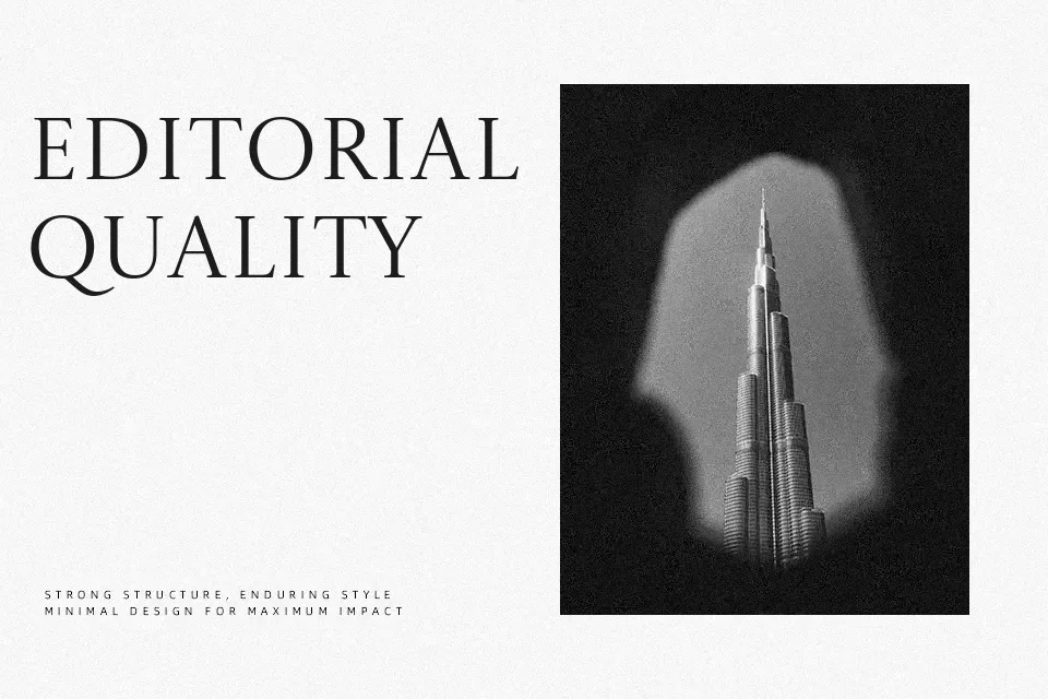
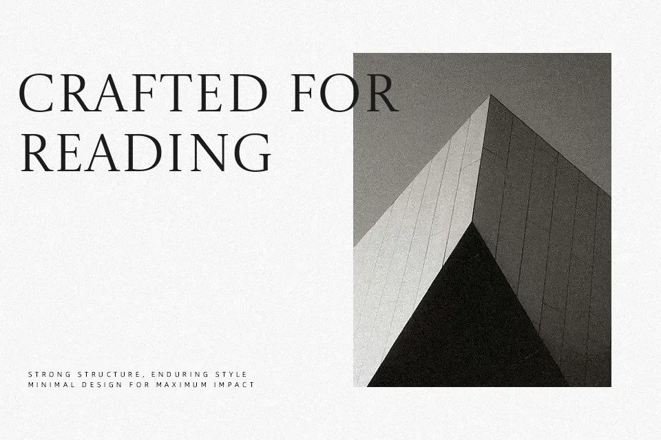
Castoro Titling Font
Free for Commercial UseAbout
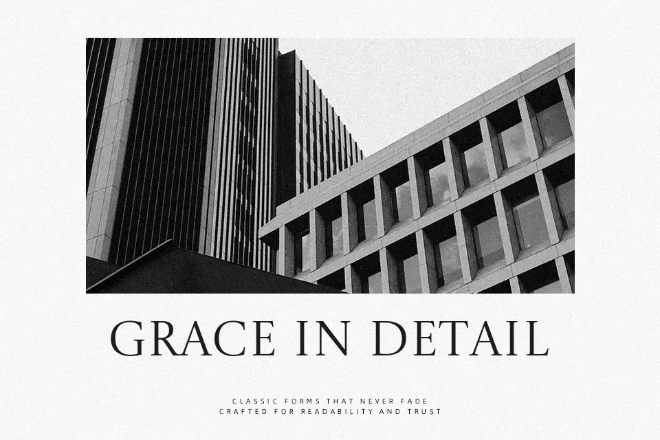
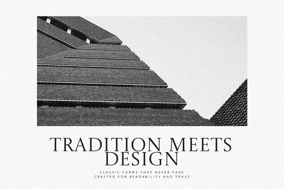
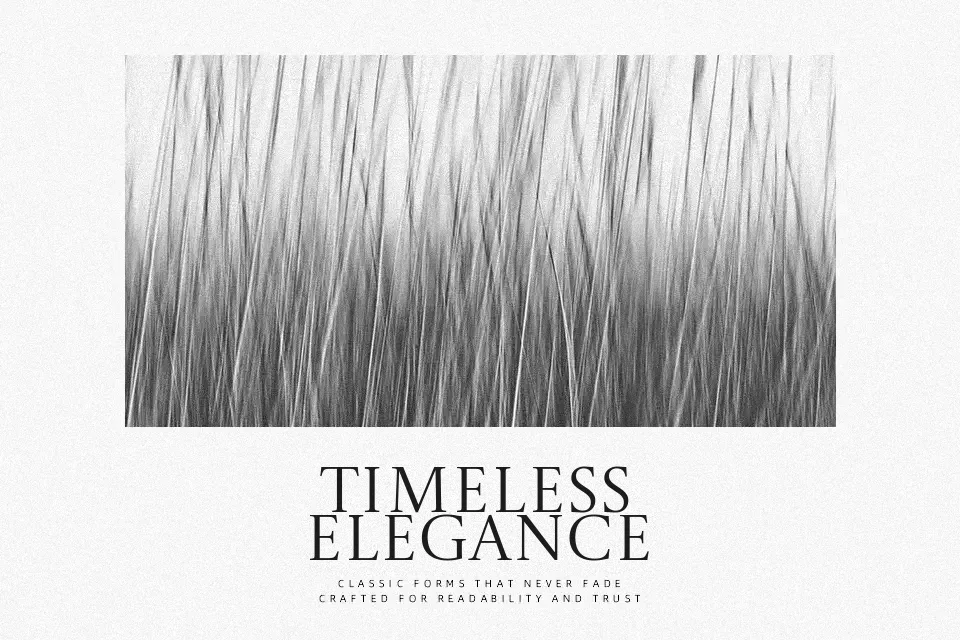
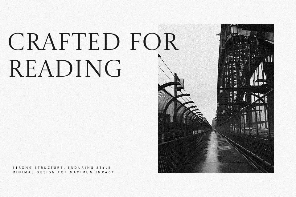
Castoro Titling Font takes the uppercase of the Castoro text family and rehanges it on proportions inspired by Roman inscriptional lettering, giving it tall, airy capitals with carefully controlled contrast and relatively open spacing. The strokes feel refined rather than muscular, so headings read with a calm, literary voice rather than shouting at the reader. It shines in large sizes—chapter titles, poster wordmarks, or museum-style signage—where the sharp serifs and classical rhythm have room to breathe. For dense UI labels or long paragraphs it can feel stiff and too uppercase-heavy, so it works best paired with a text face like regular Castoro or another serif for body copy. If you like traditional book typography but want something a bit more sculpted than a generic Old Style, this is a thoughtful option.
Best For:
editorial headlines
book covers and chapter titles
cultural or educational branding
refined poster wordmarks
Not Ideal For:
long paragraphs
small-size UI labels
informal kids content
highly technical documents
Perfect for branding, editorial, and headline, with a classic and display style.
License
Gallery