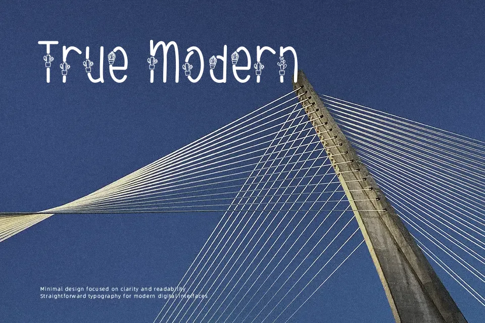
Cactuses Font
Free for personal useAbout
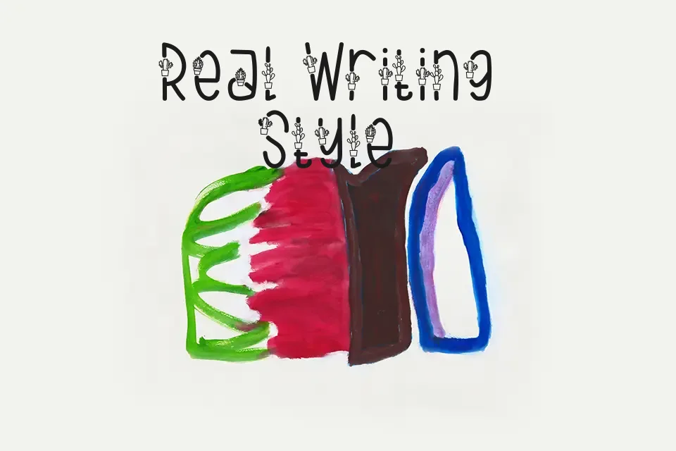
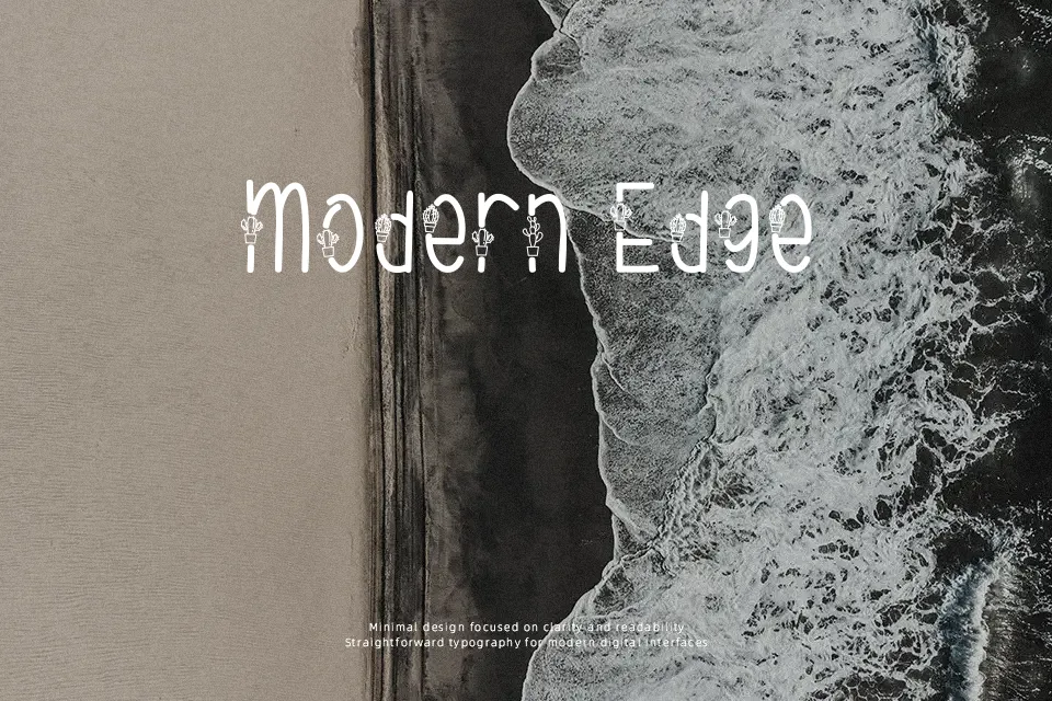
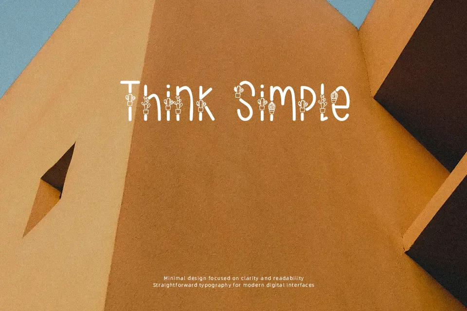
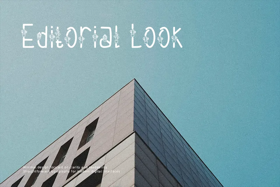
Cactuses Font features bold, irregular strokes with a slightly wobbling baseline that makes each letter feel like a cartoon cactus silhouette rather than a strict geometric shape. The spacing is fairly loose, so words read more like illustrated wordmarks than running text, which reinforces its decorative display character. This gives it a casual, friendly tone suited to lighthearted themes rather than anything corporate or restrained. In practice, it shines in headline-sized use on posters, children’s event graphics, playful product packaging, or social media posts where you only need a few words. It tends to fall apart in small sizes or dense paragraphs, where the chunky shapes and uneven rhythm quickly become tiring to read, so it works best when you treat it as a graphic element, not a text workhorse.
Best For:
kids event posters
playful product packaging
social media title cards
informal brand wordmarks
Not Ideal For:
long paragraphs or body text
serious corporate branding
small-size UI labels
formal editorial layouts
Perfect for kids, logo, and packaging, with a artistic and cartoon style.
License
Gallery