c Caos Kecap Font
Free for personal useAbout
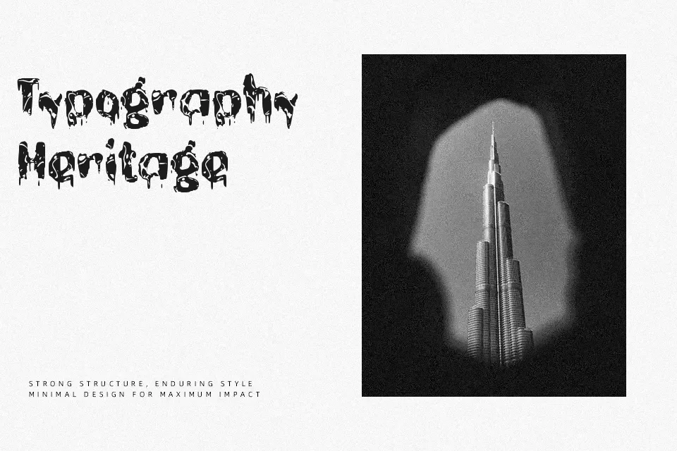
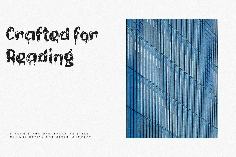
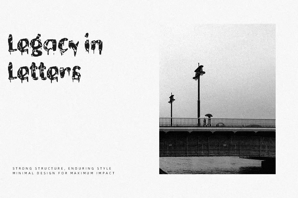
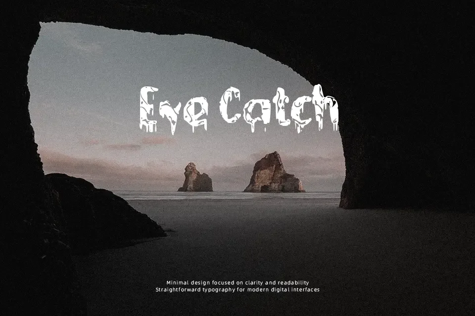
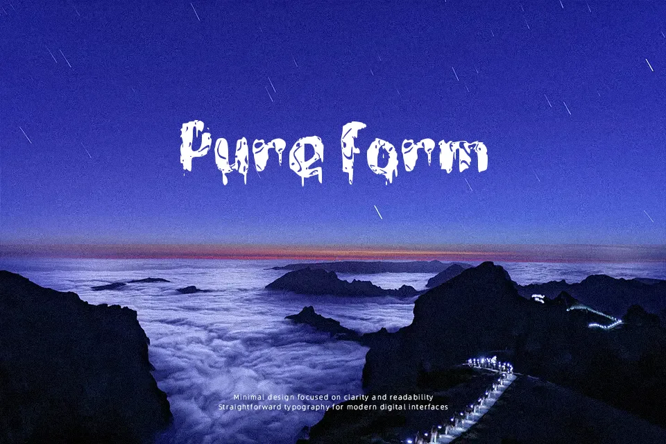
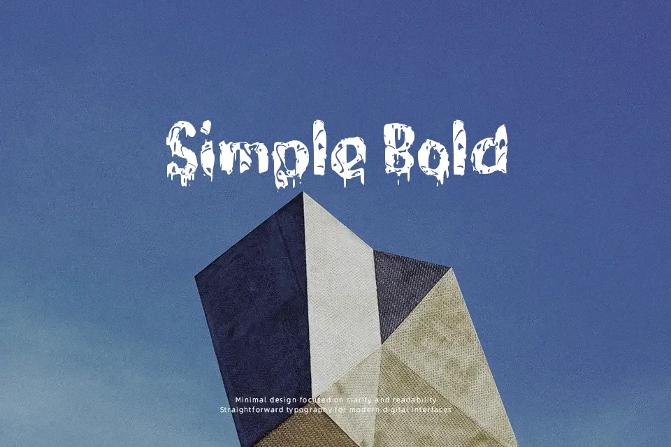
c Caos Kecap is a distressed display typeface with broken outlines, irregular curves, and tight, compact spacing that gives every word a scratchy, chaotic look. The letterforms feel hand-drawn and uneasy rather than polished, which pushes designs toward a horror, metal, or thriller aesthetic instead of something neutral or corporate. It works well on large titles for Halloween events, scary game covers, or poster graphics where the typography needs to carry most of the mood with just a few words. For long paragraphs, clean branding systems, or serious editorial layouts, the texture becomes visually tiring and can undermine readability, so it is better kept for bold headlines and short phrases.
Best For:
horror movie or game titles
Halloween event posters and flyers
scary social media graphics and thumbnails
Not Ideal For:
body text or long reading
formal corporate branding
clean minimalist UI or apps
small-size captions and disclaimers
Perfect for advertising, gaming, and headline, with a creative and decorative style.
License
Gallery