Braille Font
Free for Commercial UseAbout
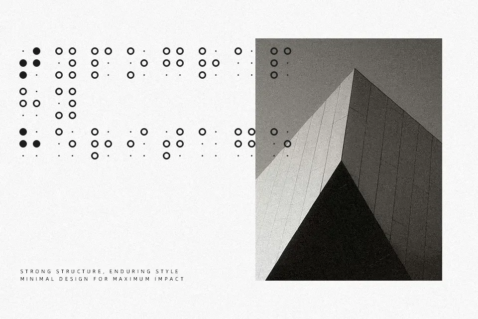
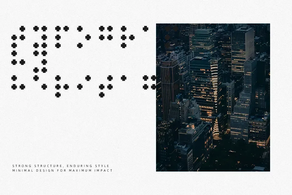
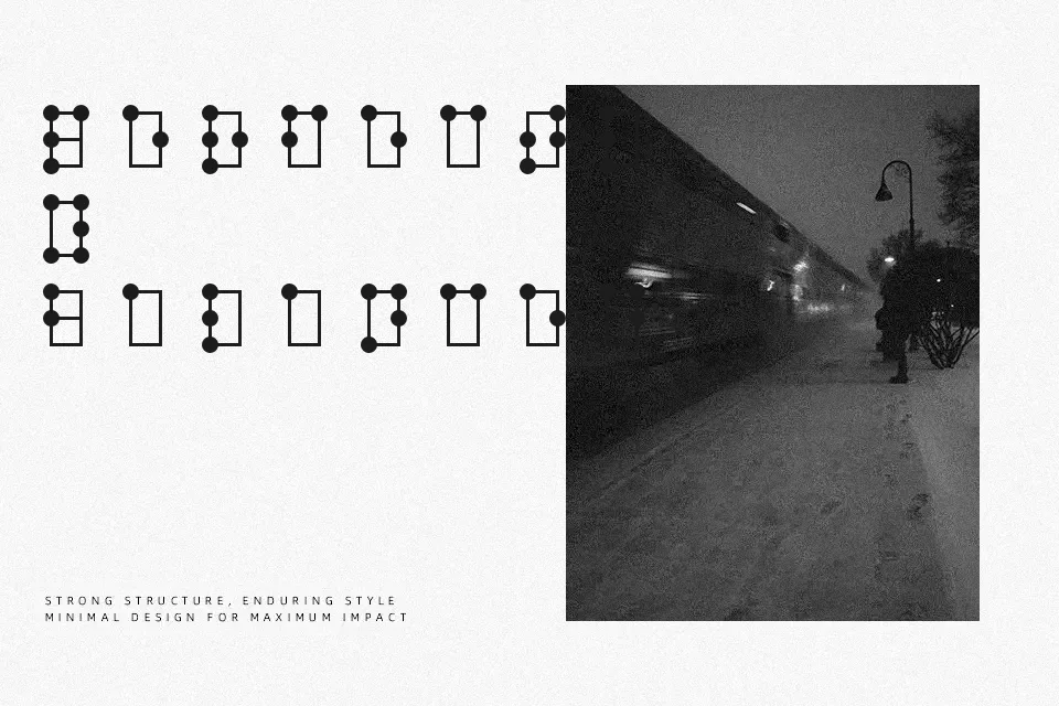
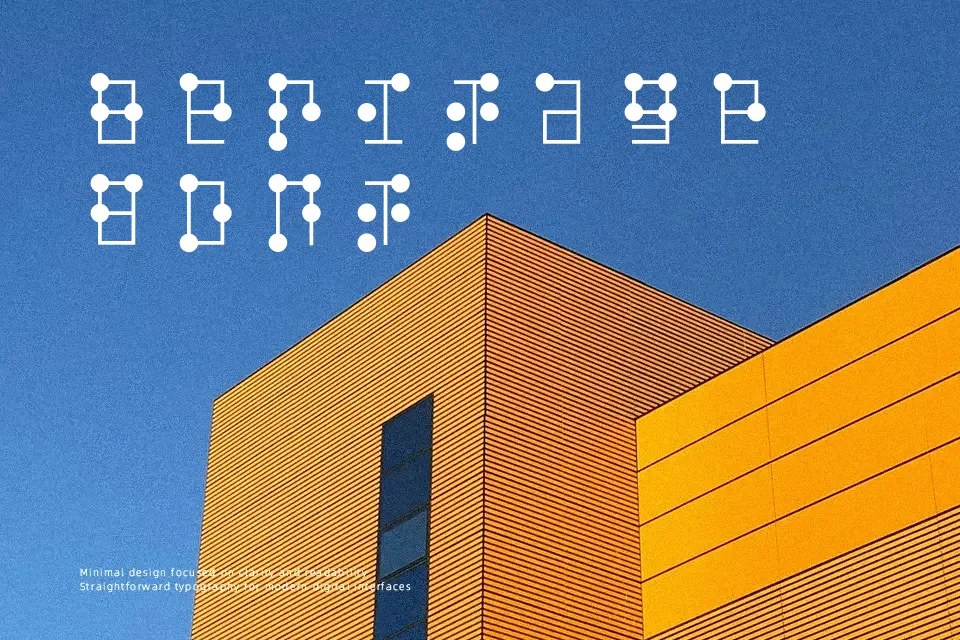
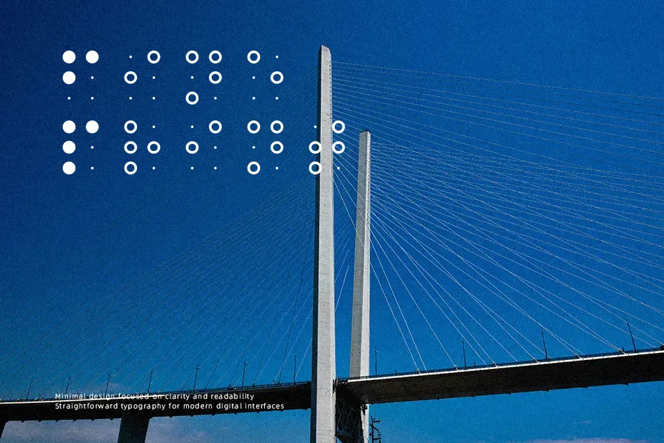
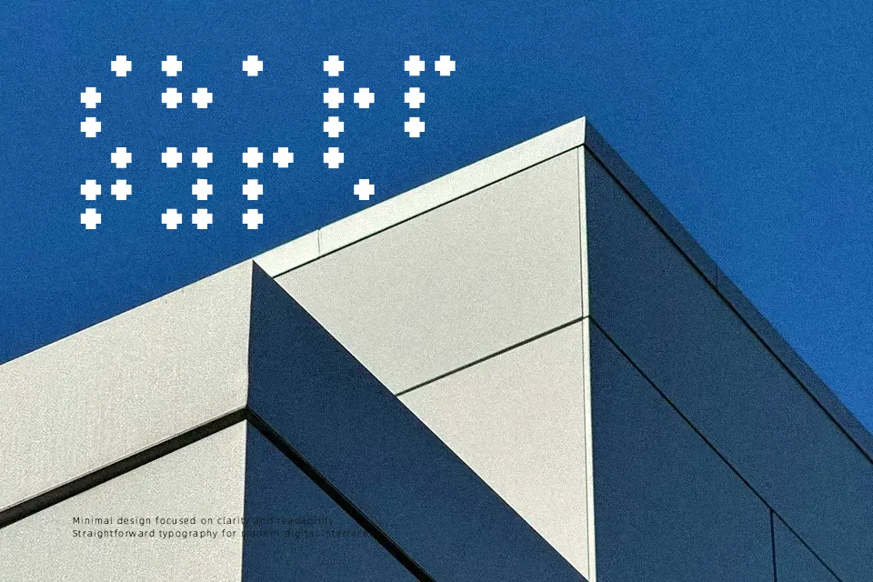
Braille Font translates the six-dot Braille cell into a set of crisp, modular letterforms, often built from evenly spaced dots or pixel-like blocks that sit on a clean grid. The look is openly decorativerather than text-driven, so strokes feel constructed and systematic rather than handwritten. Spacing tends to be generous, which helps the dot patterns remain legible at medium to large sizes but can feel airy in dense layouts. I’d reach for this when you want to visually nod to accessibility, data, or tech without using a standard geometric sans—think educational posters, museum panels, or identity work for inclusive initiatives. It is far less convincing for long paragraphs or small UI labels, where the dotted structure quickly becomes tiring to read.
Best For:
educational posters about accessibility and braille
museum graphics or exhibit panels referencing tactile reading
experimental branding that wants a techy, dot-matrix twist
headline treatments in editorial layouts needing a conceptual braille motif
Not Ideal For:
long body text or reading-heavy layouts
small UI elements, captions, or fine-print details
minimal corporate documents that require neutral typography
interfaces intended for actual tactile braille use
Perfect for advertising, branding, and editorial, with a artistic and decorative style.
License
Gallery