Braah One Font
Free for Commercial UseAbout
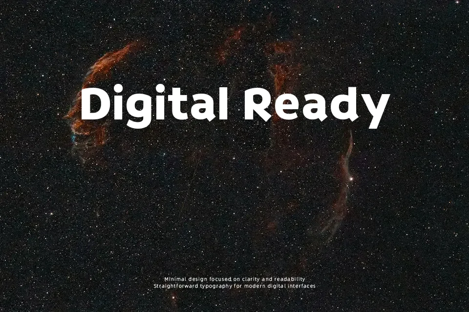
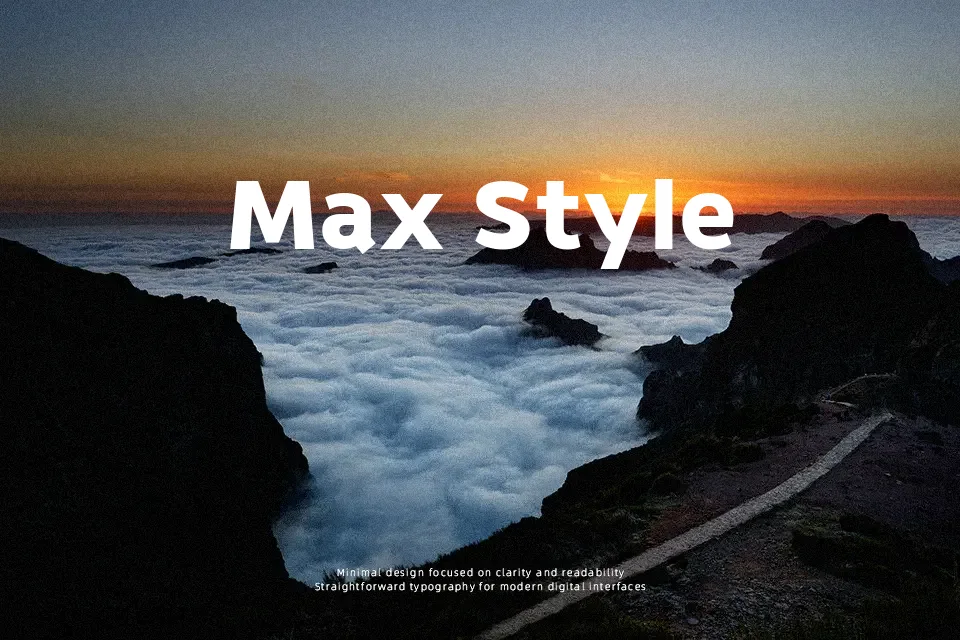
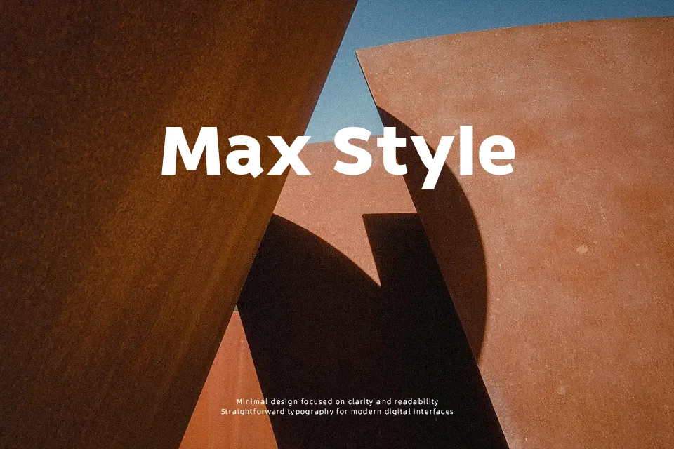
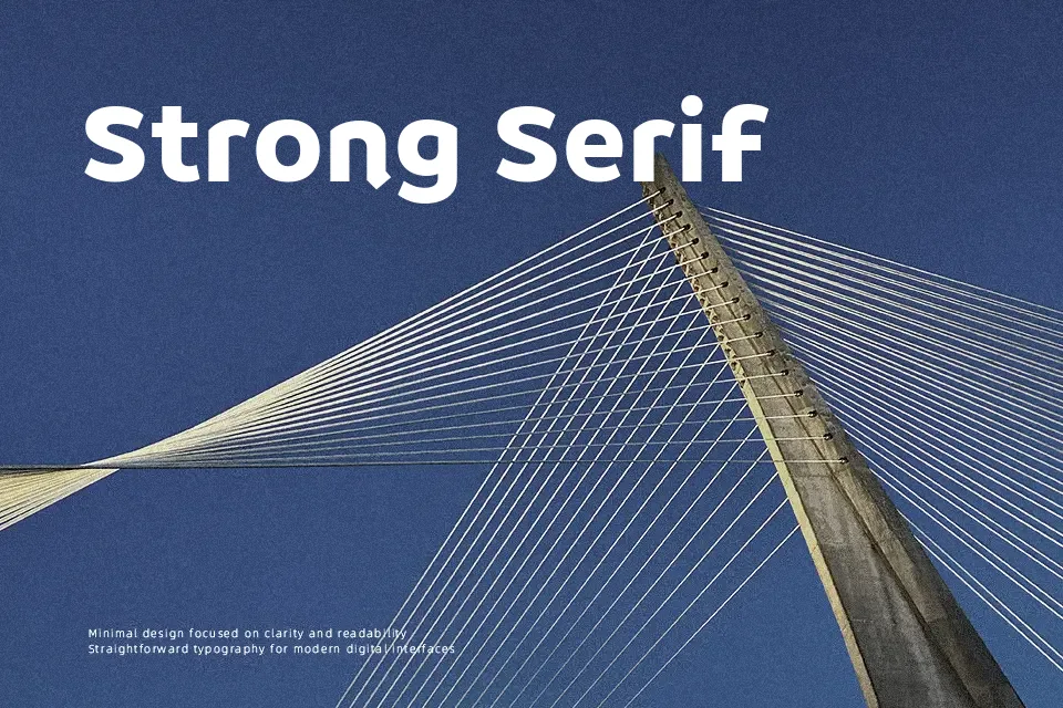
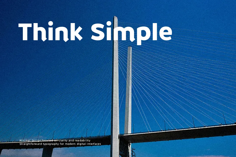
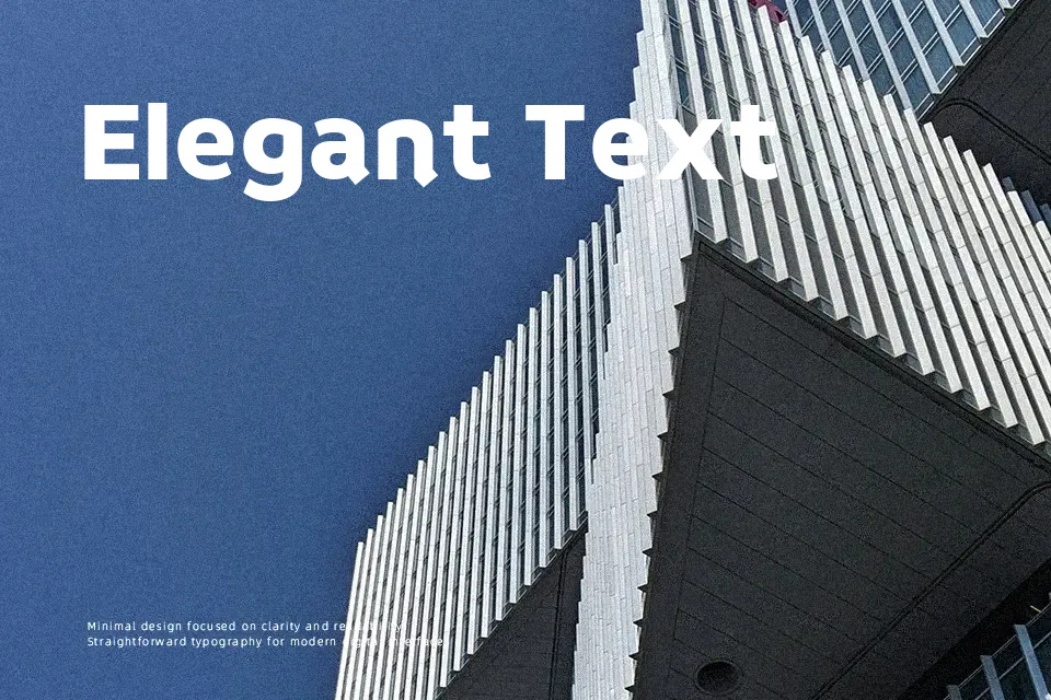
Braah One leans on thick, confident strokes with slightly condensed proportions and generous counters, so letters feel sturdy but not heavy. The shapes have a soft, approachable geometry that gives the font a casual, friendly tone rather than a stark corporate voice. Spacing is tuned for short phrases and display sizes, where its bold weight and simple forms read clearly at a glance on screens and posters. It works especially well for branding in youth-focused products, event titles, and YouTube thumbnail text where you want loud messaging with a playful edge. For dense body copy or highly formal layouts, the same chunky rhythm can start to feel tiring, so it is better kept for headlines and short emphasis lines.
Best For:
bold headlines
youthful branding
social media graphics
short display text
Not Ideal For:
long paragraphs
formal documents
small caption text
Perfect for branding, headline, and logo, with a bold and display style.
License
Gallery