Boring Font
Free for personal useAbout
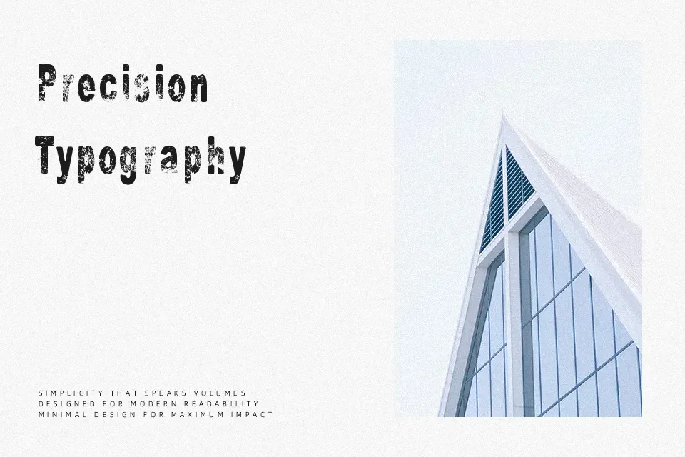
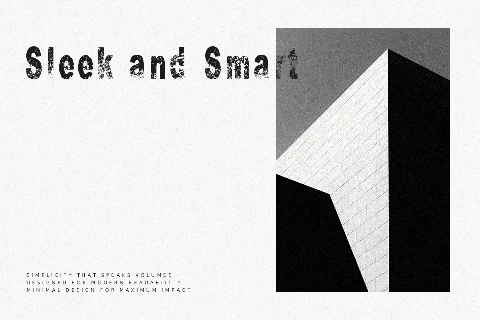
Boring Font leans into a plain, utilitarian look: simple strokes, moderate weight, and even spacing that keeps text readable without calling attention to itself. It feels functional and slightly stiff rather than expressive, which can be helpful when you want content to look matter‑of‑fact or even a bit dry. This kind of sans serif works for mock corporate reports, generic UI wireframes, low‑key banners, or conceptual projects where “boring” is the visual joke. It struggles in settings that need warmth, luxury, or strong personality, and you’ll likely need something more refined for polished branding or long reading.
Best For:
mock corporate presentations
minimal social media posts
generic UI wireframes
conceptual “boring on purpose” posters
Not Ideal For:
luxury or fashion branding
emotional editorial layouts
kids or entertainment projects
long immersive reading
Perfect for branding, headline, and poster, with a clean and display style.
License
Gallery