Blatant Font
Free for personal useAbout
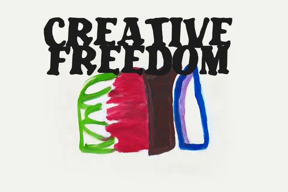
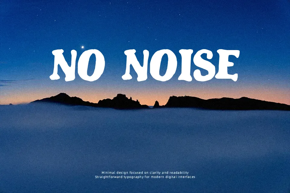
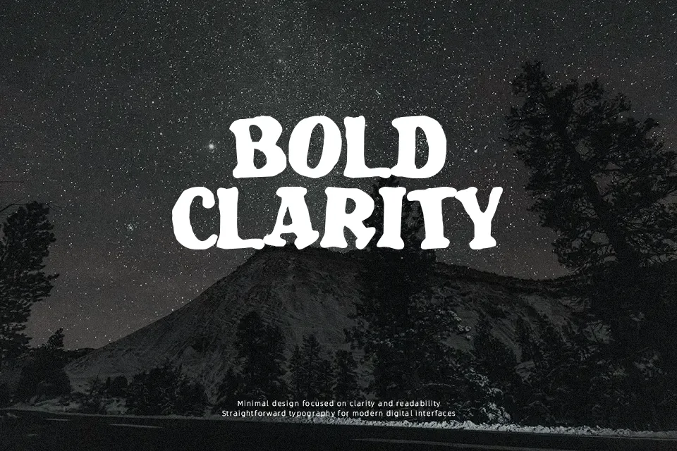
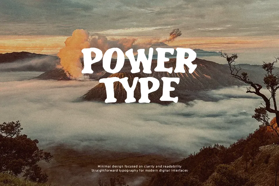
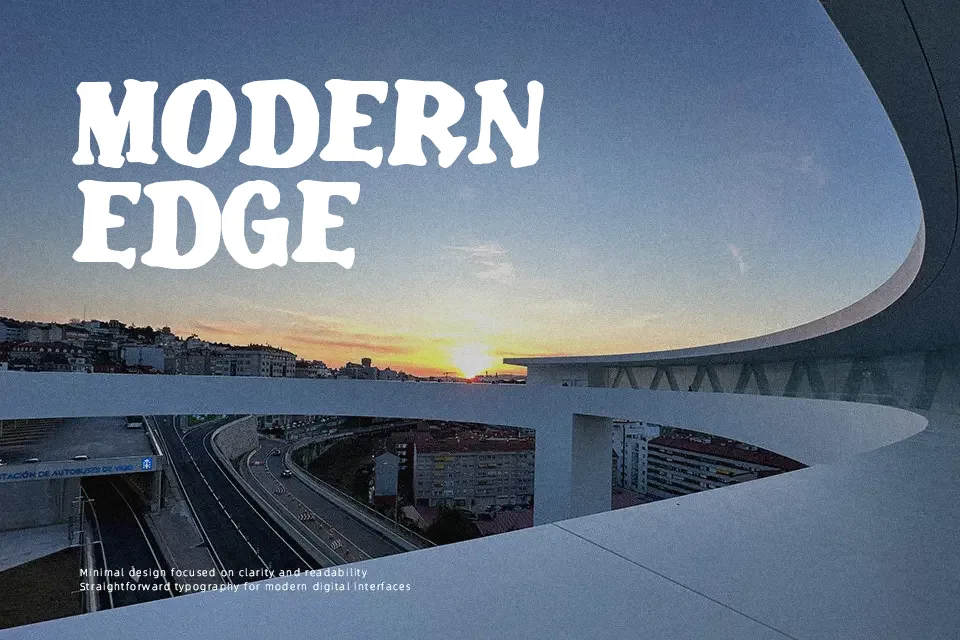
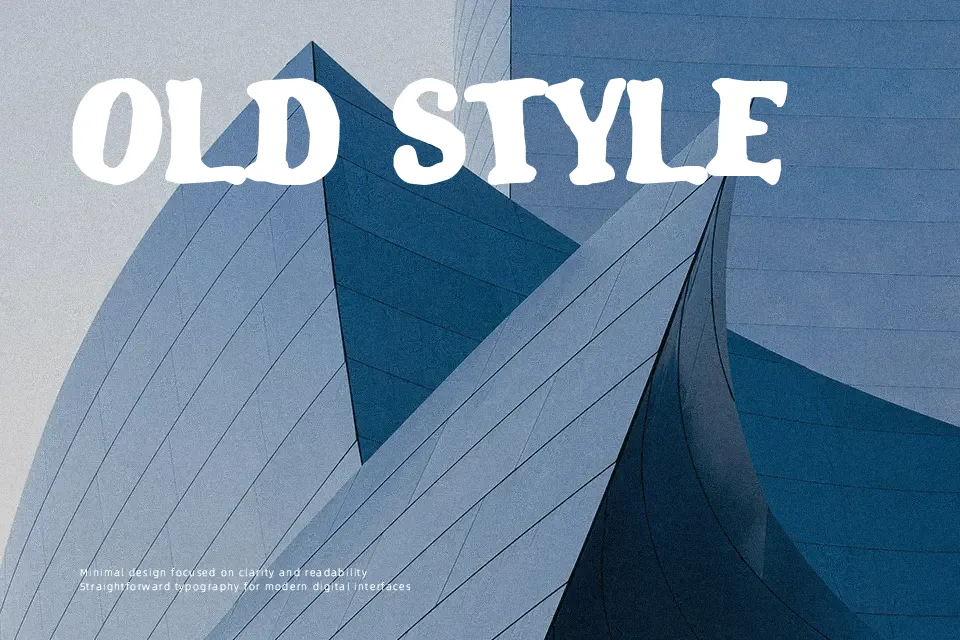
Designed by Jakob Fischer, Blatant features thick, heavy strokes and a deliberately uneven baseline. These structural quirks give the typeface a bouncy, irregular rhythm that immediately establishes a fun, cartoonish aesthetic. It truly excels when applied to punchy headlines on toy packaging, children’s event posters, or animated video game logos. The exaggerated character shapes easily draw attention, making the font highly effective for casual, energetic branding. However, due to its heavy weight and crooked letterforms, Blatant severely lacks readability at smaller sizes. You should avoid using it for dense body paragraphs, formal documents, or corporate UI design where clean legibility is essential. Compared to traditional comic styles, Blatant feels noticeably more erratic and organically unpolished.
Best For:
Eye-catching headlines on toy packaging
Animated video game logos and titles
Children’s book covers and comic graphics
Casual and energetic poster designs
Not Ideal For:
Long paragraphs or dense body text
Formal corporate branding and documents
Clean and minimalist UI design
Perfect for gaming, headline, and kids, with a bold and cartoon style.
License
Gallery