Besley Font
Free for Commercial UseAbout
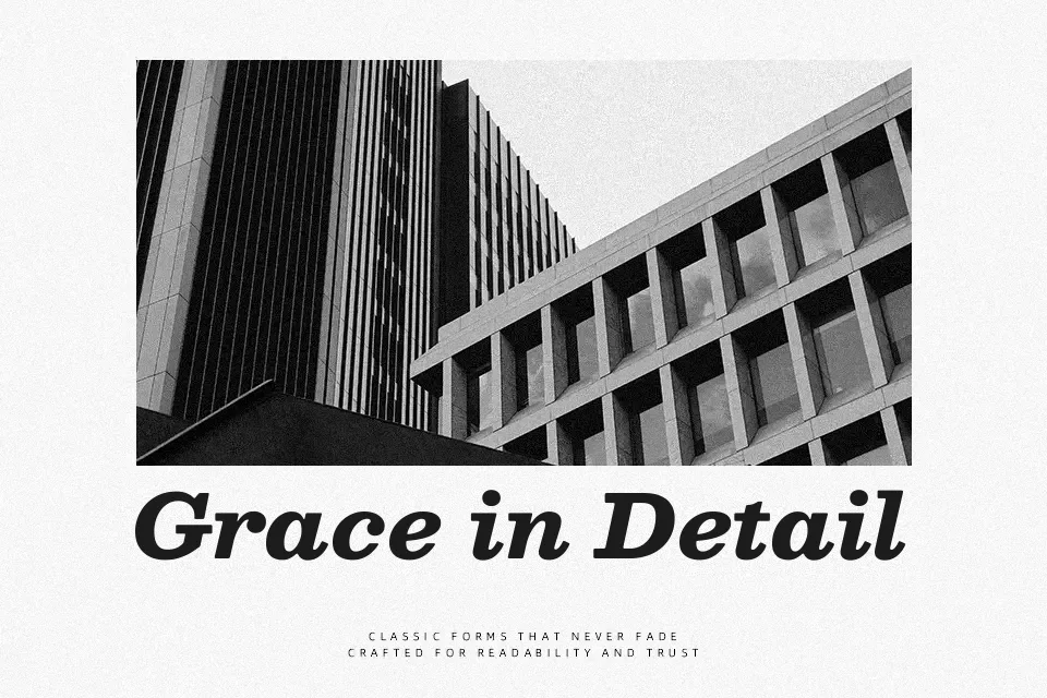
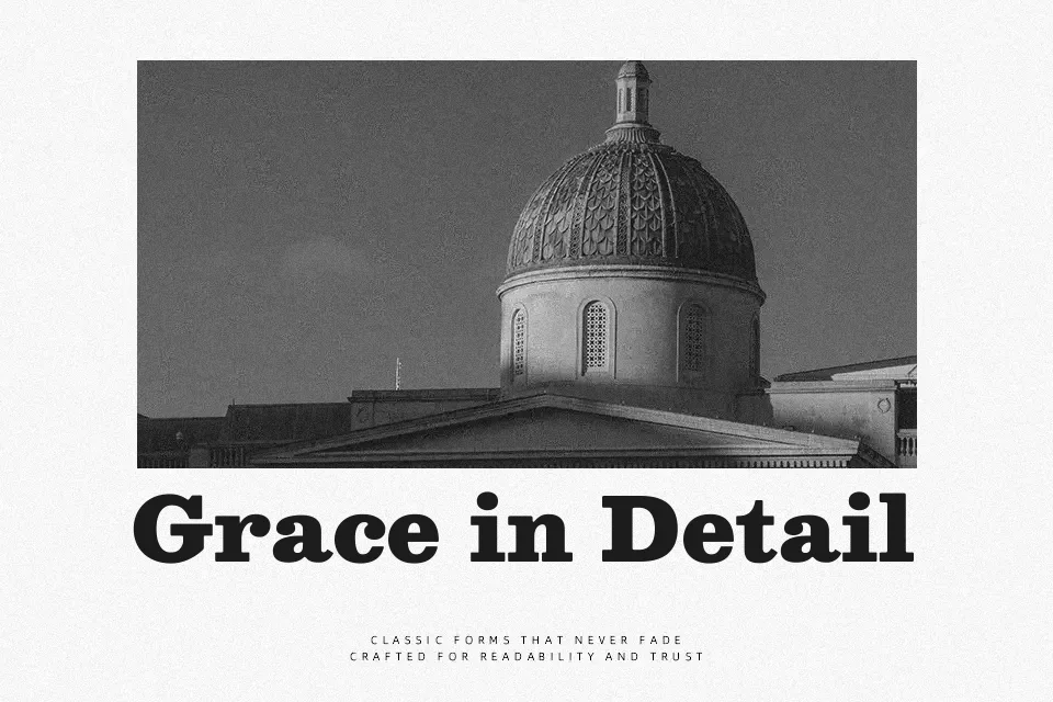
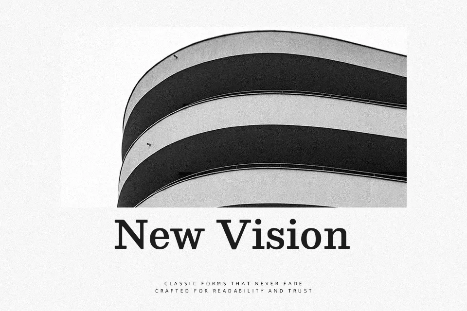
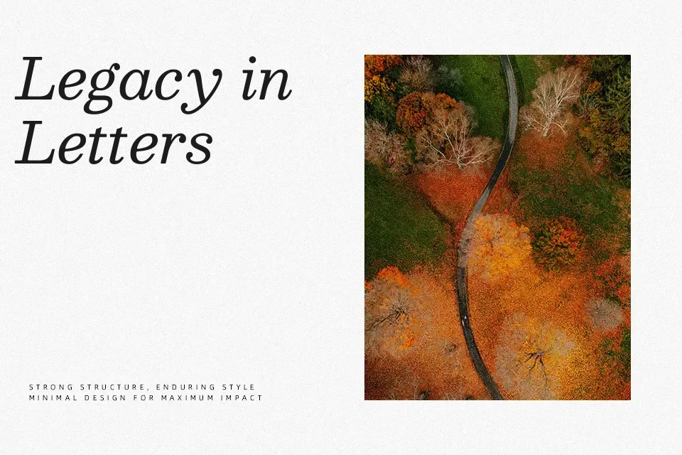
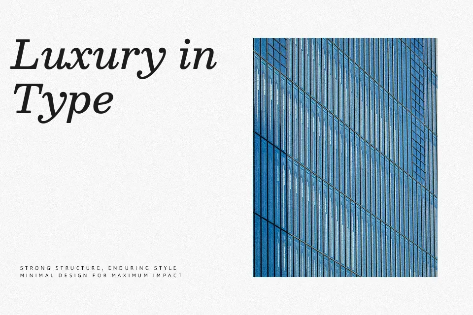
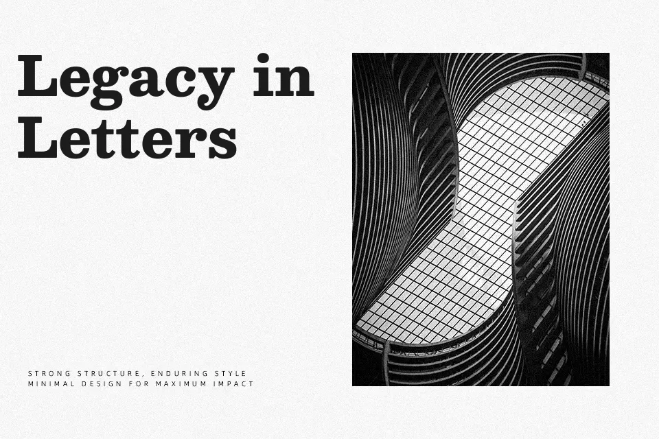
Besley leans into its antique slab serif roots with chunky, squared serifs and a noticeable yet controlled stroke contrast that keeps text from feeling blocky. The x‑height is generous, counters stay open, and spacing is tuned so small sizes remain legible while heavier weights still stack well in compact headlines. In use, it gives body copy a warm, literary character and lets titles feel assertive without shouting, closer in spirit to a friendly Clarendon than to a rigid modern slab. I reach for it in editorial layouts, brand systems, and information‑heavy websites; it’s less convincing when you need ultra‑minimal tech aesthetics or highly ornamental display lettering.
Best For:
editorial layouts and long-form reading
confident branding with a bookish tone
ui and website typography that needs warmth
headlines that coordinate with text
Not Ideal For:
high-tech or futuristic interfaces
highly decorative display lettering
ultra-formal corporate documents
very tight microcopy at tiny sizes
Perfect for body text, branding, and editorial, with a classic and serif style.
License
Gallery