Bernardo Moda Contrast Font
Free for Commercial UseAbout
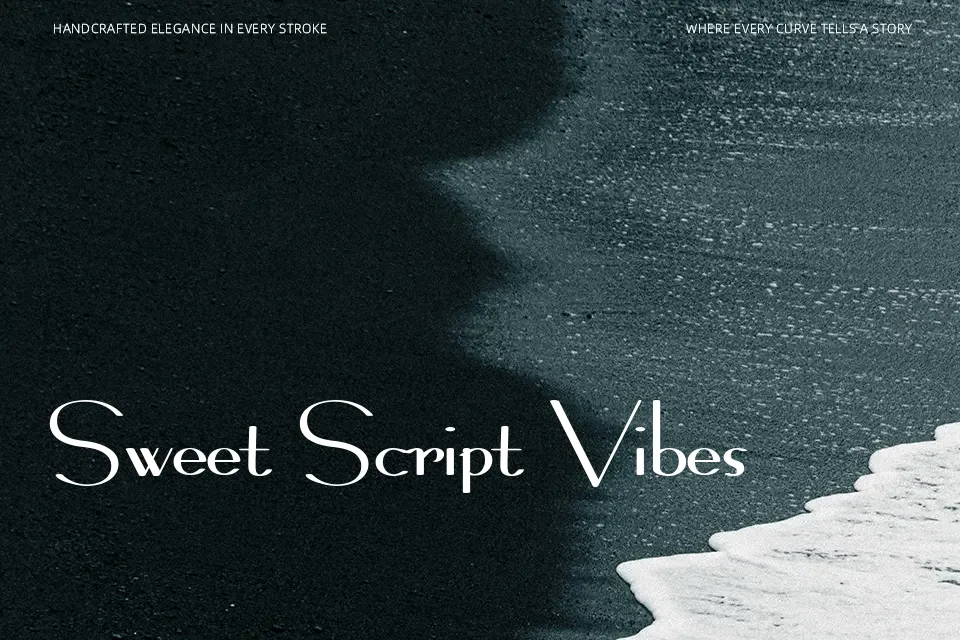
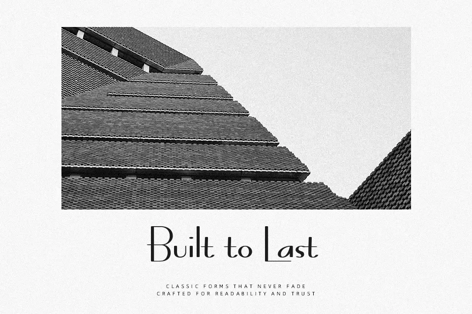
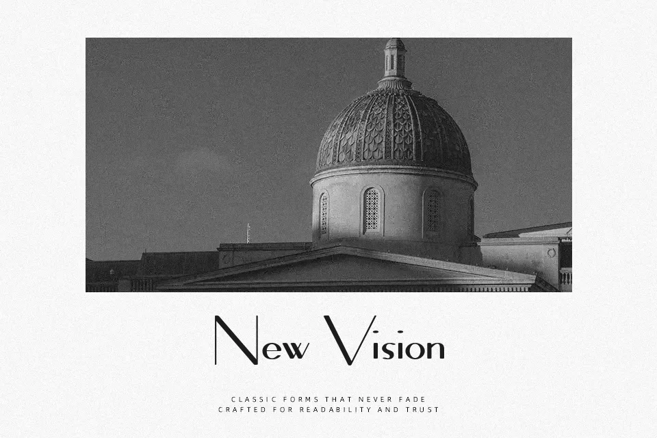
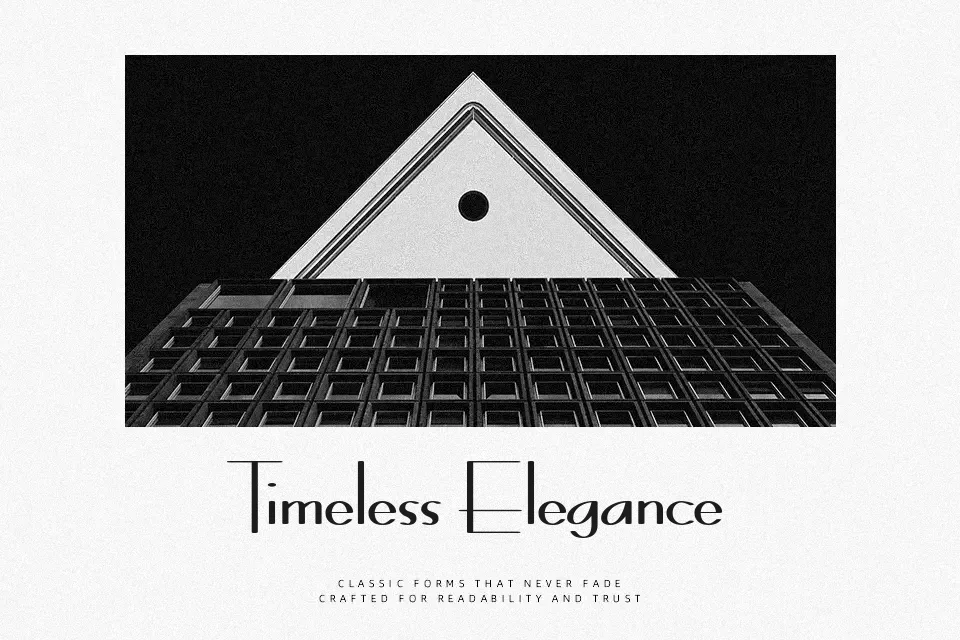
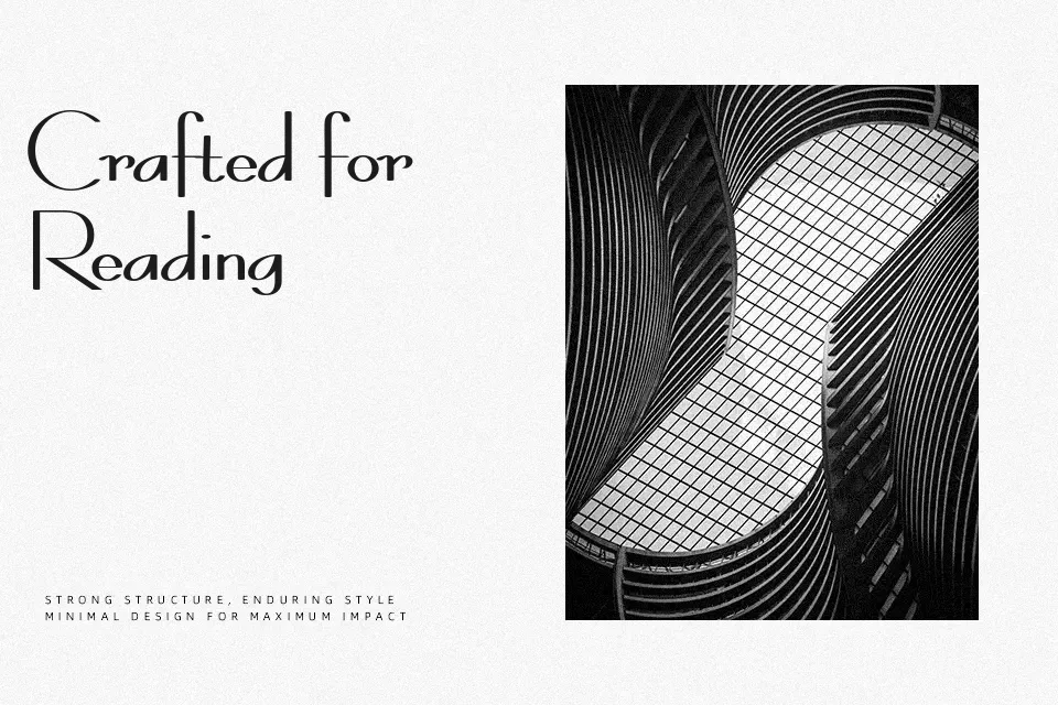
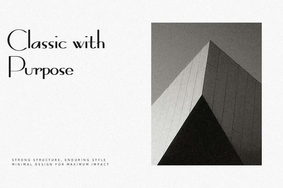
The defining feature of Bernardo Moda Contrast is its dramatic stroke tension: razor-thin horizontals running against thick, commanding verticals, creating a rhythm that reads as effortlessly formal yet visually charged. The letterforms carry refined serifs and tall proportions that nod heavily toward early 20th-century art deco typography. At large display sizes, it handles fashion lookbooks, upscale event invitations, and editorial headlines with quiet authority. The contrast ratio is steep enough that at body-text sizes, the hairline strokes begin to fade—particularly on screen—making it a poor fit for extended reading. Designers already comfortable with high-contrast faces like Bodoni or Didot will feel at home here, though Bernardo Moda Contrast carries a slightly warmer, more decorative edge than those neutral workhorses.
Best For:
– Fashion magazine headline treatments
– Luxury boutique branding and logo marks
– High-end event posters and printed invitations
– Editorial pull quotes at large display sizes
Not Ideal For:
– Body text or any continuous reading blocks
– Screen-rendered UI elements at small point sizes
– Corporate or technical reports requiring neutral tone
– Informal or playful design contexts
Perfect for advertising, branding, and editorial, with a classic and decorative style.
License
Gallery