Baumans Font
Free for Commercial UseAbout
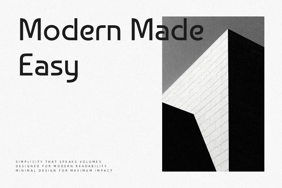
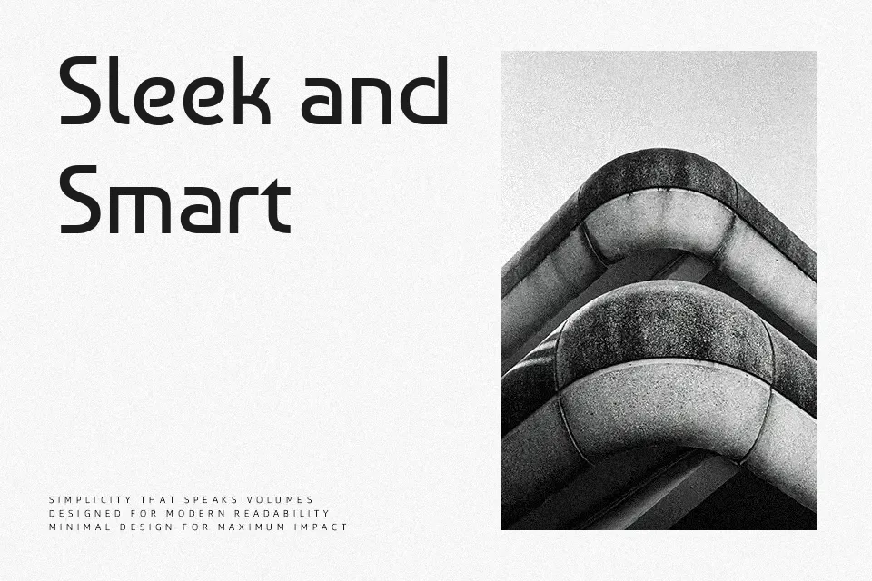
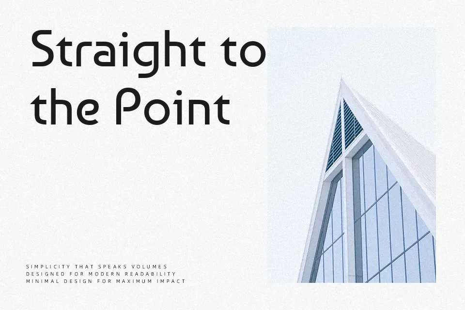
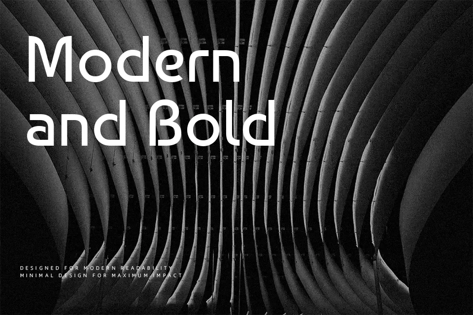
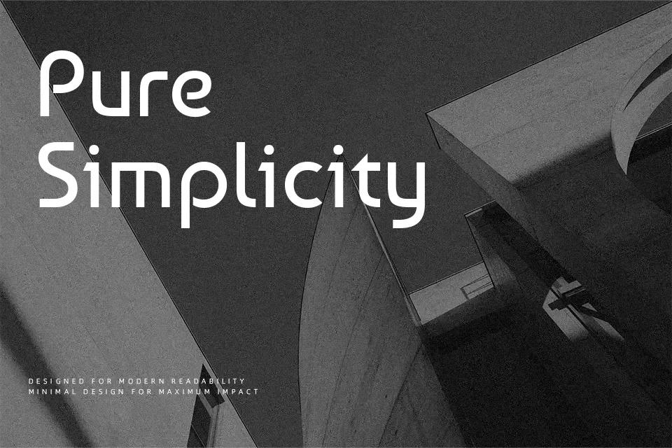
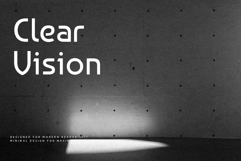
Baumans is a geometric sans serif with Bauhaus and preconstructivist roots, built from monolinear strokes and crisp, engineered curves. Letters like M, V, and W have pronounced sharp angles, while details such as the curved Z and almost unicase N give the alphabet a quirky, constructed feel. It reads clearly at medium to large sizes, so it works well for interface headers, poster titles, and stripped‑back branding where you want structure without feeling corporate. The personality is strong, though, so it can feel too stylized for dense body text, long-form reading, or very traditional corporate decks. If you like geometric display faces such as other Bauhaus-inspired grotesks but want something with a bit more character in individual letters, Baumans is worth testing in your layout.
Best For:
headline,ui hero text,experimental branding,poster titles
Not Ideal For:
long paragraphs,formal reports,print body copy,traditional editorial layouts
Perfect for branding, headline, and logo, with a artistic and display style.
License
Gallery