Baskervville SC Font
Free for Commercial UseAbout
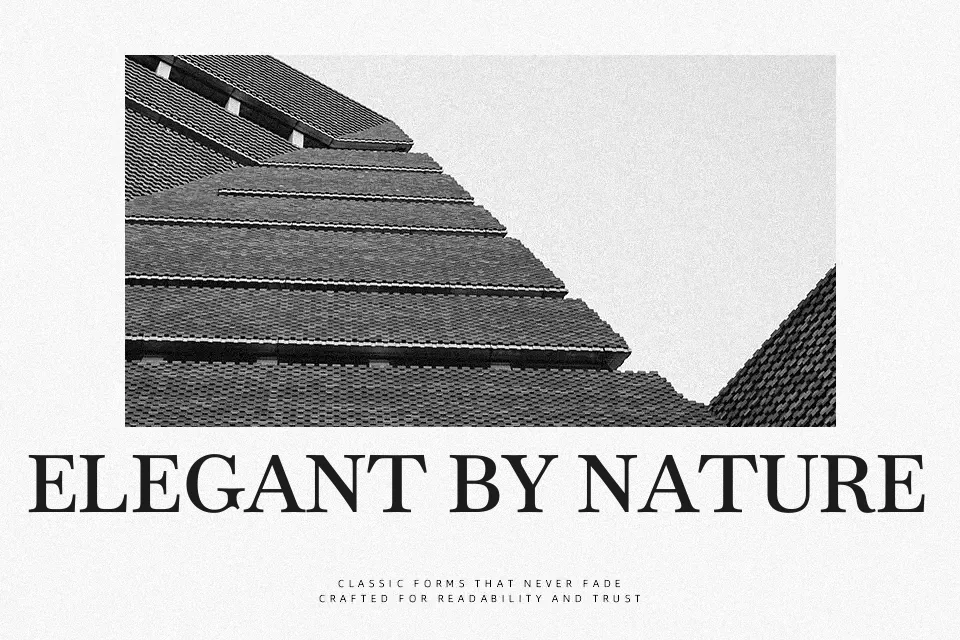
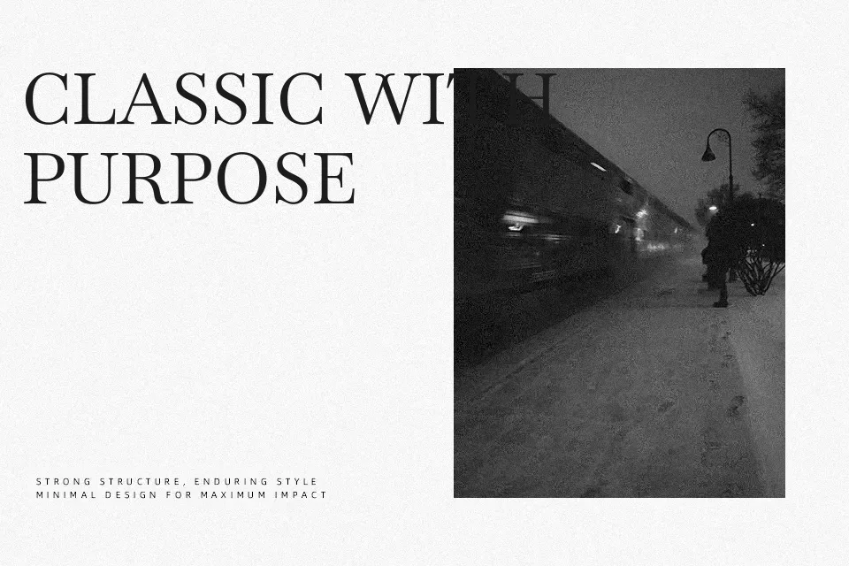
Baskervville SC delivers a compact small‑caps texture, with moderate stroke contrast, sharp serifs, and relatively tight spacing that keeps lines neat and controlled. The overall impression leans formal and literary, closer to classic book typography than flashy display work, which suits projects that need quiet authority. It tends to shine in headings, pull quotes, and short labels for magazines, reading apps, and cultural posters, especially when paired with a clean sans serif for body copy. For long paragraphs, the all‑caps rhythm can feel dense and tiring, so it’s better treated as an accent rather than the main text voice.
Best For:
literary book covers and chapter titles
editorial headings and pull quotes
museum, gallery, or cultural event posters
refined UI labels and navigation
Not Ideal For:
continuous long-form paragraphs
informal kids or gaming branding
very small body text on dense layouts
Perfect for body text, editorial, and headline, with a classic and serif style.
License
Gallery