Baskervville Font
Free for Commercial UseAbout
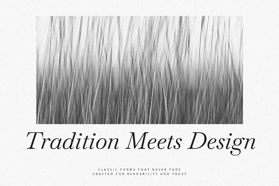
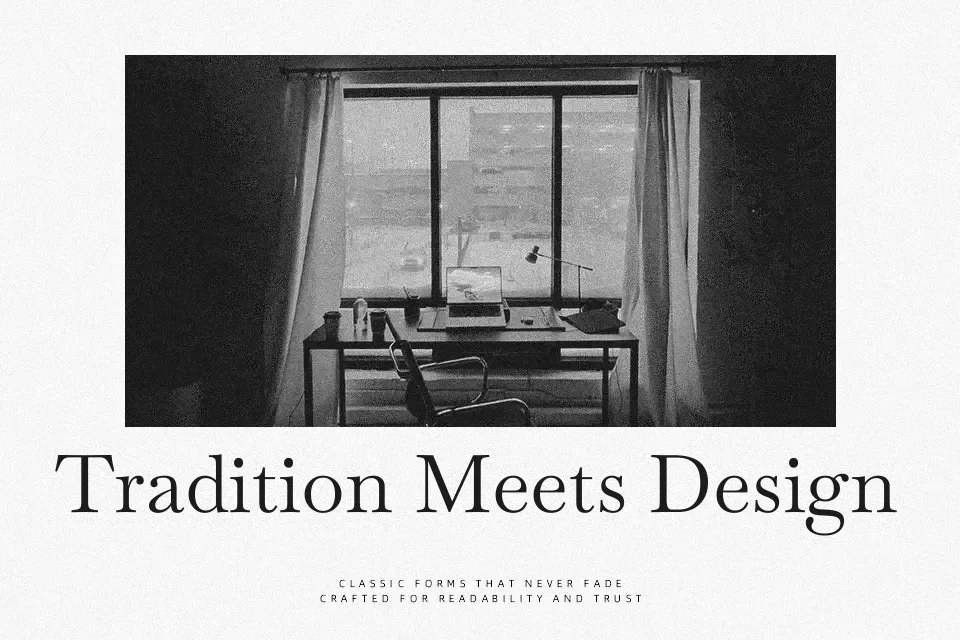
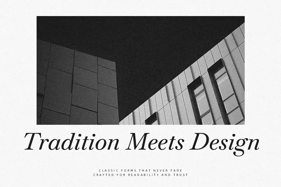
Baskervville is a serif revival with moderate stroke contrast, firm vertical stress, and relatively sharp, tapered serifs that keep text looking clean rather than fussy. The roman feels calm and bookish, while the italic leans closer to a Didot flavor, adding a slightly more theatrical rhythm for emphasis and pull quotes. On screen, it works nicely for essays, case studies, and long-form articles where you want a literary voice without sacrificing clarity; in print, it suits book interiors, restrained packaging, and identity systems that lean classic. It can look a bit stiff for very playful brands or loud, high-impact posters, so it’s better used where nuance, structure, and a sense of history matter more than sheer noise.
Best For:
editorial layouts and articles
book interiors and reports
refined brand systems
reading-focused web typography
Not Ideal For:
kids products or playful packaging
loud promotional posters
highly expressive display logos
very small UI labels
Perfect for branding, editorial, and headline, with a classic and serif style.
License
Gallery