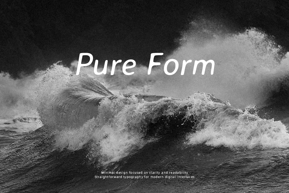
Averia Sans Libre Font
Free for Commercial UseAbout
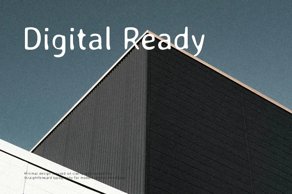
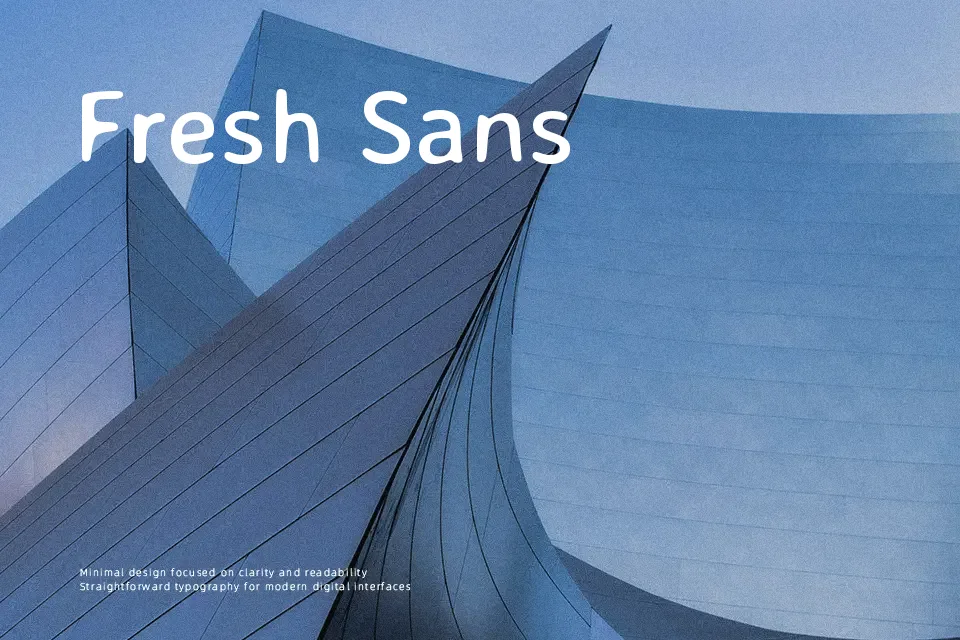
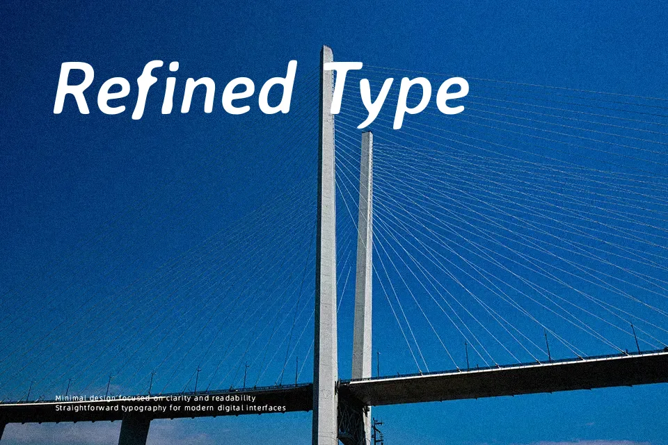
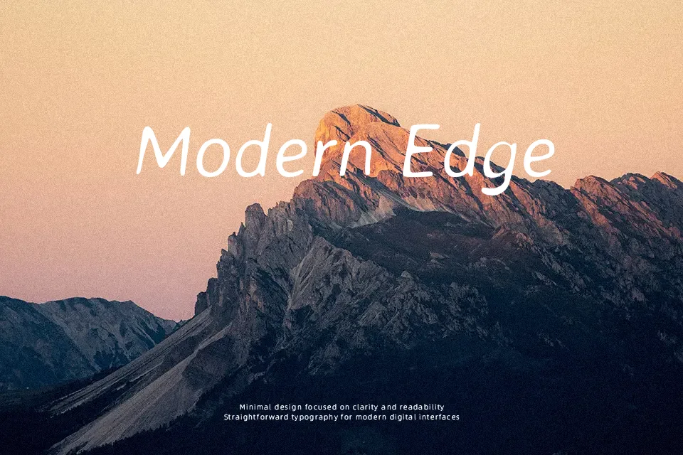
Averia Sans Libre takes its forms from the “average” of hundreds of fonts, so its strokes feel a little wobbly and human while maintaining consistent weight and generous spacing for easy reading. The overall impression sits between casual and structured: it is clearly a **sans** serif, but with softened outlines and subtle imperfections that make it warmer than typical system grotesques. It works well for titles on creative presentations, illustrated posters, and websites that want personality without going full cartoon. In long body text or strict corporate layouts, the irregular proportions can start to look sloppy rather than charming, so it fits better in short bursts, labels, and UI accents.
Best For:
friendly display headlines
casual poster layouts
informal web graphics
creative app UI labels
Not Ideal For:
dense long-form reading
formal business reports
highly technical documentation
rigid corporate branding
Perfect for branding, headline, and poster, with a clean and display style.
License
Gallery