Atkinson Hyperlegible Next Font

Free for Commercial Use

A A
AtkinsonHyperlegibleNext-ExtraLight.ttf
The quick brown fox jumps over the lazy dog
AtkinsonHyperlegibleNext-ExtraLightItalic.ttf
The quick brown fox jumps over the lazy dog
AtkinsonHyperlegibleNext-Light.ttf
The quick brown fox jumps over the lazy dog
AtkinsonHyperlegibleNext-LightItalic.ttf
The quick brown fox jumps over the lazy dog
AtkinsonHyperlegibleNext-Regular.ttf
The quick brown fox jumps over the lazy dog
AtkinsonHyperlegibleNext-Italic.ttf
The quick brown fox jumps over the lazy dog
AtkinsonHyperlegibleNext-Medium.ttf
The quick brown fox jumps over the lazy dog
AtkinsonHyperlegibleNext-MediumItalic.ttf
The quick brown fox jumps over the lazy dog
AtkinsonHyperlegibleNext-SemiBold.ttf
The quick brown fox jumps over the lazy dog
AtkinsonHyperlegibleNext-SemiBoldItalic.ttf
The quick brown fox jumps over the lazy dog
AtkinsonHyperlegibleNext-Bold.ttf
The quick brown fox jumps over the lazy dog
AtkinsonHyperlegibleNext-BoldItalic.ttf
The quick brown fox jumps over the lazy dog
AtkinsonHyperlegibleNext-ExtraBold.ttf
The quick brown fox jumps over the lazy dog
AtkinsonHyperlegibleNext-ExtraBoldItalic.ttf
The quick brown fox jumps over the lazy dog

About

Atkinson Hyperlegible Next is a humanist sans serif with generous spacing, open counters, and clearly differentiated letterforms that stay readable even at smaller sizes. Ascenders and descenders are emphasized, strokes are sturdy rather than delicate, and ambiguous characters like I/l/1 are structurally distinct, which helps users with low vision or cognitive fatigue track text more comfortably. The overall impression leans functional and **serious** rather than flashy, so it fits accessibility-first branding, public wayfinding, transport maps, dashboards, and long-form digital reading better than ornamental display tasks. Compared with more neutral workhorses like classic grotesque sans serifs, it occupies a bit more space and can feel too plain or static for expressive headlines or fashion-led visuals, but that tradeoff pays off when readability and inclusivity sit at the top of your design brief.

Best For:
accessible user interfaces
wayfinding and signage systems
reading-heavy web or app layouts
inclusive public information materials

Not Ideal For:
highly expressive display logos
ultra-condensed layouts with tight space
luxury fashion or beauty branding
ornamental event invitations

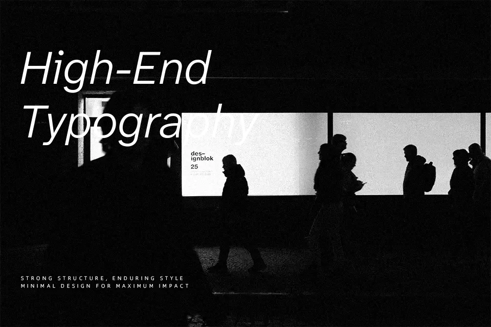
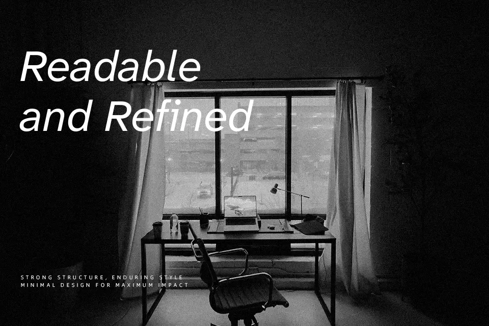
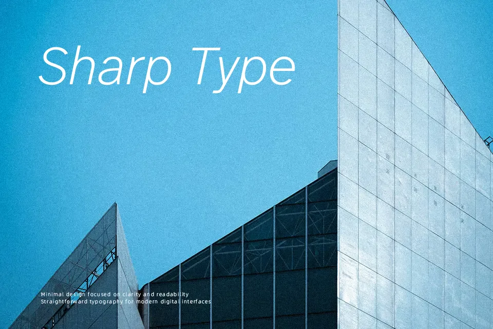
Perfect for advertising, body text, and headline, with a calm and geometric style.

License

check
Free for commercial use
This font may be used in commercial design projects such as branding, advertising, and visual content. Usage rights may vary depending on the license terms. Please review the license details for specific restrictions.
check
Free for personal use
You can also use this font freely in personal and non-commercial projects.
Atkinson Hyperlegible Next Font is licensed under the SIL Open Font License (OFL).
Atkinson Hyperlegible Next Font is distributed under the README.txt. The full license document is included in the downloaded package.

Similar Fonts

You may also like

Fonts by Language

How to Use Atkinson Hyperlegible Next Font

  1. Download the font file.
  2. Install it on your device (TTF or OTF format).
  3. Use it in your favorite design tools, such as Photoshop, Illustrator, or Canva.

Atkinson Hyperlegible Next Font FAQ

Q: Is this font free for commercial use?

A: This font is released under the SIL Open Font License (OFL), which generally allows both personal and commercial use. Please review the license for specific conditions or contact the author if you have any questions.

Q: Can I use this font for logos or branding?

A: This font can typically be used for logos and branding, subject to the OFL terms. For further clarification, please contact the author.

Q: What file formats are included?

A: Most fonts include TTF or OTF files.