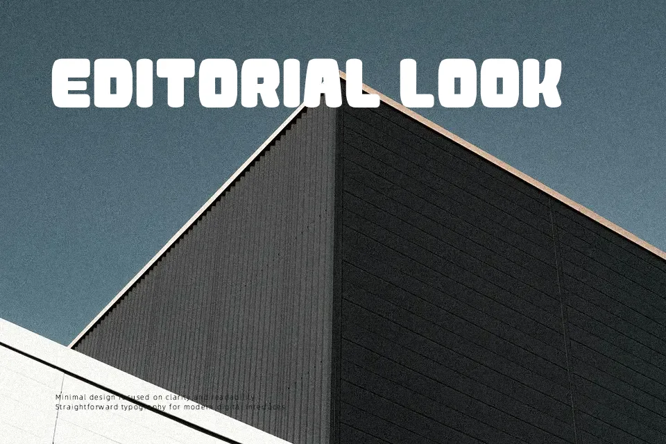
Atama Simple Font
Free for Commercial UseAbout
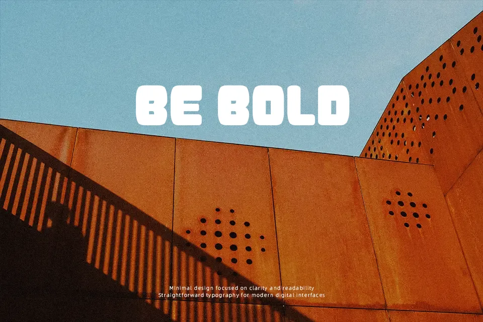
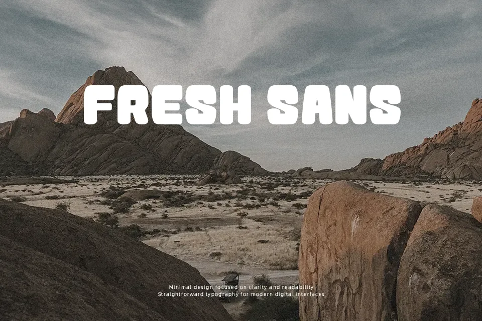
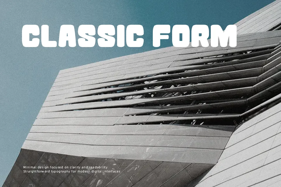
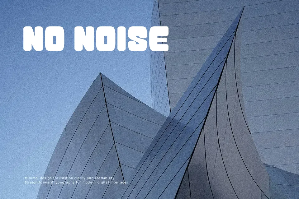
Thick uniform strokes with softly rounded terminals give Atama Simple an instantly approachable, almost tactile quality. There’s zero stroke contrast throughout — every curve and corner carries the same weight, which keeps the overall look cohesive at a glance. In practice, it holds up well on poster headlines, event banners, and children’s book covers where the type needs to do the heavy lifting without extra decoration. That said, the single-weight design becomes a real constraint when you need typographic hierarchy — swapping sizes alone won’t create enough visual contrast between a title and a subheading. It handles short bursts of copy confidently, but drop it into a paragraph and readability quickly deteriorates. Think of it as a display workhorse with a cheerful attitude, not a versatile text face.
Best For:- Children’s book cover titles
– Event poster headlines
– Toy or game product packaging labels
– Social media graphic headers
Not Ideal For:- Long-form body text or editorial paragraphs
– Corporate identity systems requiring formal weight
– Multi-level typographic hierarchy layouts
– Small-size UI labels or captions
Perfect for kids, logo, and packaging, with a bold and decorative style.
License
Gallery