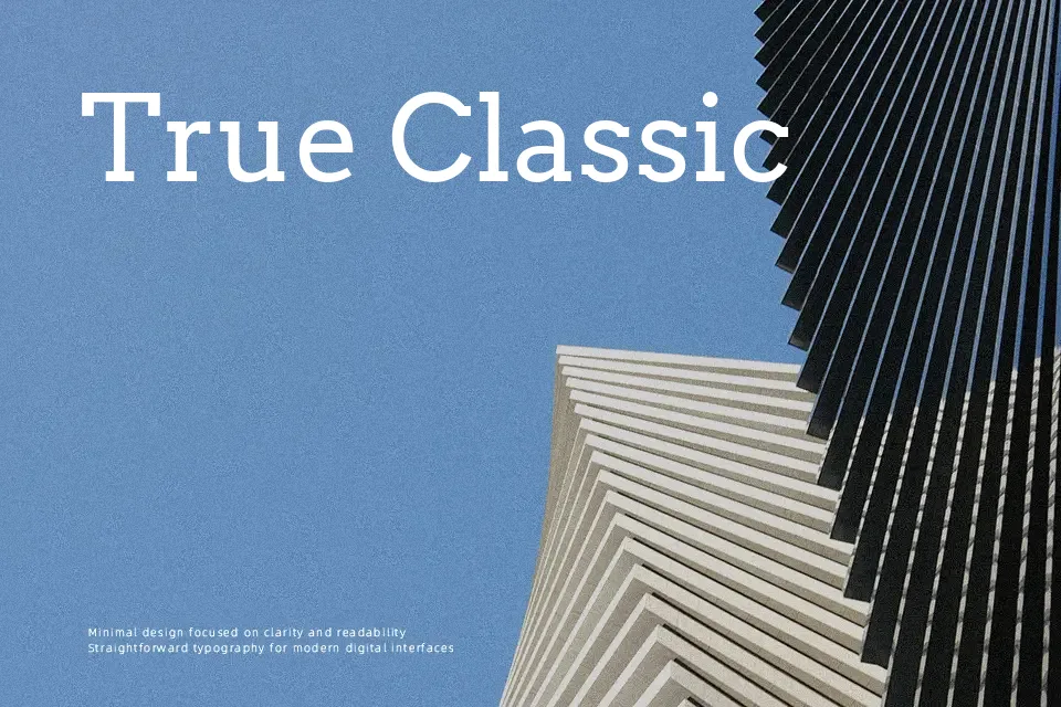
Arvo Font
Free for Commercial UseAbout
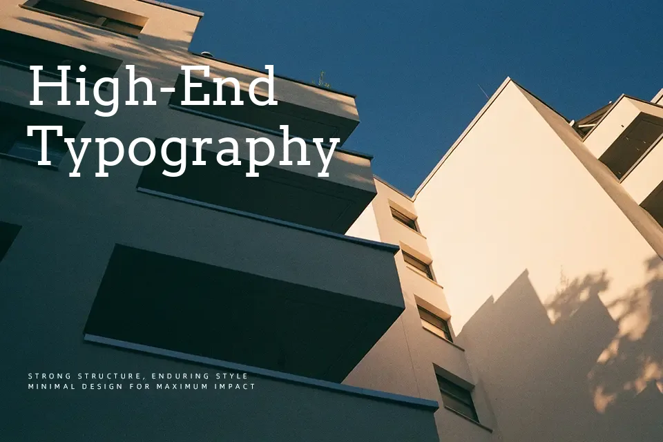
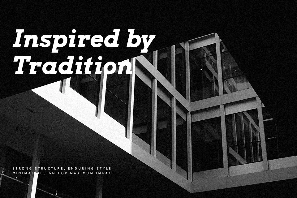
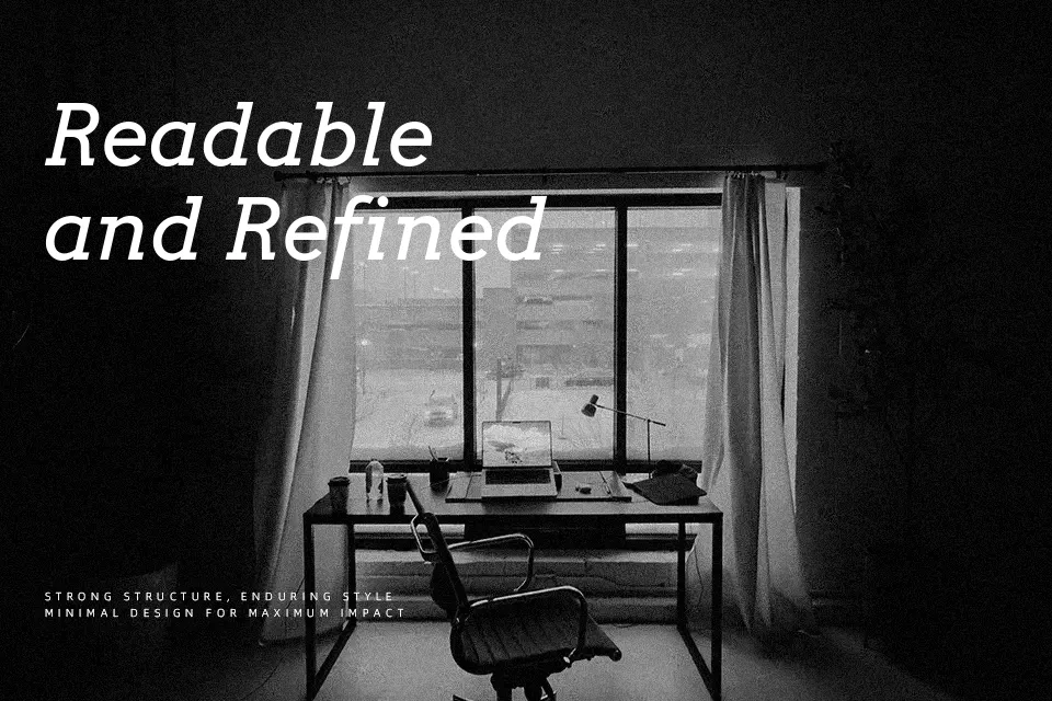
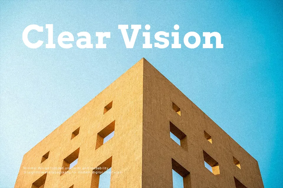
Arvo blends geometric structure with slab serifs, giving each letter a steady, almost architectural feel without looking cold or mechanical. Strokes are largely monolinear, counters stay open, and the spacing is tuned so text doesn’t feel cramped even at smaller sizes. On screen, it reads cleanly in UI labels, data-heavy dashboards, and short paragraphs where you want a touch of personality over a neutral sans. In print, it suits magazine-style headings, infographics, and poster work where hierarchy matters but you don’t want shouty display forms. For dense long-form books or ultra-formal corporate documents, though, Arvo can feel a bit rigid and tiring, so I’d pair it with a softer serif for extended reading.
Best For:
bold headlines
editorial spreads
web UI labels
data-heavy presentations
Not Ideal For:
long book paragraphs
highly formal reports
tiny legal footnotes
Perfect for branding, editorial, and headline, with a bold and geometric style.
License
Gallery