Artifika Font
Free for Commercial UseAbout
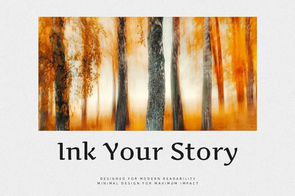
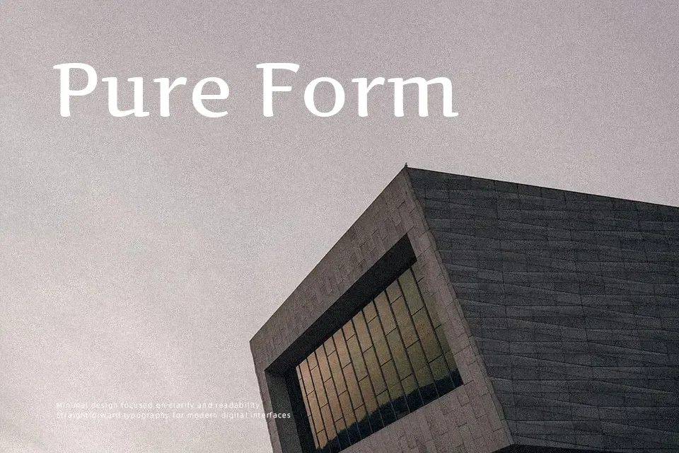
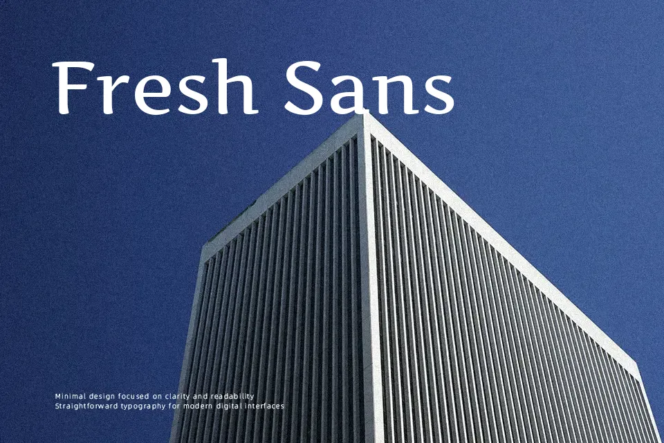
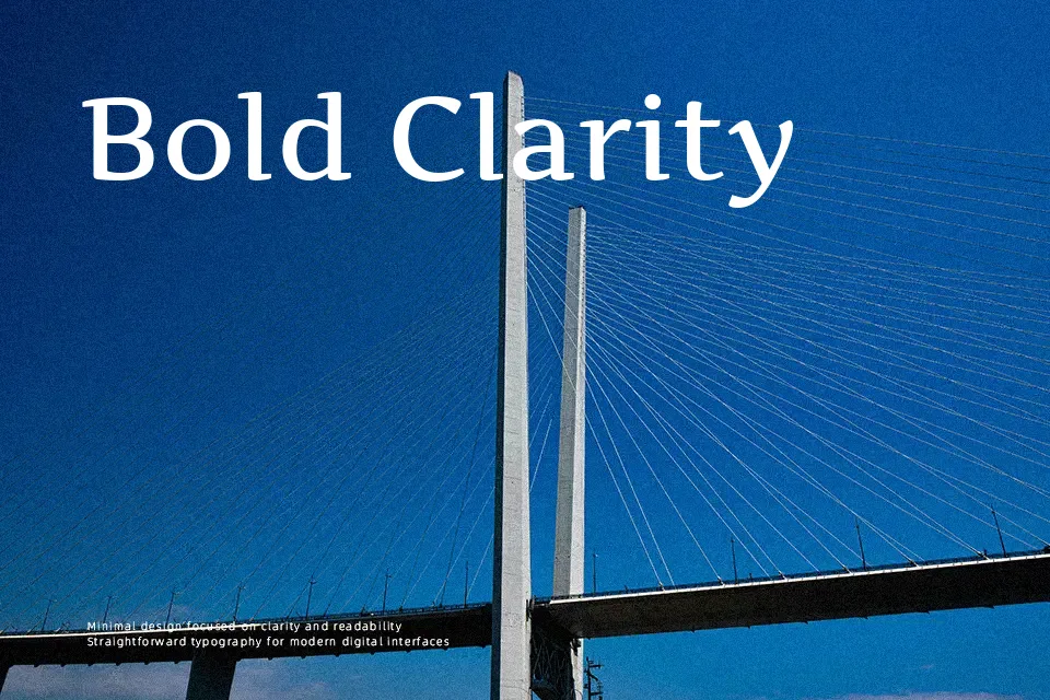
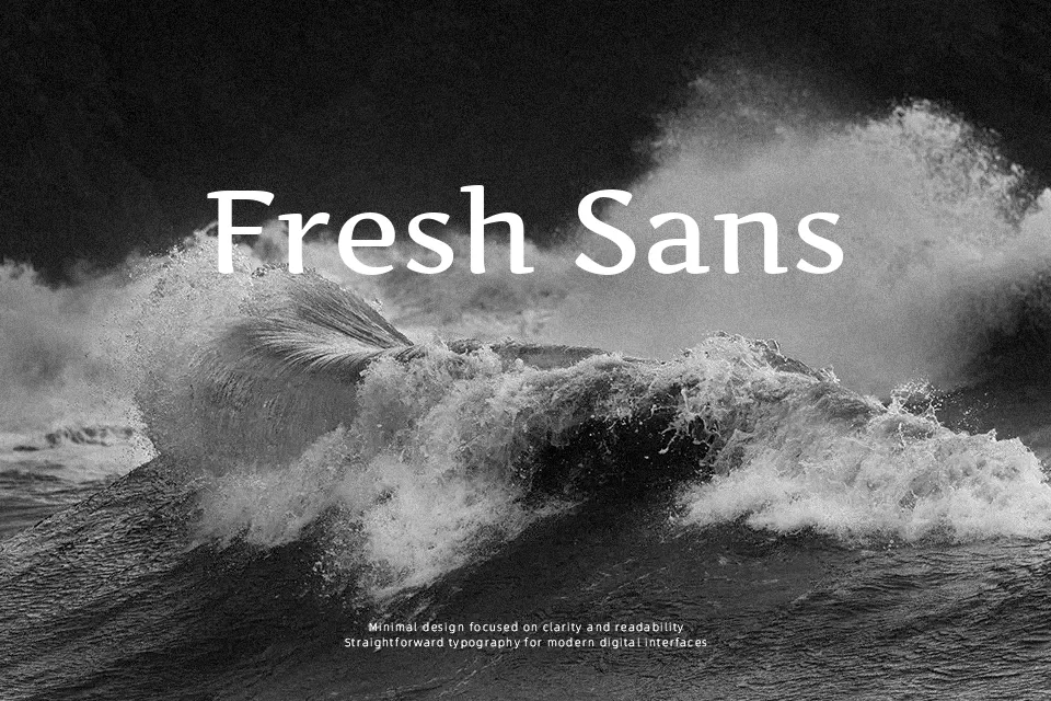
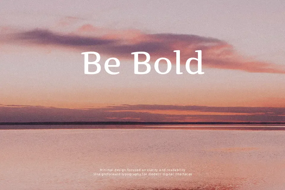
Artifika combines upright italic rhythm with a serif structure, so letters feel slightly slanted in spirit while remaining steady and legible. Strokes are moderately contrasted, terminals are crisp rather than flashy, and the short descenders keep lines compact, which helps when space is tight. The nearly horizontal serifs guide the eye along the line and read comfortably on screens, giving it a softer alternative to more rigid text serifs. In practice, it works well for fashion-forward headlines, beauty packaging, blog wordmarks, or quote graphics where you want a gentle, cultured tone. For dense body copy or highly formal corporate documents, its informal calligraphic flavor can feel a bit too stylized, so it is better treated as display or short-text typography rather than a universal workhorse.
Best For:
editorial headlines
fashion and beauty branding
short on-screen titles
quote or tagline graphics
Not Ideal For:
long paragraphs
strictly formal documents
tiny UI labels
highly technical reports
Perfect for branding, editorial, and headline, with a artistic and display style.
License
Gallery