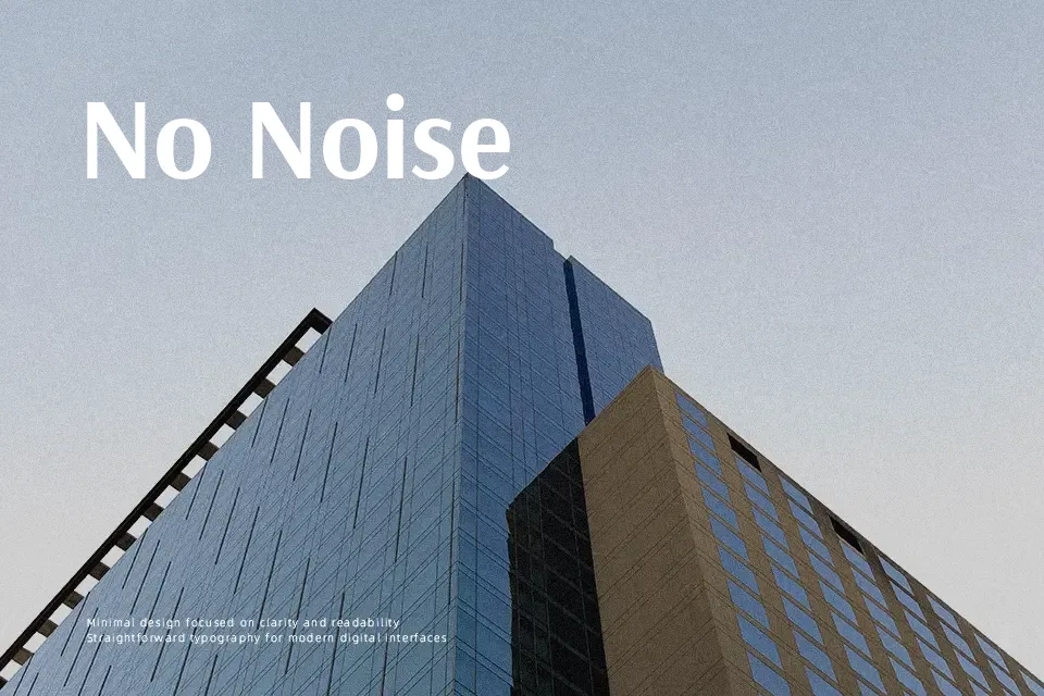
Arsenal SC Font
Free for Commercial UseAbout
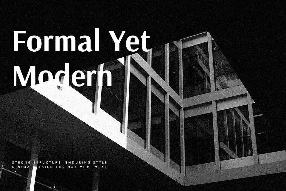
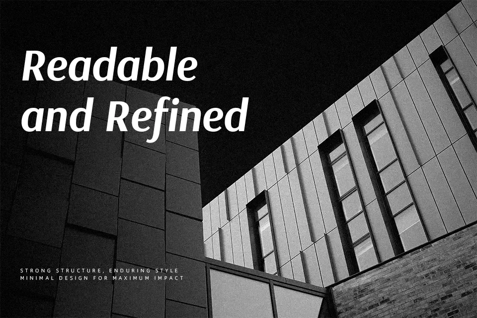
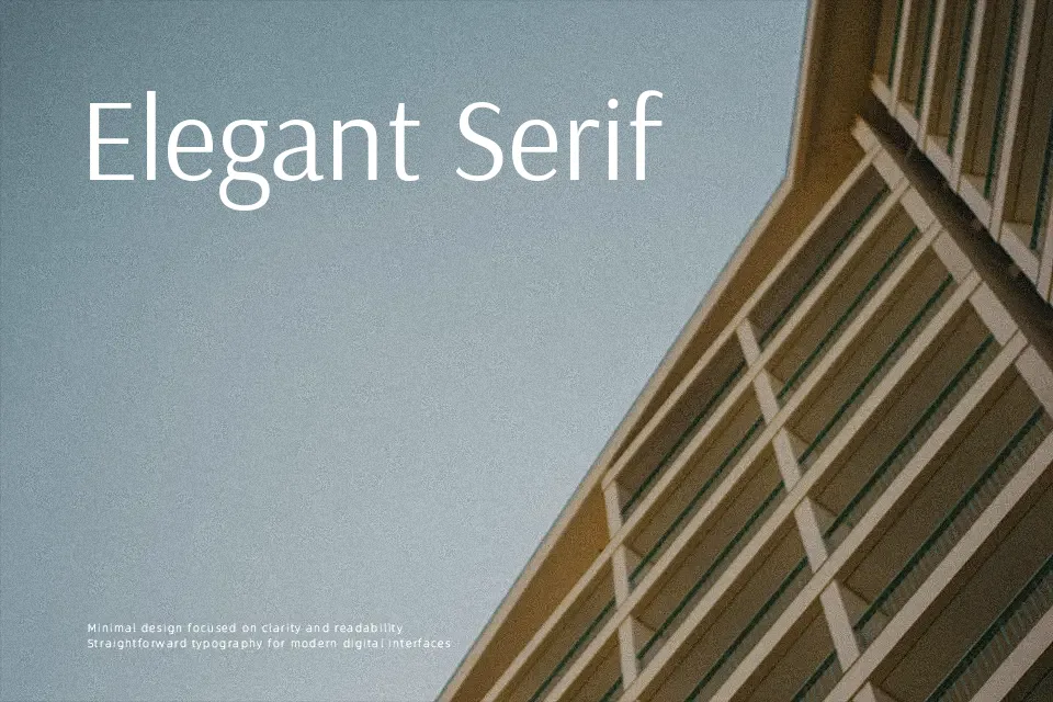
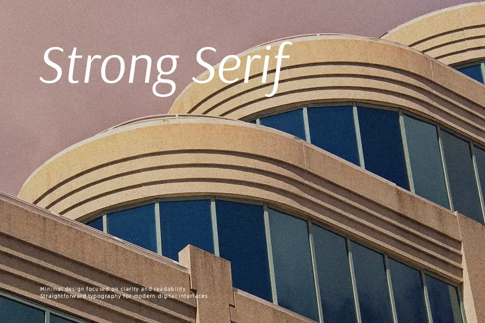
Arsenal SC Font takes the semi-grotesque structure of the Arsenal family and renders it entirely in small caps, which instantly tightens the texture and keeps word shapes calm and orderly. Strokes show gentle contrast, counters stay open, and the relatively narrow width helps you fit more information into limited space without looking cramped. On screen, it feels restrained and utilitarian rather than flashy, so it shines in sober interfaces, compact editorial sidebars, and structured label systems rather than loud, character-driven branding. It handles multi-language layouts with Latin and Cyrillic support, which is handy if your project crosses regions. I would not reach for it for long immersive reading or highly expressive display work, where fuller lowercase or more personality helps.
Best For:
compact headlines
navigation menus and labels
interface annotations and captions
bilingual or multilingual layouts
Not Ideal For:
long paragraphs
expressive logo wordmarks
playful children’s materials
highly decorative posters
Perfect for branding, editorial, and headline, with a classic and condensed style.
License
Gallery