Arsenal Font
Free for Commercial UseAbout
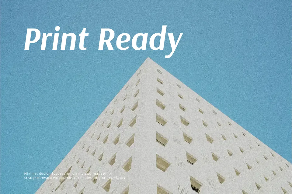
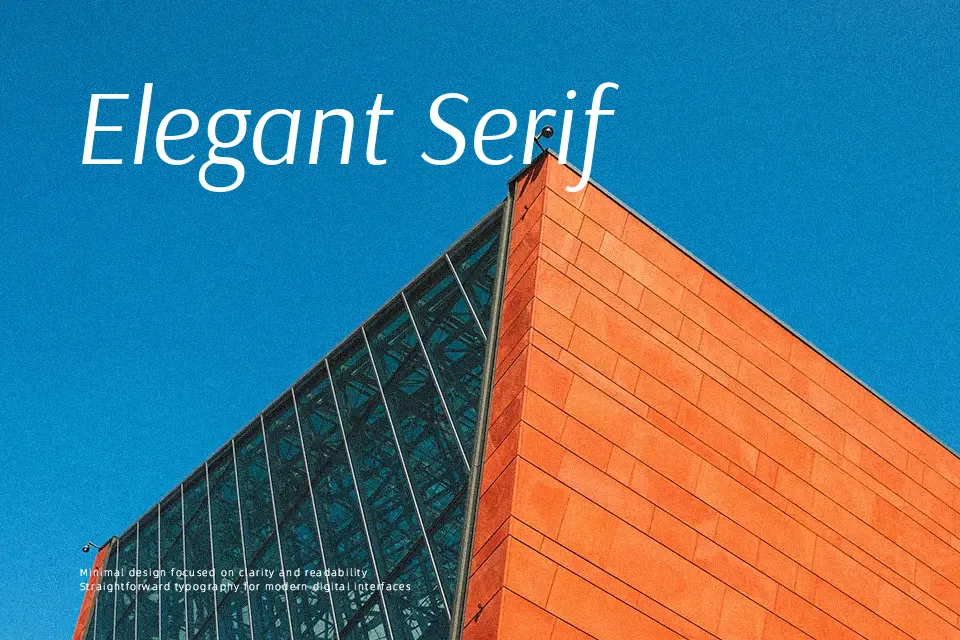
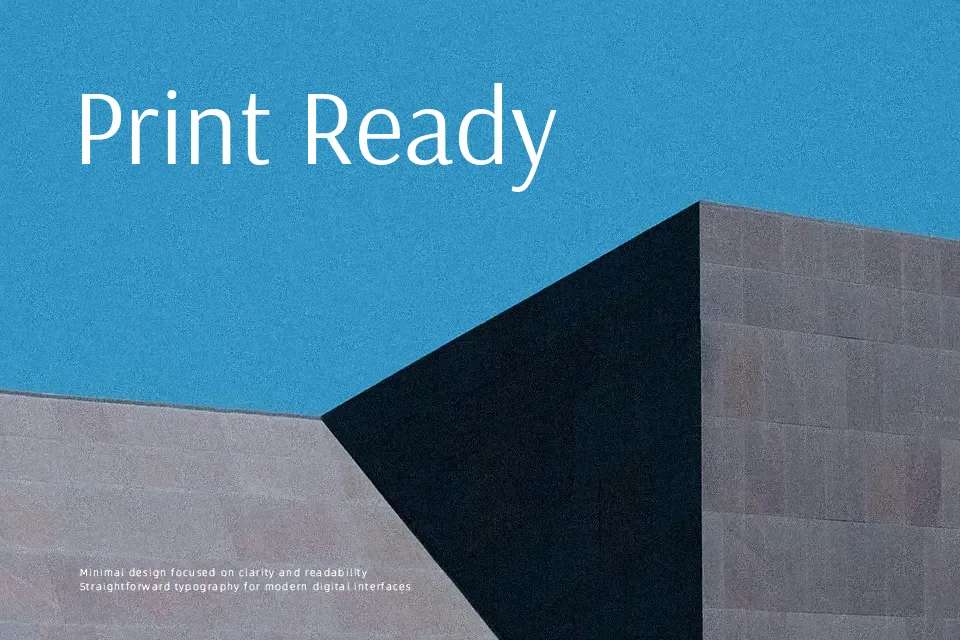
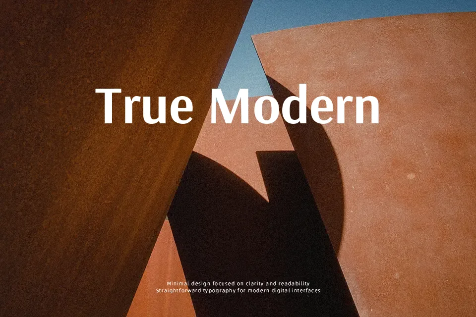
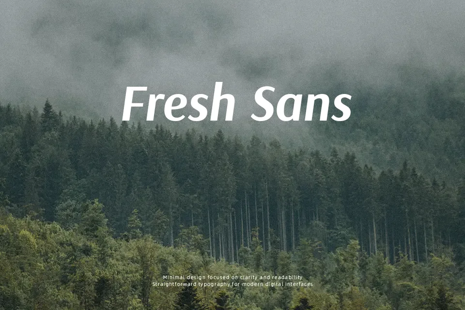
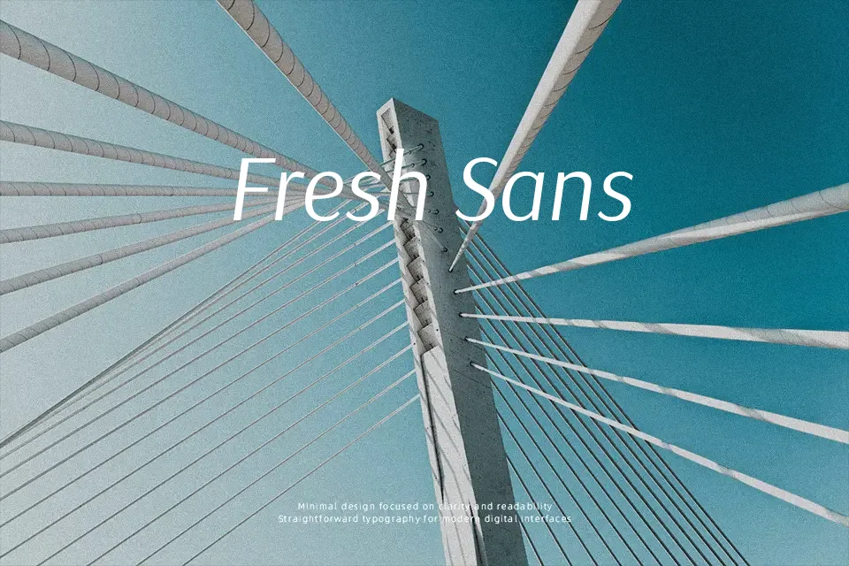
Arsenal sits between grotesque and humanist sans serif, with moderate contrast, open counters, and slightly softened terminals that keep paragraphs readable even at smaller sizes. Strokes feel controlled rather than flashy, spacing is even, and the overall rhythm is calm, which works nicely for long-form articles, interface copy, reports, and bilingual layouts mixing Latin and Cyrillic. Visually, it feels more personable than strict neo-grotesks like Helvetica, but more restrained than expressive display sans fonts. If you need loud, highly compressed headlines or ultra-characterful logos, Arsenal can feel too quiet, but when the goal is clarity with a bit of warmth, it performs reliably across print and screen.
Best For:
editorial body text
clean web articles
bilingual Latin–Cyrillic layouts
subtle corporate branding
Not Ideal For:
high-impact display logos
heavily condensed headlines
playful kids products
ornate wedding graphics
Perfect for branding, editorial, and headline, with a calm and sans serif style.
License
Gallery