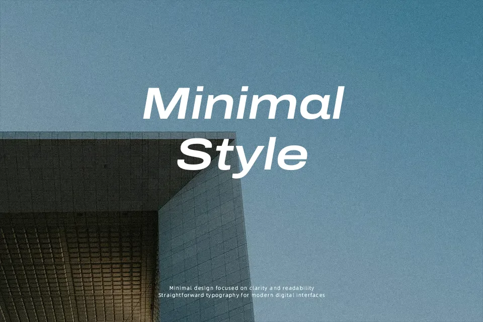
Archivo Font
Free for Commercial UseAbout
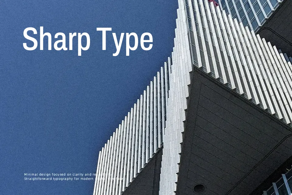
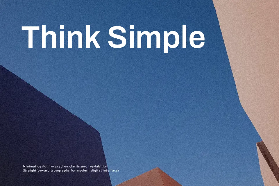
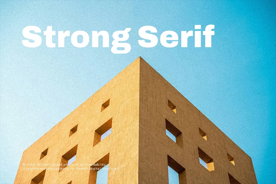
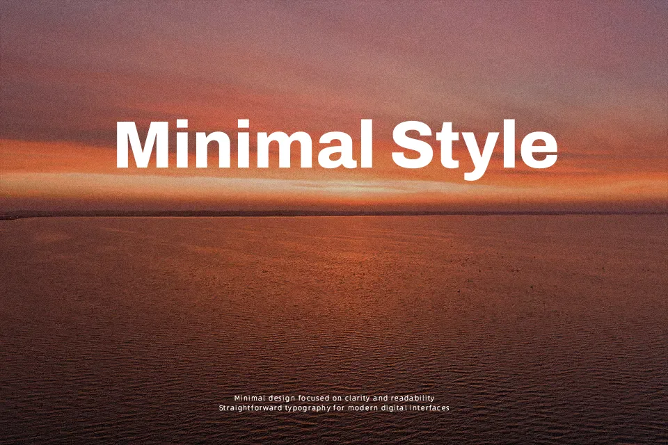
Archivo combines compact, neo‑grotesque proportions with a firm vertical rhythm, giving text a controlled, almost industrial calm on the page. Strokes are even, counters are open enough for screens, and the spacing is tuned to pack information without feeling crushed. It was built to work across print and digital, so it copes well with responsive interfaces, dense tables, and content-heavy dashboards where space is tight. At display sizes it has a straightforward, utilitarian voice; for long reading it stays readable but can feel a bit rigid compared with softer humanist sans serifs. If you like the efficiency of classic grotesques but want a variable, web-ready family, Archivo sits in that space comfortably.
Best For:
information-dense dashboards
editorial layouts with tight grids
interfaces where space is limited
utility branding and internal tools
Not Ideal For:
highly formal luxury identities
warm, story-driven brand voices
very small text on low-quality print
Perfect for body text, branding, and headline, with a clean and condensed style.
License
Gallery