Antic Font
Free for Commercial UseAbout
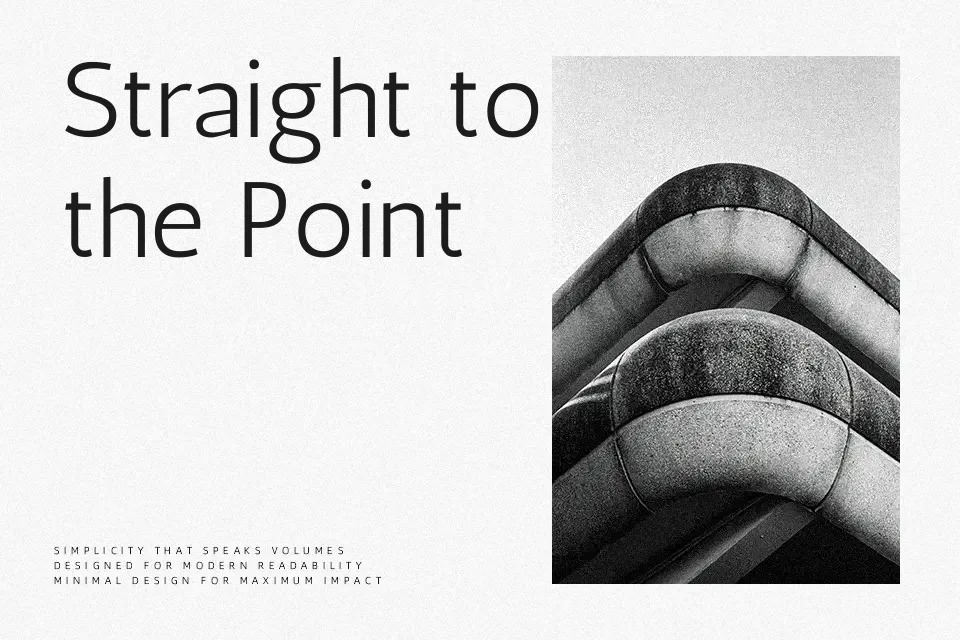
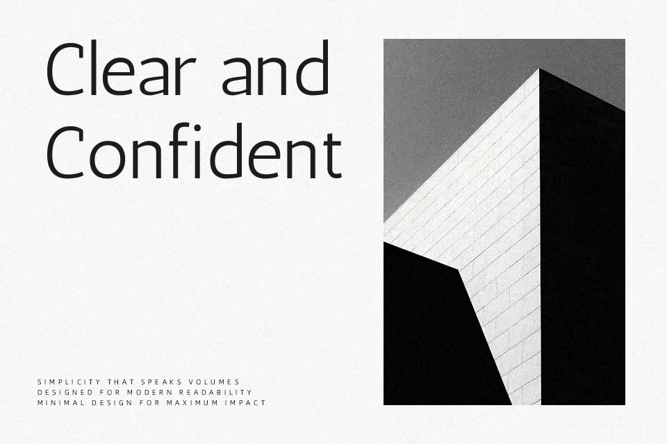
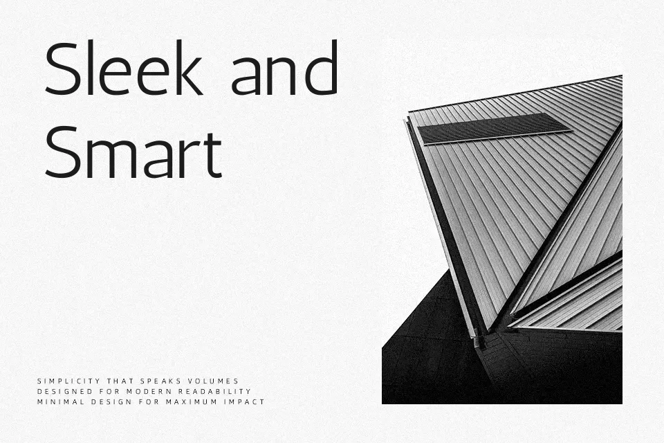
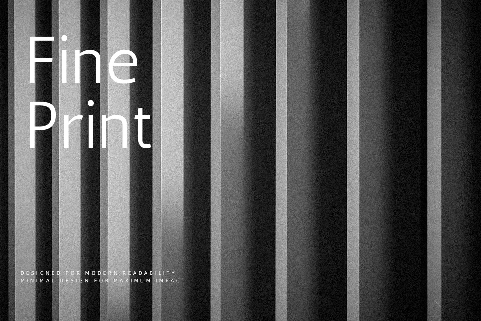
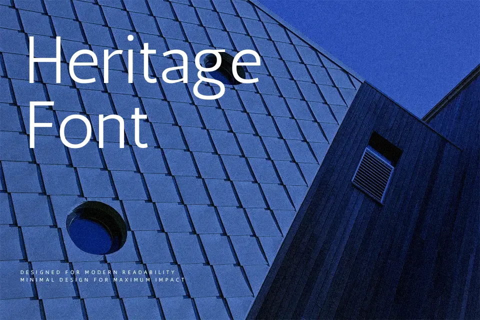
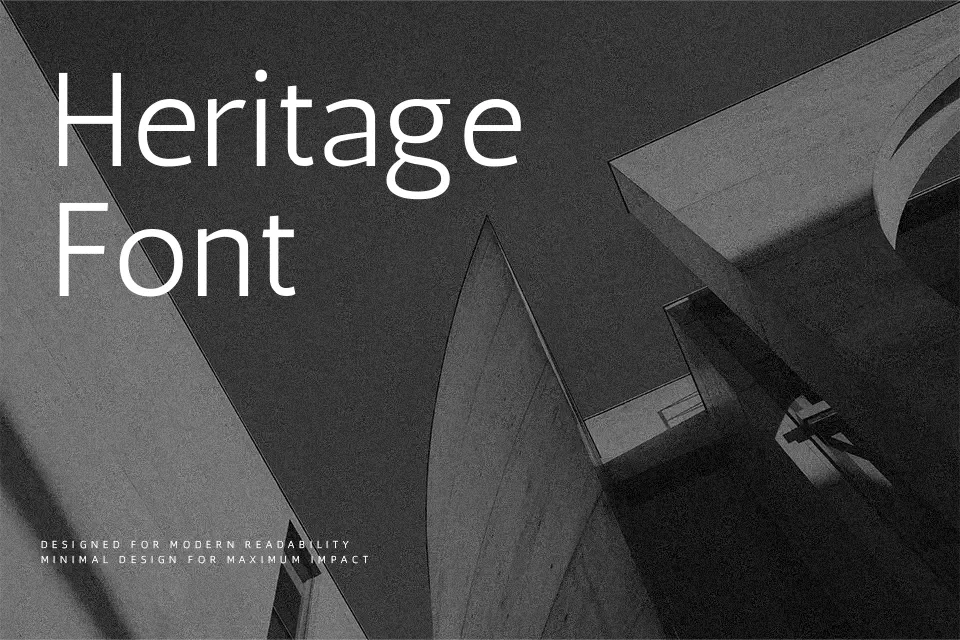
Antic has narrow, humanist proportions with soft stroke modulation, open counters, and a slight diagonal stress that hints at calligraphy without feeling showy. Letterforms feel calm and steady, so paragraphs hold together nicely on screens and in print, especially at small to medium sizes. I like it when a layout needs a neutral tone that still avoids the mechanical feel of many grotesque sans serifs, for example in simple brand guides, blog articles, or product pages. It can feel too restrained for loud marketing graphics or highly expressive titles, where a stronger display face might do more of the storytelling.
Best For:
continuous reading on web pages
subtle branding systems
editorial layouts with calm tone
UI labels and settings text
Not Ideal For:
high-impact display headlines
playful kids products
highly decorative poster work
formal ceremonial invitations
Perfect for body text, branding, and editorial, with a calm and condensed style.
License
Gallery