Amatic SC Font
Free for Commercial UseAbout
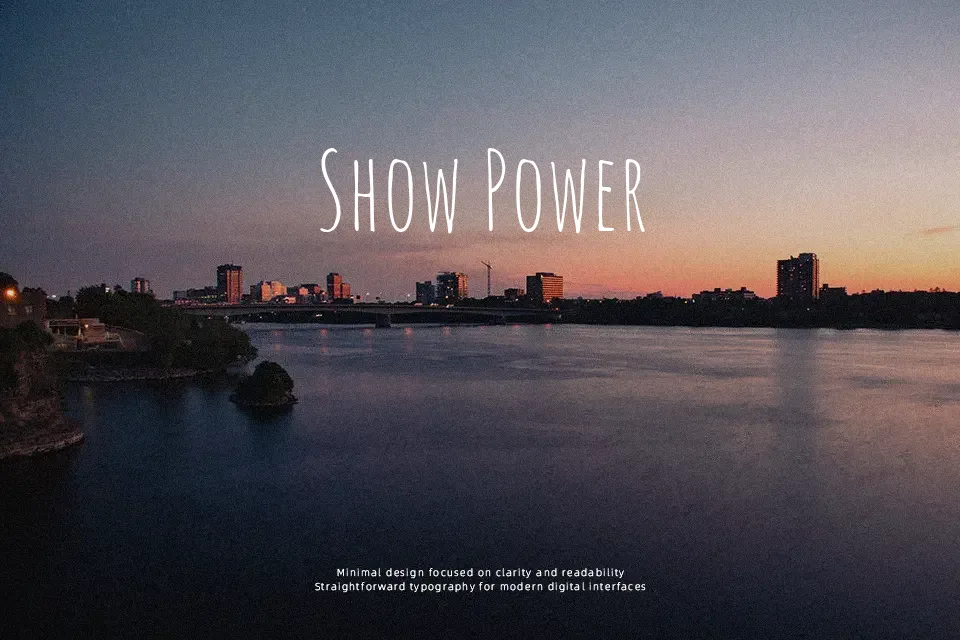
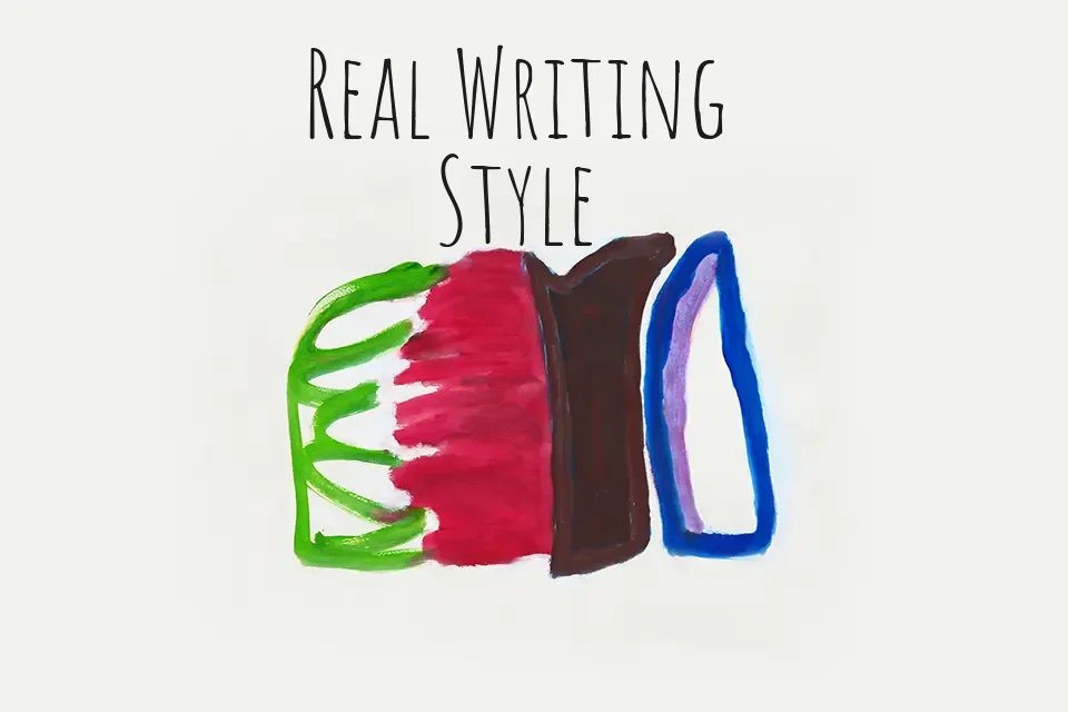
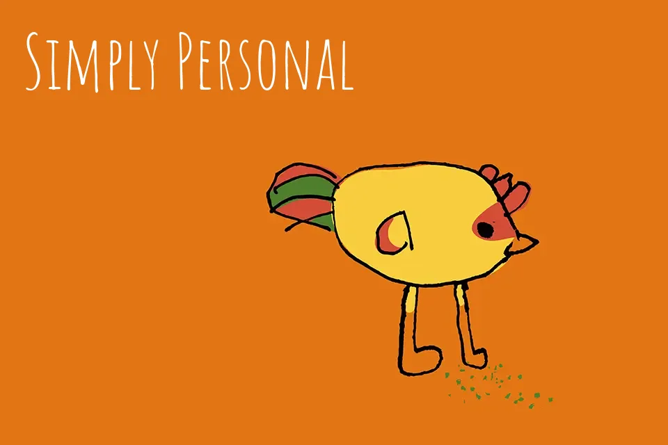
Amatic SC is a narrow, hand-drawn small-caps typeface with uneven strokes, loose curves, and irregular vertical rhythm that gives text a quick marker-pen feel. The letters sit close together, with tall x-height and scratchy outlines that read clearly at display sizes but start to feel crowded in dense copy. Visually it leans casual and slightly rustic, so it works nicely on street-food menus, indie poster designs, kids’ product labels, or YouTube thumbnails that want a friendly, handmade tone rather than a polished corporate voice. For long paragraphs, formal reports, or luxury branding, the rough texture and compressed proportions can become distracting, so it’s better treated as a characterful accent paired with a calmer supporting font.
Best For:
hand-drawn poster titles
casual branding and labels
social media graphics with a handmade vibe
short headline text on web or apps
Not Ideal For:
long-form body copy
formal documents or reports
high-end luxury branding
small caption text
Perfect for headline, kids, and logo, with a artistic and condensed style.
License
Gallery