Alike Font
Free for Commercial UseAbout
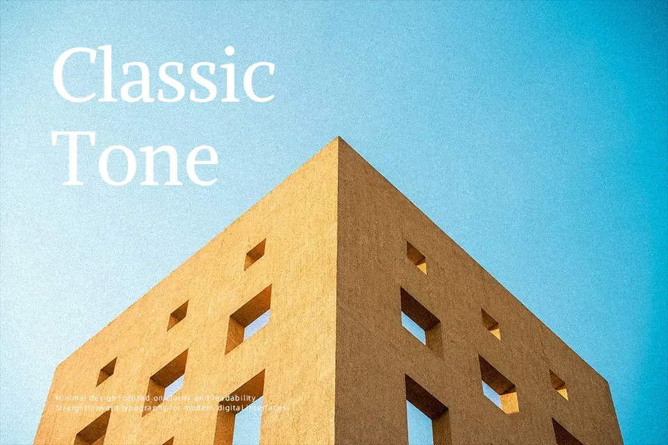
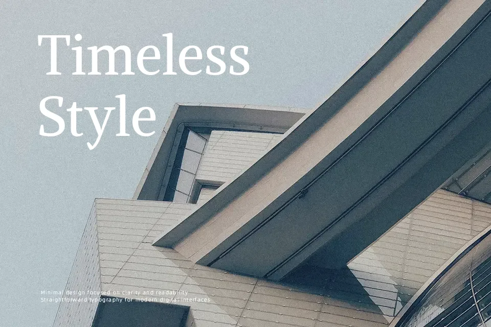
Alike is a gracefully constructed serif typeface tailored for optimal readability. Its visual structure features regular proportions and low contrast between thick and thin strokes, creating a calm, inviting texture on the page. The letterforms display a subtle tension inspired by Czech typographic traditions, but the edges are softened to ensure a warm, friendly impression. This makes it an excellent option for demanding editorial layouts, literary magazines, and lengthy website articles where continuous reading is required. However, because of its understated, text-focused design, it struggles to command attention in high-impact streetwear logo design or aggressive billboard advertising. Compared to highly dramatic modern serifs, Alike remains quietly reliable rather than flashy.
Best For:
long-form editorial articles
book publishing interiors
approachable corporate branding
digital blog body text
Not Ideal For:
aggressive streetwear logos
ultra-condensed mobile interfaces
high-impact billboard headlines
Perfect for body text, branding, and editorial, with a classic and serif style.
License
Gallery