Aleo Font
Free for Commercial UseAbout
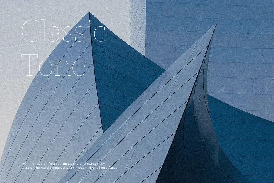
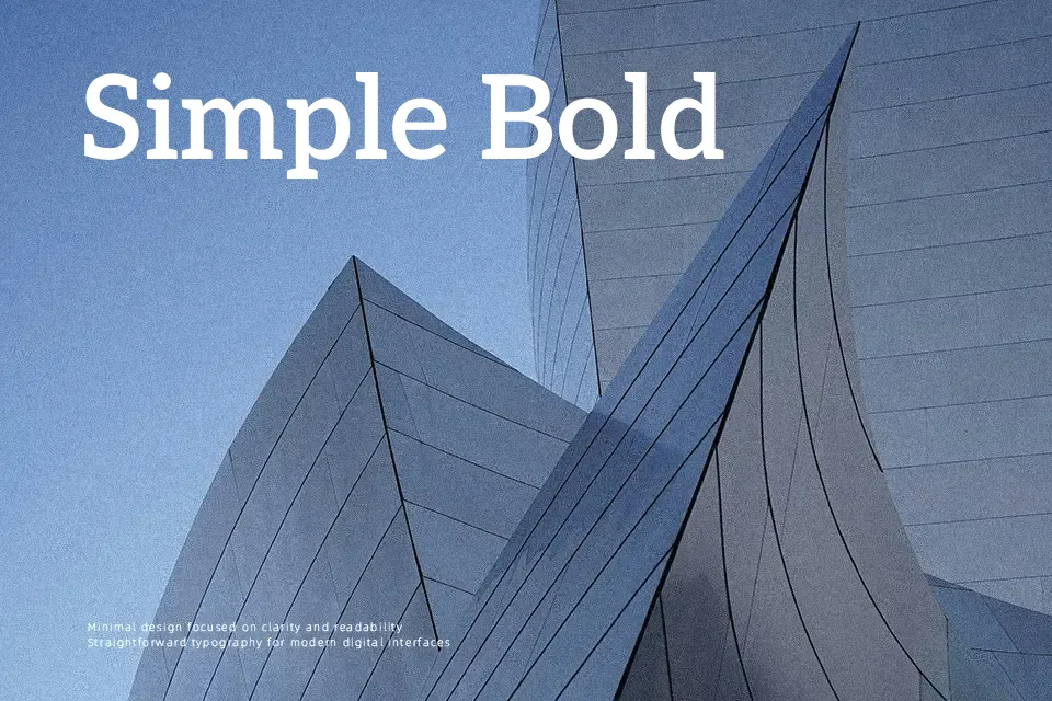
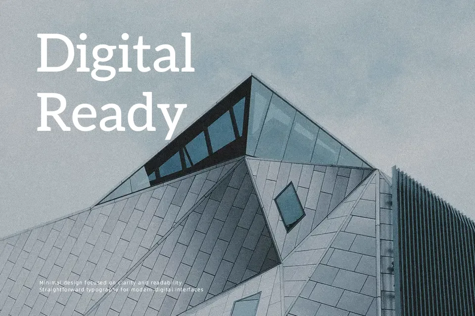
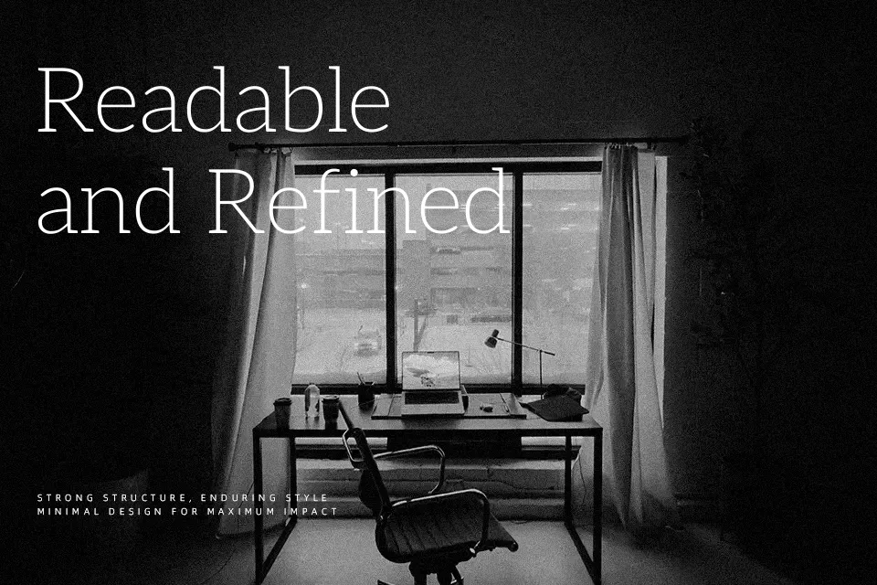
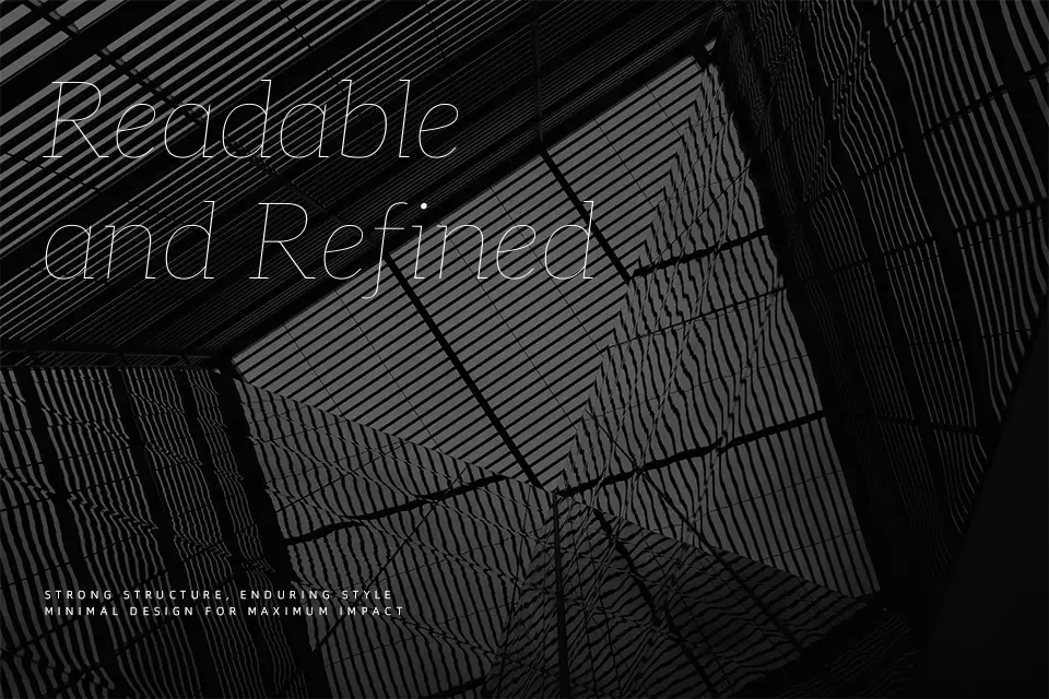
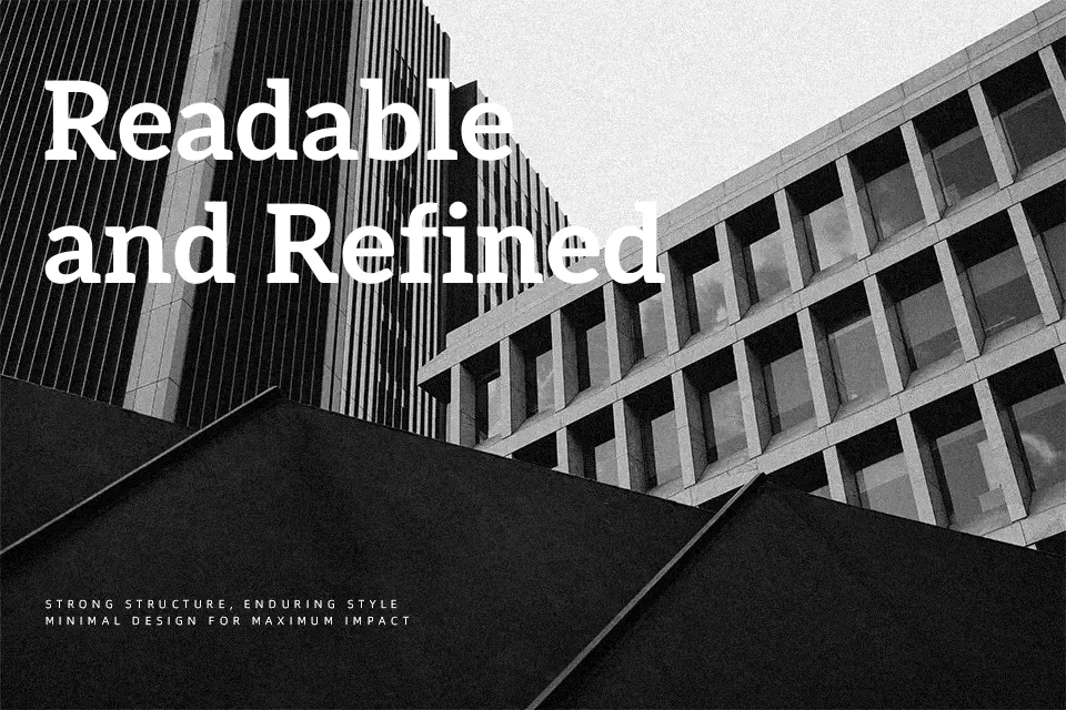
Aleo occupies a rare middle ground in the slab serif space — it carries the structural authority of geometric type, yet its semi-rounded terminals and moderate stroke contrast keep it from feeling stiff or cold. The spacing is open without being loose, which makes extended reading surprisingly comfortable. Developed in 2013 by Alessio Laiso as a slab companion to Lato, it shares comparable proportions while establishing its own distinct voice through its bracketed slab details. It works well in annual report layouts, editorial magazine spreads, and nonprofit brand systems where credibility and approachability must coexist. That said, it may feel visually heavy in ultra-minimal UI contexts or dense technical documentation where a clean neutral sans would fare better.
Best For:
editorial and magazine layouts
nonprofit and corporate brand identities
long-form website body copy
print reports and brochures
Not Ideal For:
ultra-minimal UI design systems
dense technical or legal documentation
projects requiring a completely neutral, voice-free typeface
Perfect for body text, branding, and editorial, with a clean and serif style.
License
Gallery