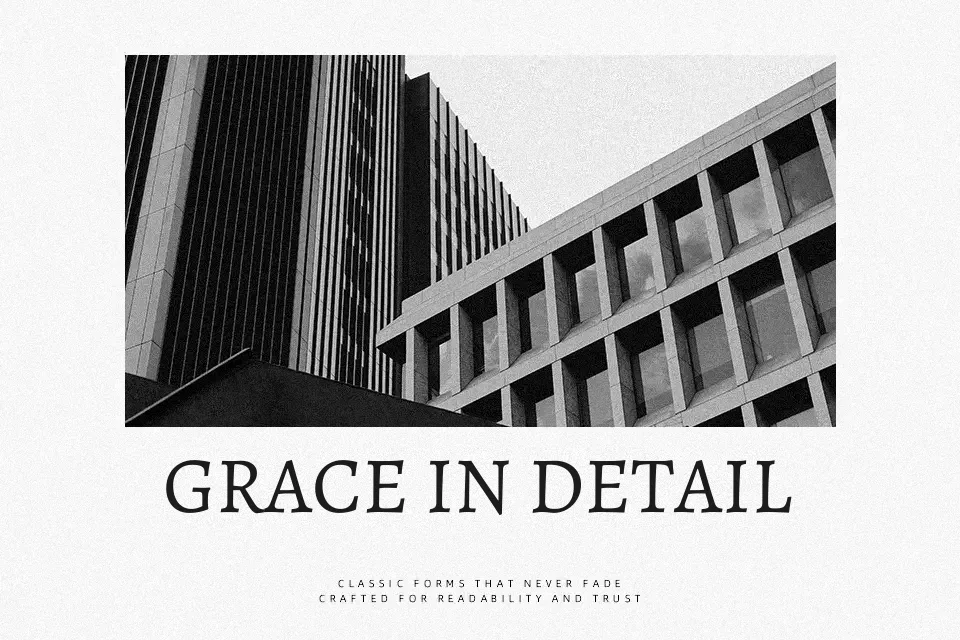
Alegreya SC Font
Free for Commercial UseAbout
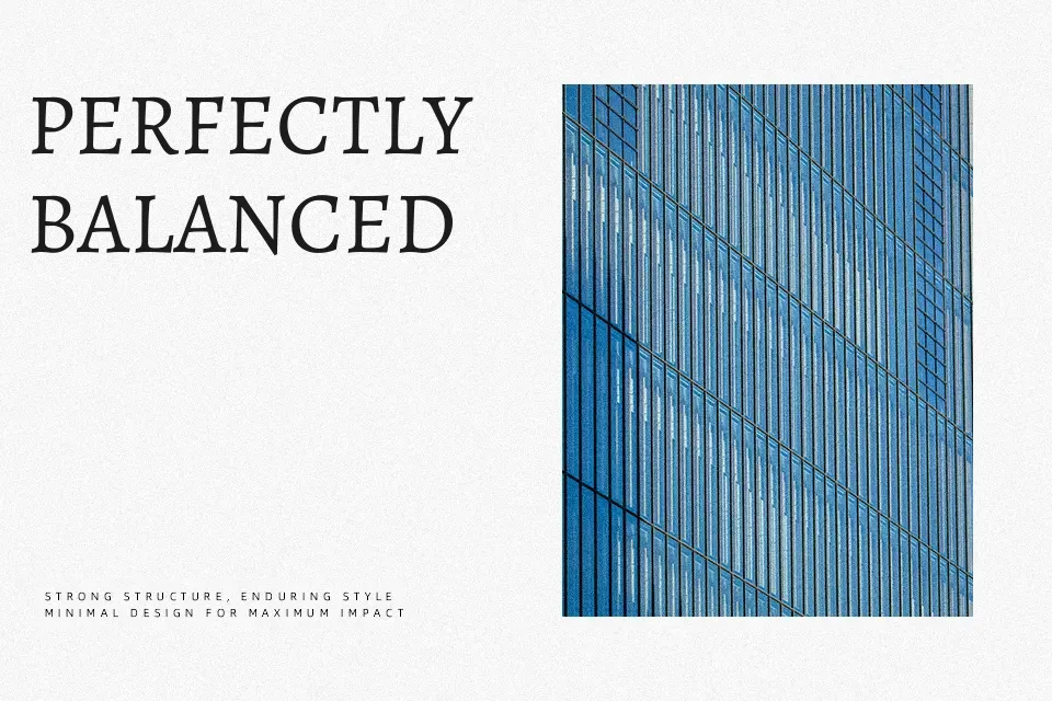
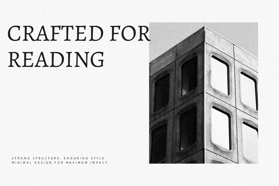
Alegreya SC is built entirely around small capitals, an uncommon structural choice that gives it an immediately distinctive typographic voice. The letterforms carry clear calligraphic influence — stroke weight transitions from thick to thin with a fluid naturalness that keeps the eye moving across the page. Character spacing is well-calibrated, preventing visual congestion even in dense paragraphs. This makes it one of the more readable classical serifs available at no cost.
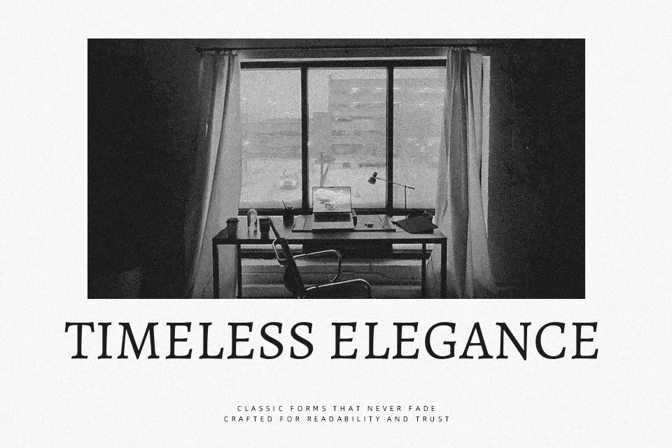
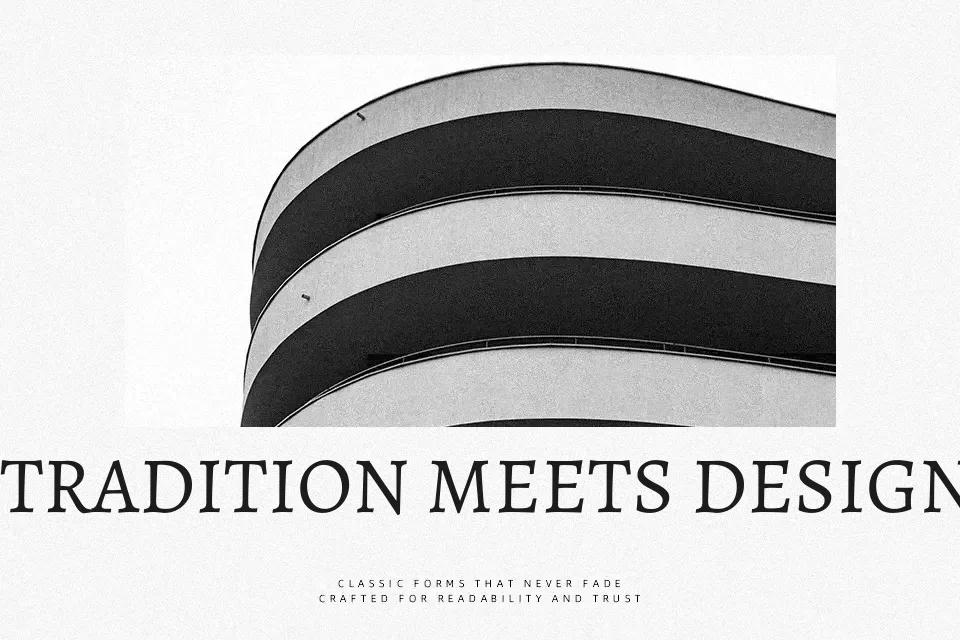
It performs strongly in chapter openings for literary novels, signage for museums or cultural institutions, and editorial headers where a measured, dignified tone is expected. The small caps format also works beautifully for pull quotes and lede text in long-form journalism.
Where it struggles: anything requiring an approachable, casual energy. Pair it with a contemporary geometric sans and the tonal mismatch becomes obvious. Also worth noting — the all-caps nature limits its flexibility in mixed-case display settings.
Best For:
Literary book covers and chapter headers
Cultural institution and museum branding
Editorial magazine layouts with classical aesthetics
Academic and archival print documents
Not Ideal For:
Casual or streetwear brand identities
Minimal modern UI design systems
Mixed-case display contexts requiring lowercase versatility
Perfect for body text, branding, and editorial, with a classic and display style.
License
Gallery