Aldrich Font
Free for Commercial UseAbout
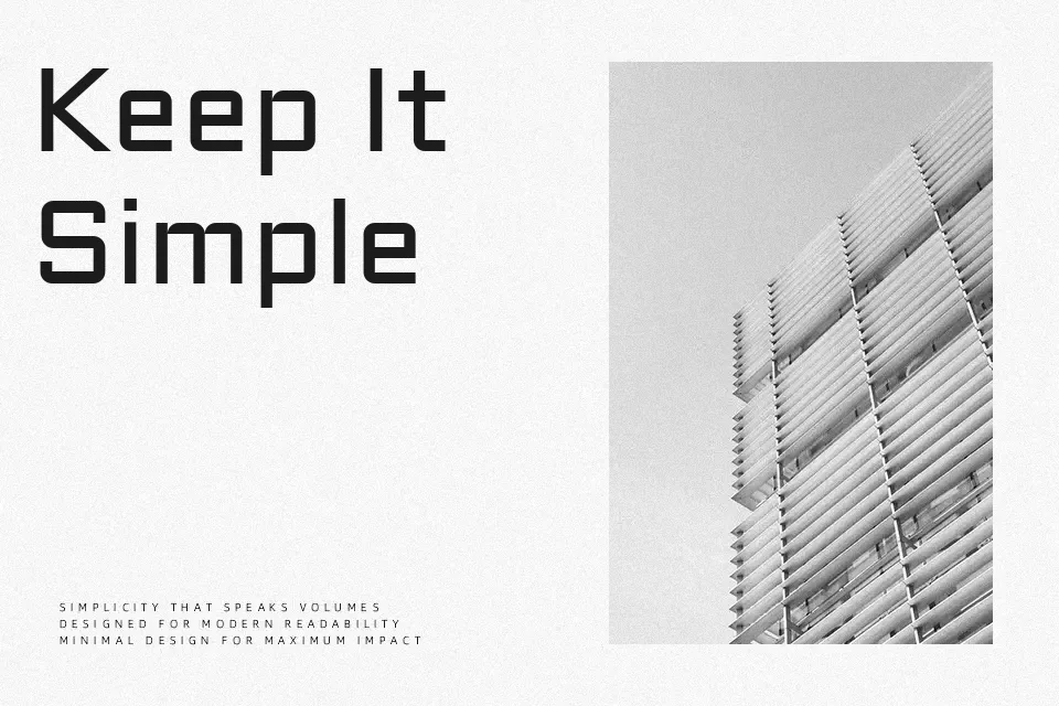
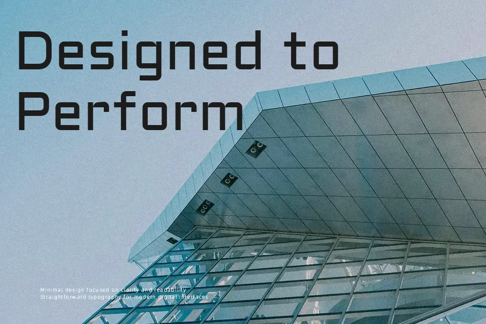
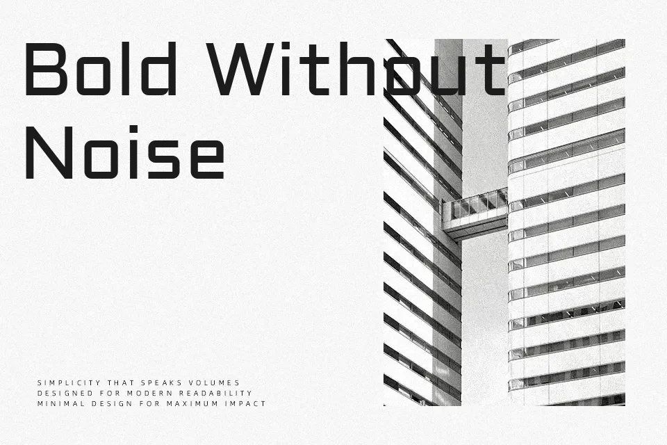
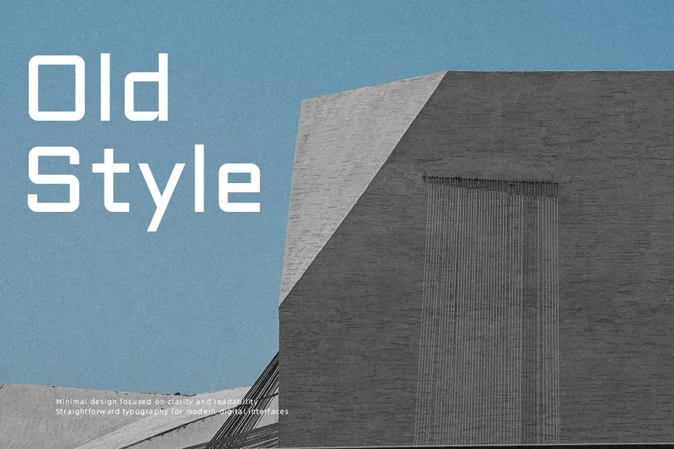
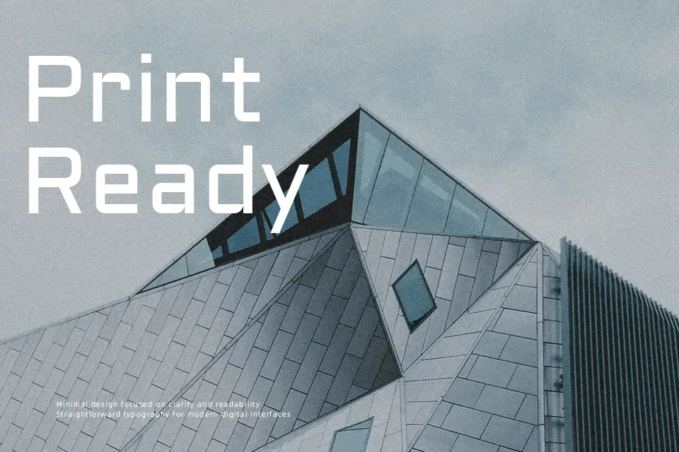
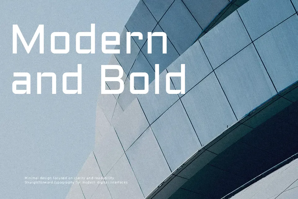
Aldrich sits in an interesting middle ground — its letterforms carry the rigid geometry of industrial type while the rounded terminals soften what could otherwise be a cold, mechanical feel. The mono-weight strokes create a uniformity that reads crisply at display sizes, particularly in tech product headers, science editorial layouts, or gaming UI where mechanical consistency is a design feature, not a flaw. The early American gothic influence gives it a grounded, workman-like character that feels more earned than styled. That said, Aldrich ships in a single weight only, which significantly limits typographic hierarchy in complex layouts. It struggles to carry warmth in lifestyle or wellness branding, and long paragraphs set in Aldrich quickly feel monotonous. Think of it less as a workhorse and more as a confident voice reserved for short, high-impact moments.
Best For:
tech and gaming display headlines
futuristic or industrial logo design
editorial header treatments
UI navigation labels and interface headers
Not Ideal For:
long-form body text or running paragraphs
warm lifestyle, wellness, or organic branding
layouts requiring multi-weight typographic contrast
Perfect for branding, gaming, and headline, with a bold and geometric style.
License
Gallery