Albert Sans Font
Free for Commercial UseAbout
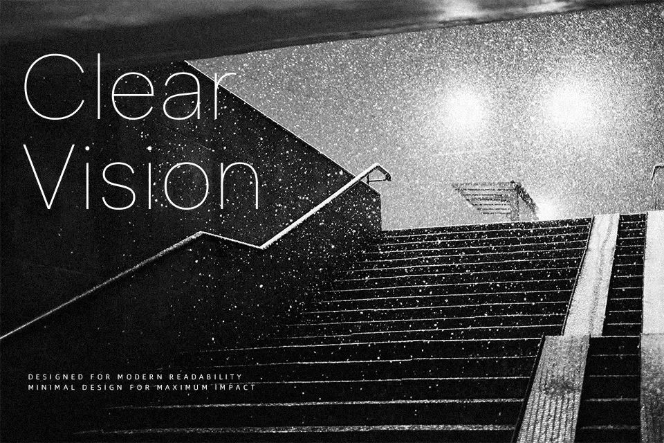
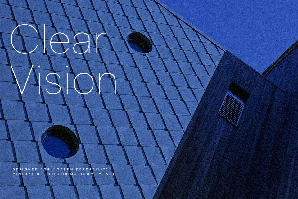
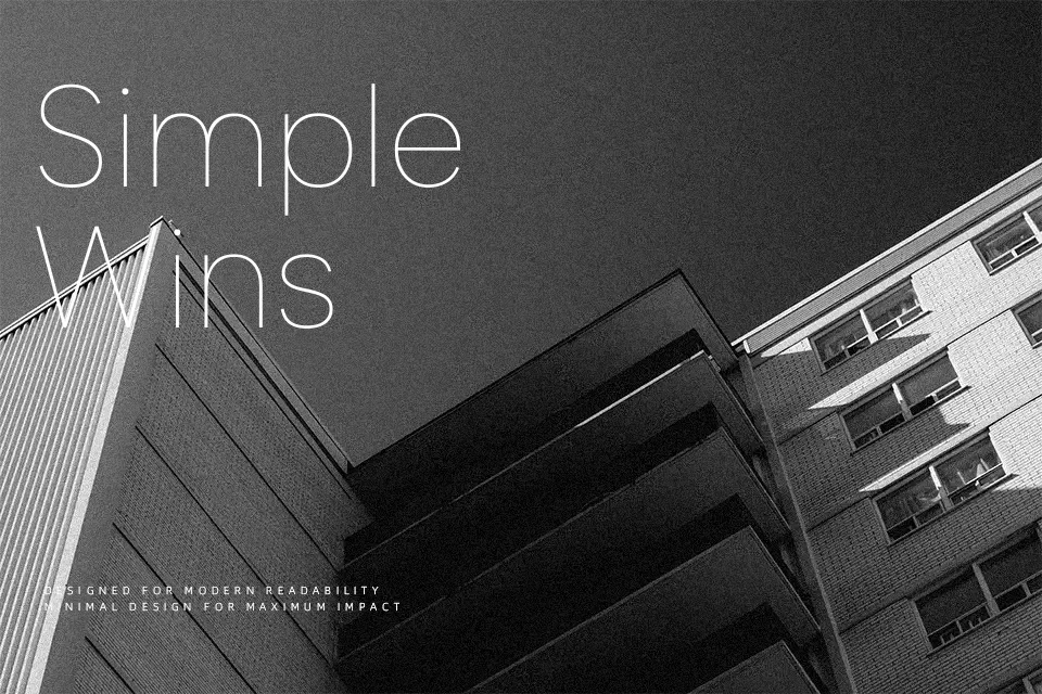
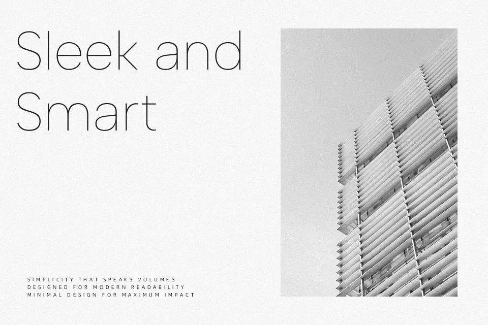
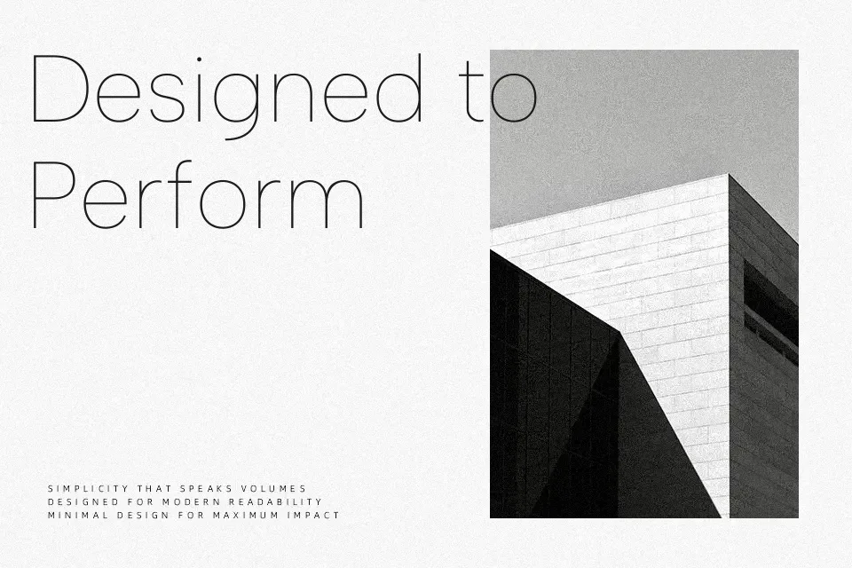
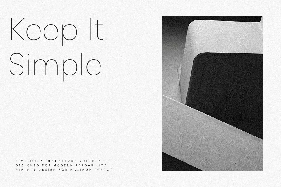
Albert Sans carries a quiet confidence that’s difficult to fake — clean, open strokes, slightly wide apertures, and a geometric skeleton that never tips into sterile. The letterforms stay sharp at small sizes without losing character, making it a reliable fit for app interfaces, SaaS product websites, and brand systems where text needs to feel considered without demanding attention. The full ten-weight range enables genuine typographic hierarchy for editorial or corporate identity work. It functions especially well in Scandinavian-influenced design systems or tech-adjacent branding where restraint reads as intention, not laziness. That said, it lacks the warmth required for wellness or handcrafted product aesthetics, and in emotionally charged contexts — think music festival posters or bold streetwear drops — the neutral structure can feel underpowered.
Best For:
tech startup branding and SaaS product sites
multi-weight editorial typographic systems
app UI and interface body text
packaging with a Nordic or minimal design direction
Not Ideal For:
expressive music event or festival posters
luxury fashion with artisanal or heritage positioning
decorative display contexts needing stylistic personality
Perfect for branding, headline, and logo, with a clean and geometric style.
License
Gallery