After Fall Font
Free for personal useAbout
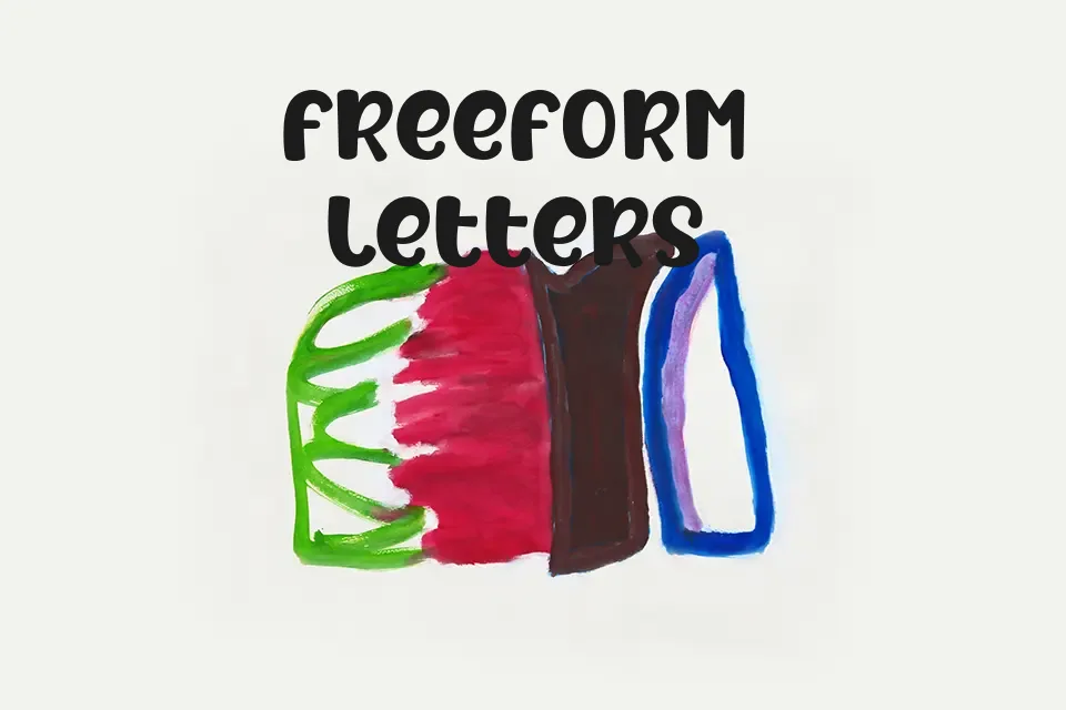
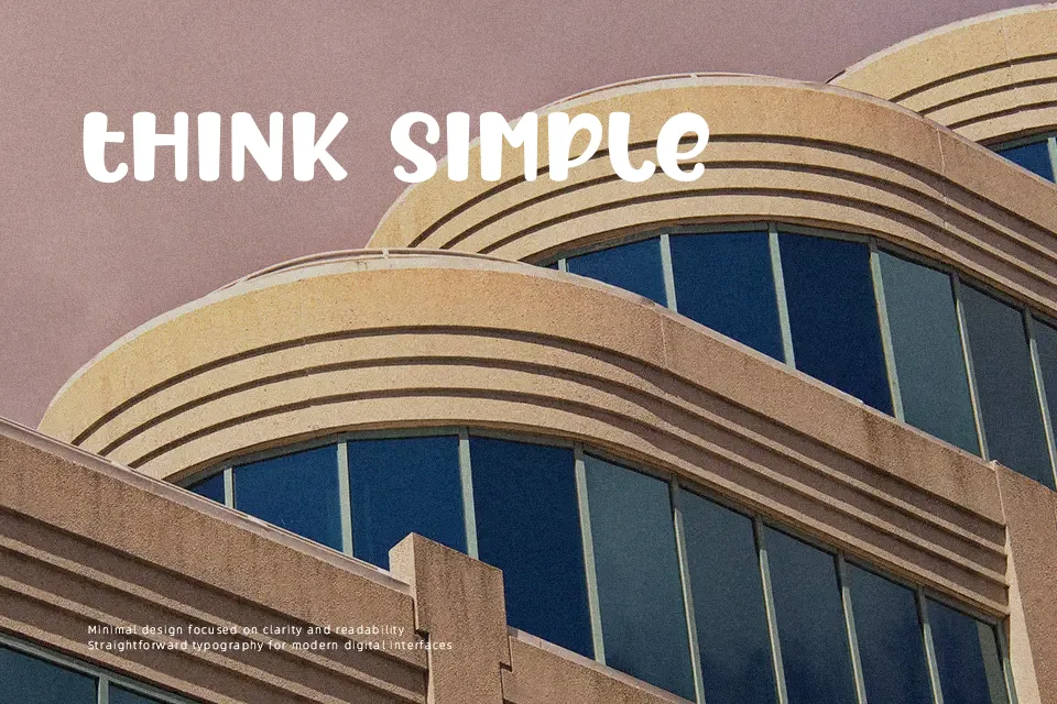
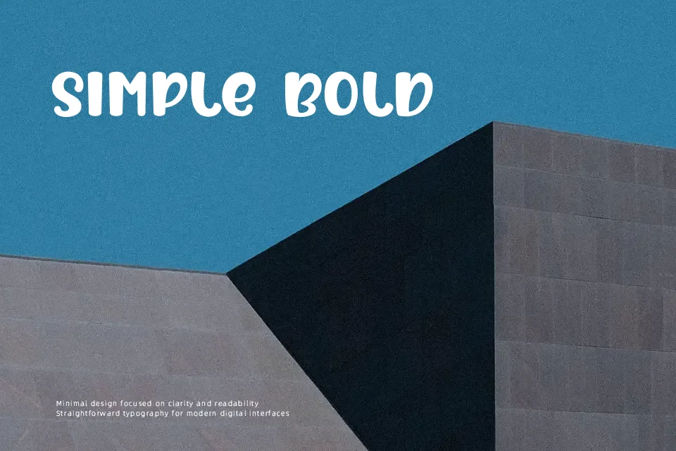
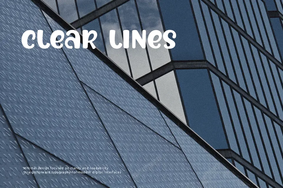
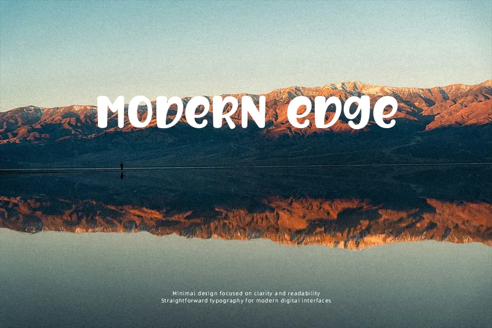
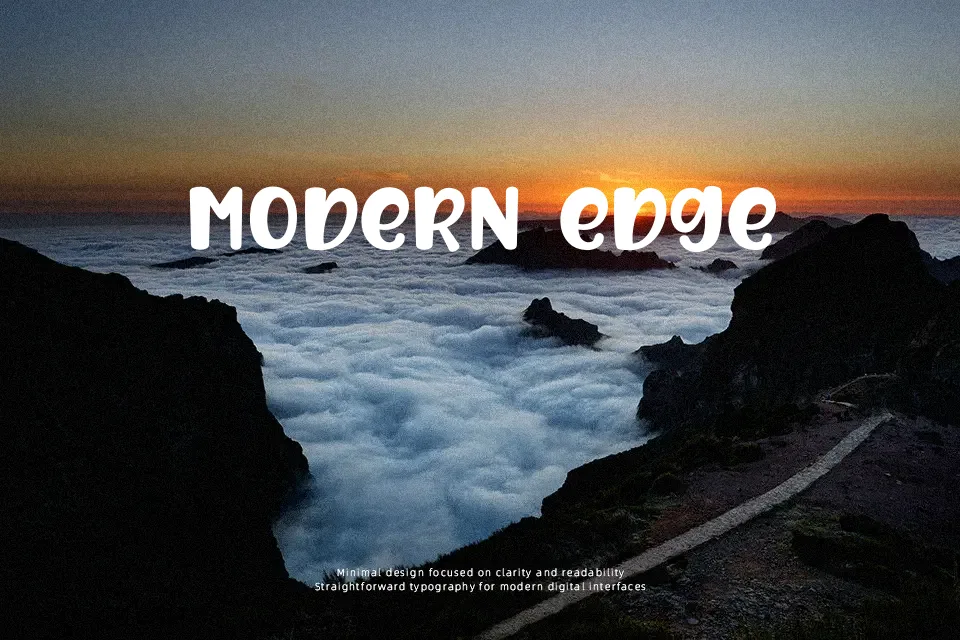
After Fall carries the kind of loose, hand-lettered energy that feels drawn rather than designed — strokes vary in weight, letterforms sit slightly unevenly on the baseline, and the overall texture reads as deliberately imperfect. That roughness is actually its strength in short-burst contexts like product labels, seasonal campaign headers, or nature-themed poster titles. The spacing works best at display sizes; scaling it down for captions makes the irregularity feel messy rather than charming. It won’t hold up in body text or anywhere legibility under pressure is required. For designers who need warmth without the slickness of a polished brush script, this delivers — but don’t expect it to carry professional weight in corporate or formal contexts.
Best For:
– Autumn or seasonal event poster headers
– Handcrafted product packaging labels
– Nature-themed social media graphics
– Independent café or market promotional materials
Not Ideal For:
– Body text or any extended reading
– Corporate presentations or formal reports
– UI interfaces requiring consistent legibility
– Multilingual layouts beyond basic Latin characters
Perfect for branding, holiday, and packaging, with a artistic and decorative style.
License
Gallery