A Wolf At The Door Font
Free for personal useAbout
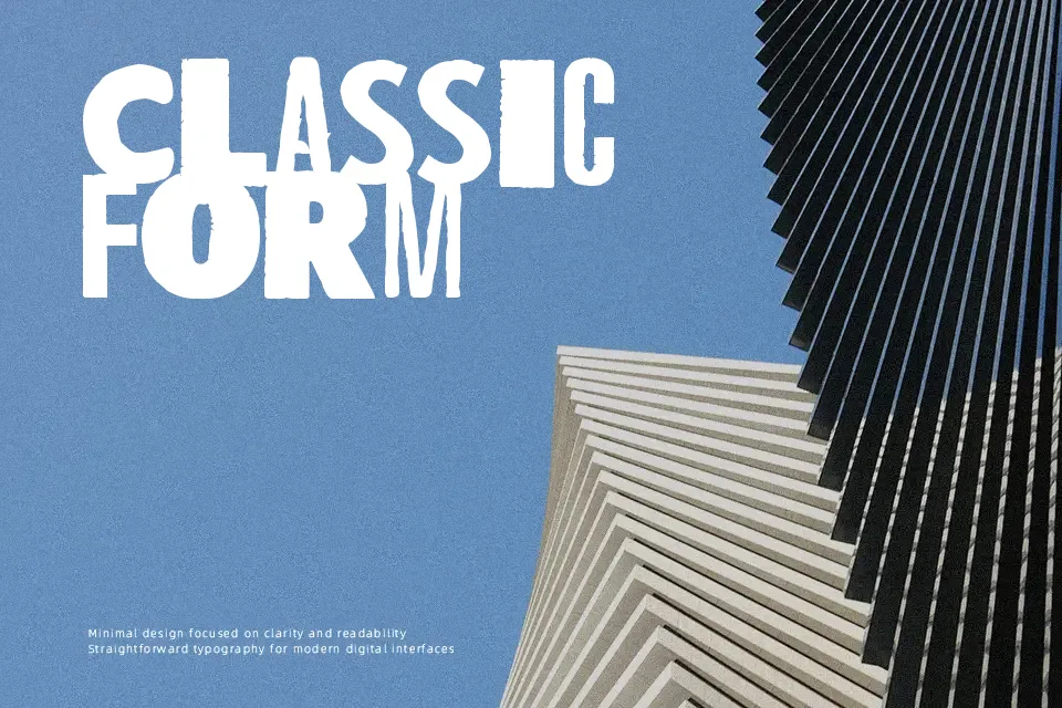
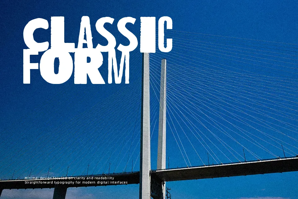
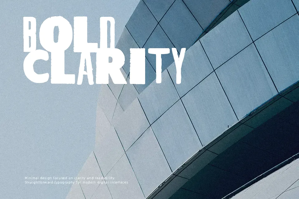
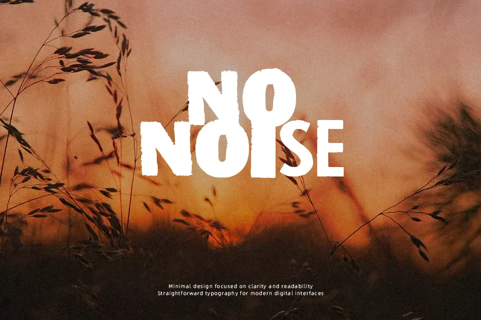
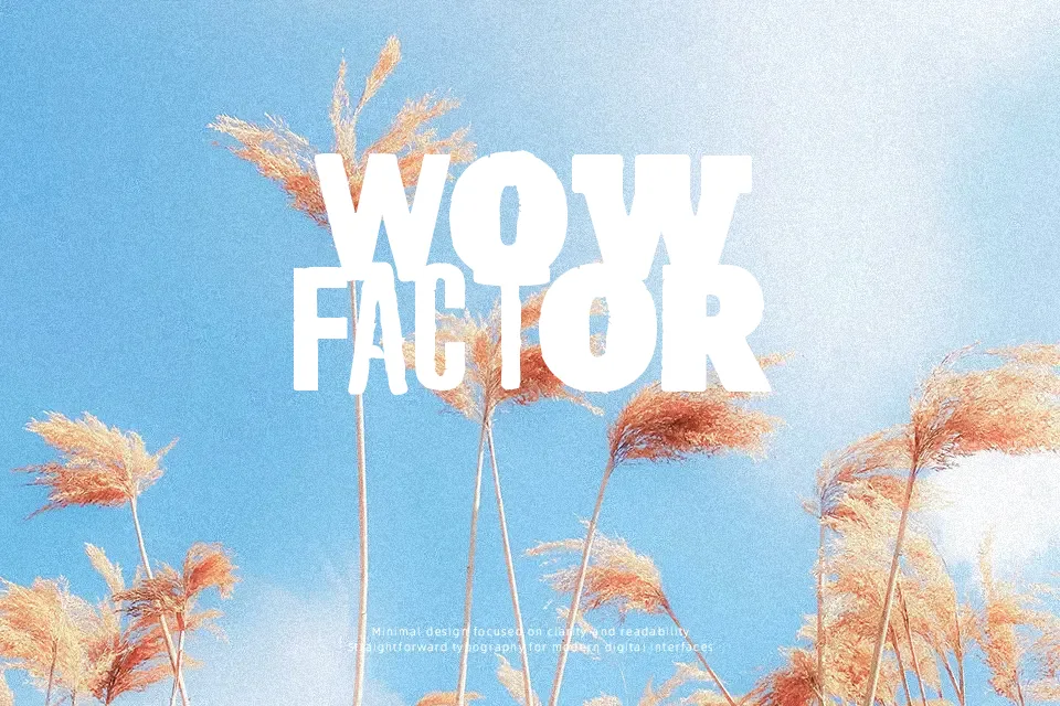
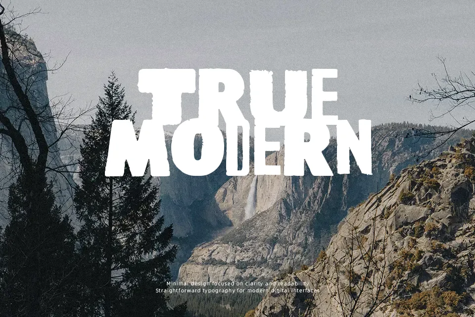
There’s an uneasy tension built into every letterform here — strokes feel like they were scratched rather than drawn, with uneven weight distribution and deliberate roughness that gives the typeface its unsettling personality. The spacing is loose enough to breathe but tight enough to hold together as a headline. Stylistically, it sits somewhere between blackletter tradition and grunge expressionism, making it a natural fit for Halloween event flyers, horror film title cards, or underground music branding. Where it earns its place is in short bursts of bold, atmospheric text — a single word or phrase where mood matters more than polish. It struggles badly in body copy or any context requiring extended reading, and designers expecting clean vector consistency will find the roughness unpredictable at certain scales.
Best For:
– Horror-themed poster headlines
– Halloween event or party flyers
– Underground band merchandise and album artwork
– Dark fantasy or gothic game UI titles
Not Ideal For:
– Body text or long-form reading
– Corporate or professional branding
– Small print applications where stroke detail collapses
– Clean, minimal design systems
Perfect for film, halloween, and logo, with a dark and blackletter style.
License
Gallery