Mansalva Font
Free for Commercial UseAbout
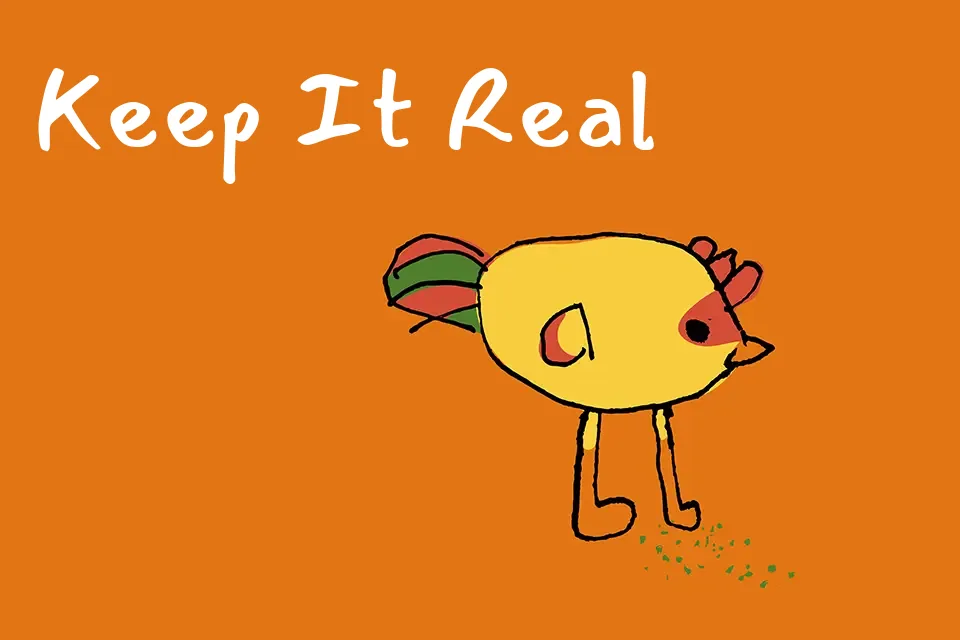
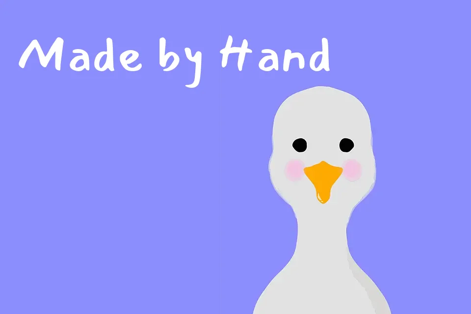
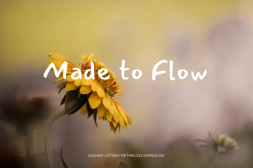
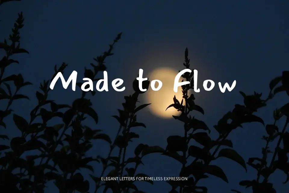
Mansalva has loose, slightly slanted strokes with rounded terminals and low contrast, so text looks like quick but careful handwriting rather than a polished calligraphy script. The letters sit with comfortable spacing and a generous x-height, which keeps short phrases readable even when scaled down on screen. Alternates for letters and numbers help avoid repeated shapes, so headlines and notes feel less mechanical. In practice, it shines in slide annotations, casual posters, and friendly UI labels where you want a handwritten voice without sacrificing clarity. For dense paragraphs, technical reports, or brand systems that demand strict formality, its informal energy quickly becomes tiring and visually noisy.
Best For:
short notes and annotations
casual poster headlines
social media quote graphics
kids or classroom materials
Not Ideal For:
long paragraphs of body copy
formal corporate documents
data-heavy editorial layouts
Perfect for advertising, headline, and kids, with a artistic and handwritten style.
License
Gallery