Maitree Font
Free for Commercial UseAbout
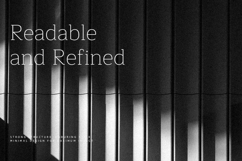
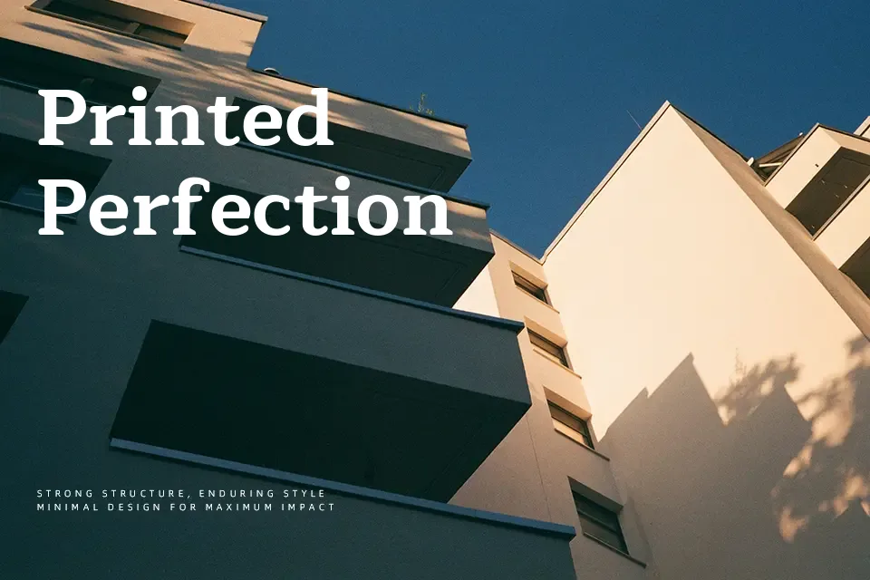
Maitree combines sturdy serif structure with soft, looped terminals, so strokes feel stable yet approachable rather than stiff. The x-height is generous and spacing slightly open, which helps multi-language text stay readable on screens and in small captions. In use, it reads as a contemporary bookish serif with a subtle Thai calligraphic influence, making bilingual layouts feel coherent instead of patched together. I reach for it in interface labels, editorial pages, and brand guides where you need warmth and clarity in both Latin and Thai, but I would avoid it for ultra-minimal tech branding that demands a stricter, neutral serif voice.
Best For:
bilingual editorial layouts
interface labels with Thai and Latin
approachable brand guidelines
long-form reading with a warm tone
Not Ideal For:
highly rigid corporate reports
ultra-minimal tech branding
very condensed headlines
expressive display wordmarks
Perfect for body text, branding, and editorial, with a classic and serif style.
License
Gallery