M PLUS 1 Code Font
Free for Commercial UseAbout
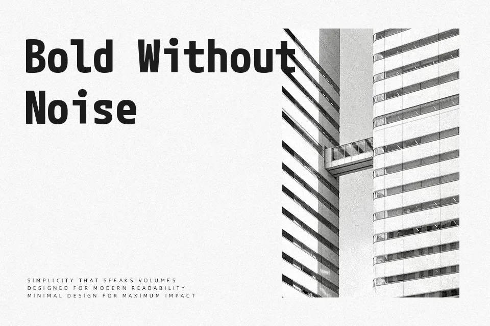
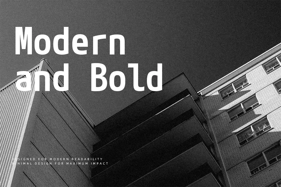
M PLUS 1 Code brings the geometric clarity of M PLUS 1 into monospace territory, pairing full-width Japanese glyphs with half-width Latin and numeric characters. Stroke contrast is kept intentionally flat — characters stay crisp in the small-size environments typical of code editors and terminal windows. The seven-weight variable axis gives developers real flexibility to tune text density across UI dashboards or documentation sites without ever needing a second typeface.
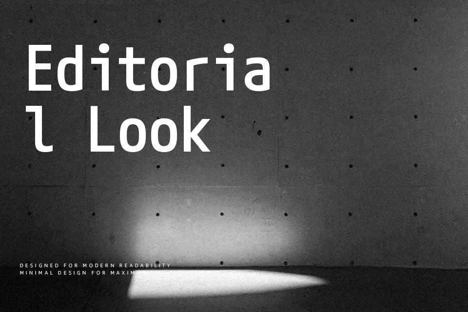
The standout quality here is glyph disambiguation. Characters like O, 0, I, l, and | are shaped to be identifiable even in isolation — not just when compared side by side. That kind of deliberate precision suits syntax-heavy interfaces and multilingual developer tooling well. However, it carries little typographic warmth, so any editorial context seeking expressive voice or display setting that calls for personality would be better matched elsewhere.
Best For:- code editor and IDE interfaces
– multilingual developer documentation
– programming tool UI text
– terminal and console display
Not Ideal For:- expressive display or headline typography
– branding projects requiring visual character
– long-form editorial with warmth or personality
Perfect for body text, editorial, and headline, with a clean and geometric style.
License
Gallery