Liu Jian Mao Cao Font
Free for Commercial UseAbout
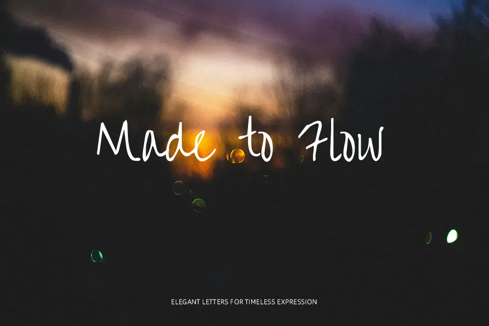
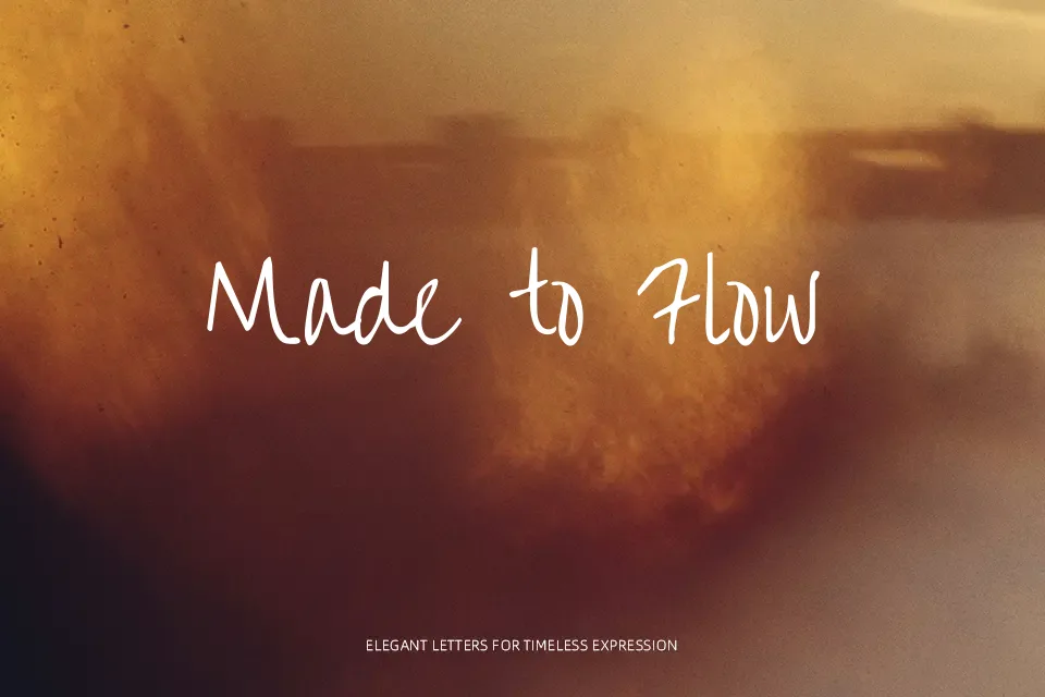
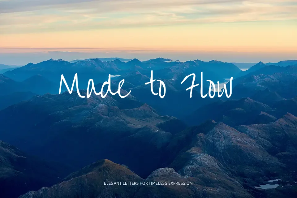
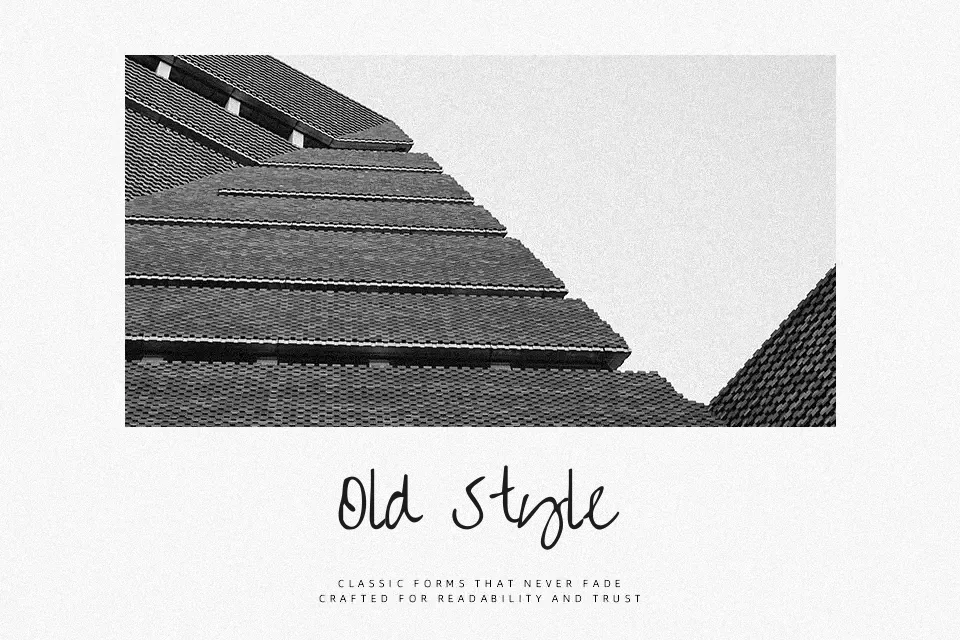
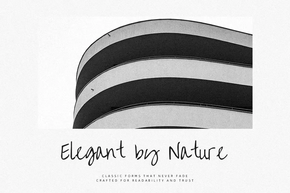
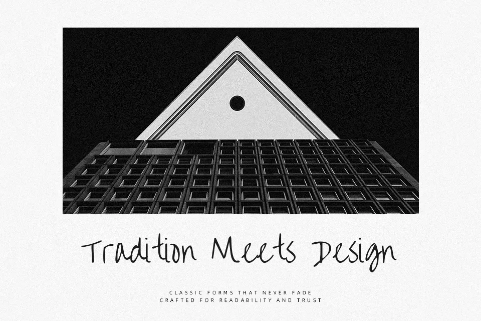
Liu Jian Mao Cao draws directly from the fluid tradition of Chinese grass script (草书), where strokes lean, overlap, and taper in ways that only a brush in motion can produce. The weight is deliberately uneven — thick downstrokes dissolve into thin, trailing ends that imply lift-off from paper. Even rendered on screen, the font carries an ink-on-paper quality that feels unhurried and expressive. It performs best on cultural event posters, tea or wellness packaging, and editorial splash pages where an East Asian calligraphic aesthetic is a conscious choice, not an afterthought. That said, readability falls off quickly at small sizes, and it is a poor fit for text-heavy layouts. The Latin glyphs, contributed by Kimberly Geswein, are functional but visually secondary — avoid treating them as equals to the Chinese characters in bilingual designs.
Best For:- Cultural event posters and exhibition headers
– Tea, wellness, and artisan brand identities
– Editorial splash or chapter-opening typography
– Social media visuals with a calligraphy focus
Not Ideal For:- Small-size or body text
– Corporate or tech branding
– Bilingual designs requiring Latin–Chinese visual balance
Perfect for branding, editorial, and headline, with a artistic and brush style.
License
Gallery