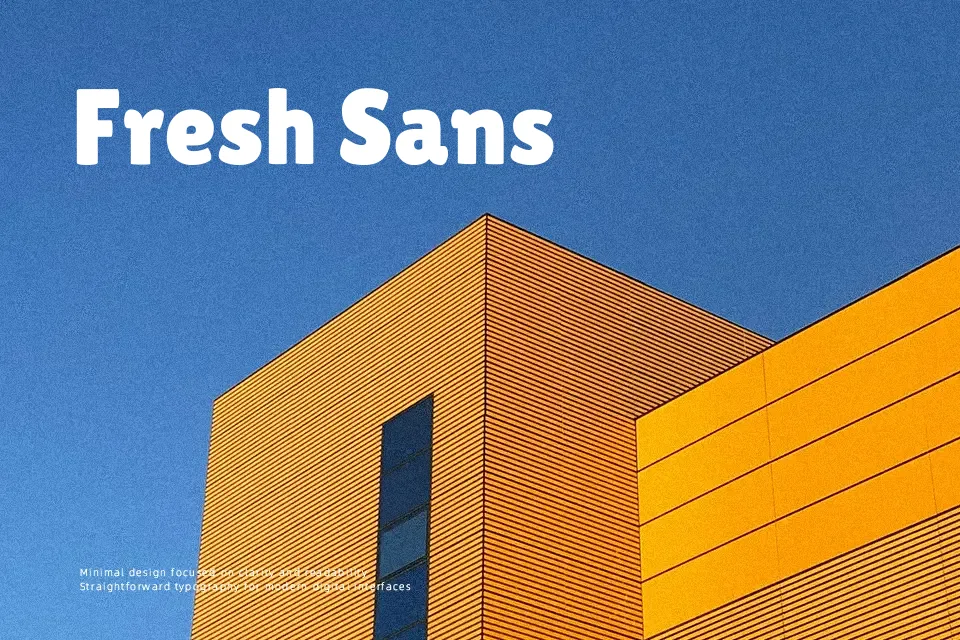
Lilita One Font
Free for Commercial UseAbout
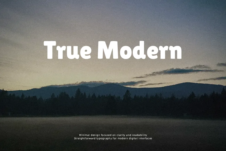
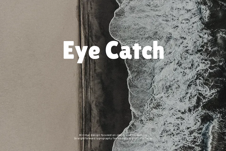
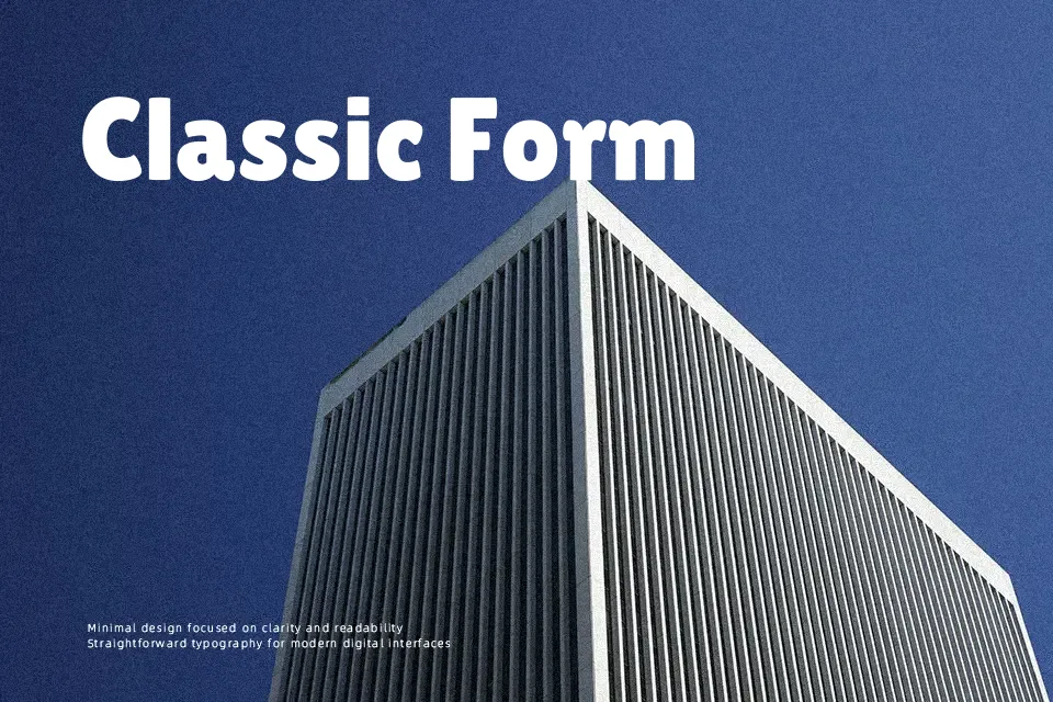
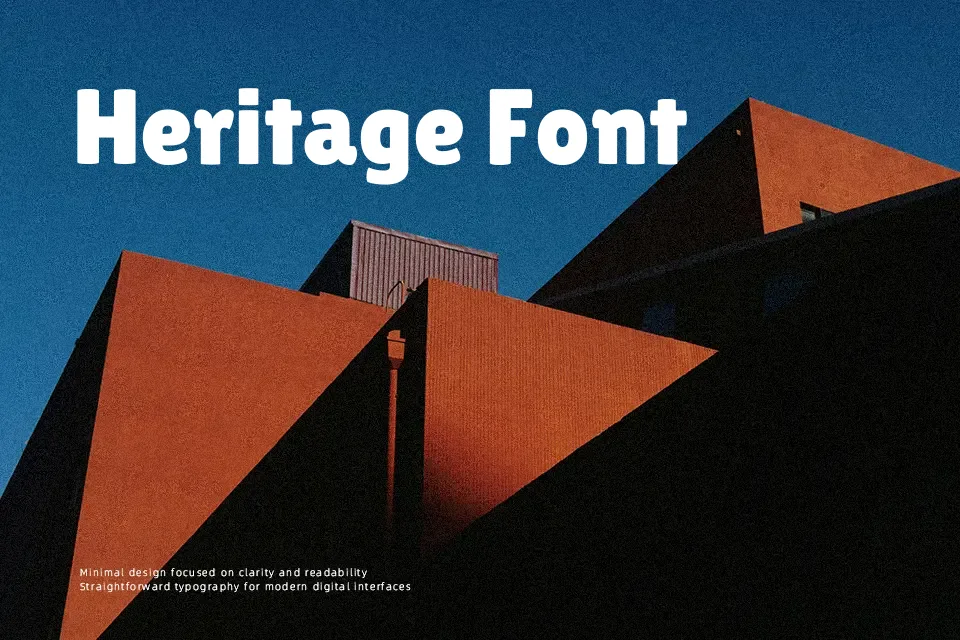
Lilita One carries serious visual weight without feeling stiff or mechanical. Its letterforms are thick-stroked and slightly condensed, keeping tight clusters of text readable at large sizes — a trait that makes it a reliable pick for gaming UI labels, youth-focused app interfaces, or bold section headers in editorial layouts. Small optical details give it personality beyond a standard fat grotesque, leaning toward the friendly side of bold rather than the aggressive.
That said, this font has clear limits. Drop it into body copy or multi-line paragraphs and readability deteriorates fast. Its casual personality also tends to clash with luxury branding or formal corporate contexts. Designers who lean toward Fredoka or Nunito Black will find Lilita One hits harder with slightly more visual authority — though the tradeoff is narrower versatility.
Best For:- bold display headlines
– kids product packaging and app UI labels
– event or concert promotional posters
– YouTube thumbnail text
Not Ideal For:- body copy or multi-line paragraphs
– luxury or premium brand identity
– formal corporate documents
Perfect for branding, headline, and kids, with a bold and condensed style.
License
Gallery