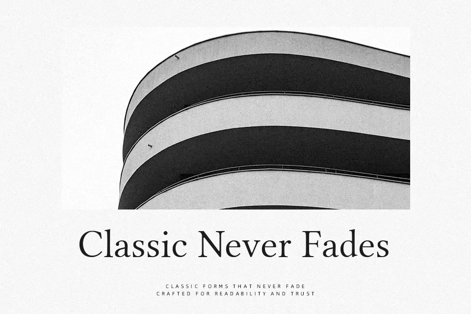
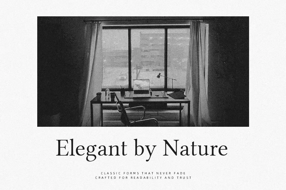
Libertinus Serif Display Font
Free for Commercial UseAbout
Libertinus Serif Display takes the structure of a traditional book serif and tightens the details for large-scale use, with crisp serifs, clear contrast, and spacing that holds up in oversized headlines. It carries a formal, literary tone, but the Display cut feels less stodgy than many old-style faces, so it works nicely for magazine covers, feature spreads, or institutional branding that wants authority without looking dusty. I would reach for it when setting chapter openings, poster titles, or event programs, where a text face would feel too timid yet you still want typographic restraint. For dense body copy, small UI text, or very informal layouts, its contrast and proportions can become tiring or overly serious, so it is better paired with a simpler companion serif or sans in those roles.
Best For:
editorial headlines
book covers and title pages
institutional or academic branding
poster titles with a classic tone
Not Ideal For:
long body paragraphs
small UI labels or captions
casual, playful layouts
heavily condensed text blocks
Perfect for branding, editorial, and headline, with a classic and display style.
License
Gallery