Kanit Font
Free for Commercial UseAbout
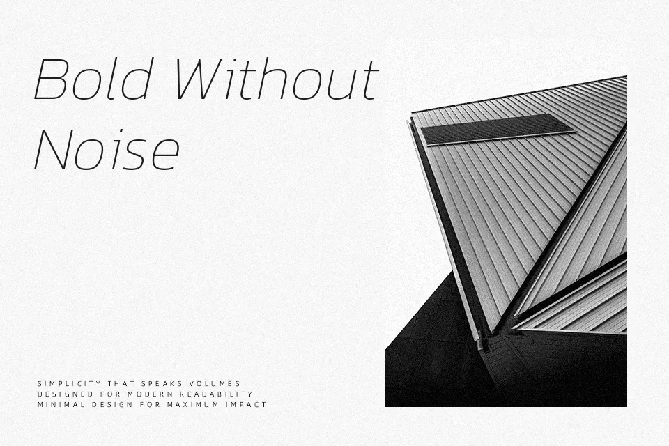
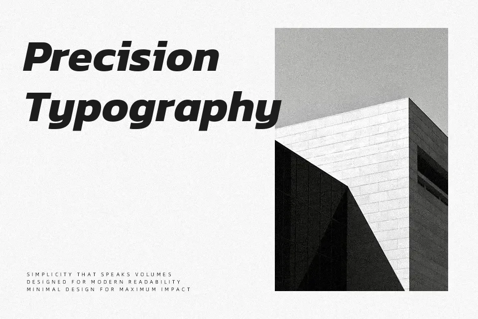
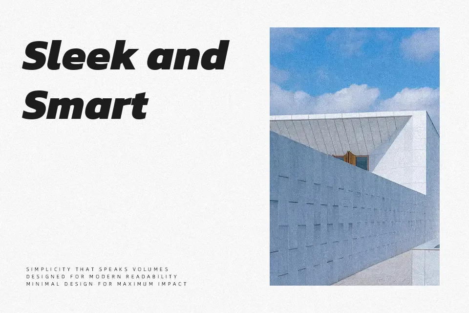
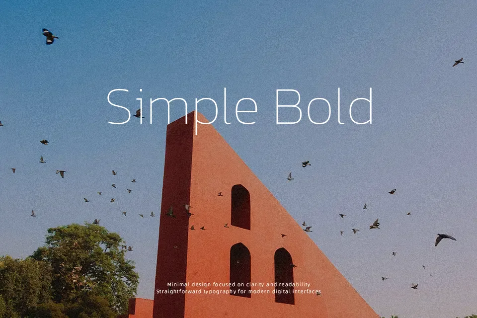
Kanit combines humanist sans shapes with rounded, capsule-like geometry, so its letters feel sturdy yet not overly stiff. The flat stroke endings and relatively tight spacing help headlines lock together while still staying readable at smaller sizes. Its loopless Thai script aligns visually with the Latin set, which is helpful when Thai and English need to sit in the same line without one overpowering the other. With many weights to choose from, you can push heavier cuts for UI labels, esports wordmarks, or transport signage, and keep lighter styles for supporting copy or data tables. It can feel a bit too technical for warm, story-driven layouts, so it suits structured, contemporary work more than expressive, editorial typography.
Best For:
bilingual Thai-English branding
app and web interface text
signage and wayfinding systems
tech or esports visual identities
Not Ideal For:
novel-style long reading text
highly traditional editorial layouts
warm or nostalgic storytelling brands
Perfect for advertising, branding, and headline, with a bold and geometric style.
License
Gallery