Abril Fatface Font
Free for Commercial UseAbout
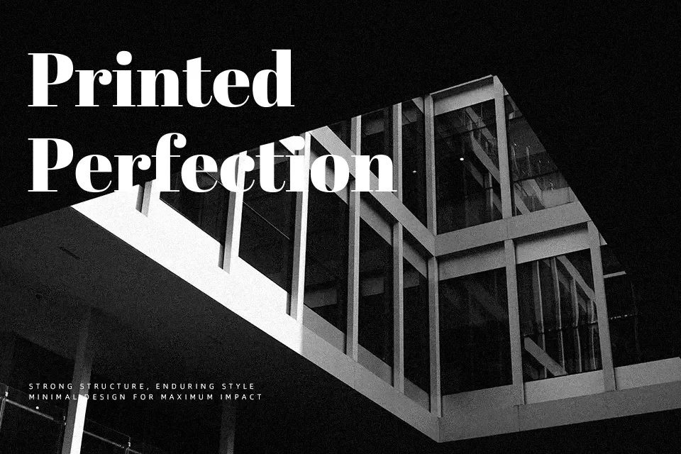
Abril Fatface borrows directly from the theatrical titling fonts that dominated European advertising posters in the 1800s — and that heritage is written all over its letterforms. Extreme contrast between the swelling thick strokes and the near-hairline serifs creates a visual tension that demands attention at large display sizes. Tight default spacing reinforces the dense, architectural character of the design. It occupies territory close to Bodoni Poster in the Didone tradition, though the curves here are noticeably cleaner and less rigid. This makes it a strong candidate for magazine cover hierarchies, fashion lookbook headings, and luxury event branding where a single bold word must anchor the entire composition. Drop it below 18pt and the hairline details begin to collapse — running body text is where it genuinely struggles, and playful or youthful aesthetics are outside its natural register.
Best For:
editorial headlines
fashion campaign titles
luxury brand identities
book cover typography
Not Ideal For:
body text or long-form reading
small UI labels or mobile interfaces
playful or children’s-oriented branding
Perfect for branding, editorial, and fashion, with a bold and display style.
License
Gallery