IM Fell Great Primer SC Font
Free for Commercial UseAbout
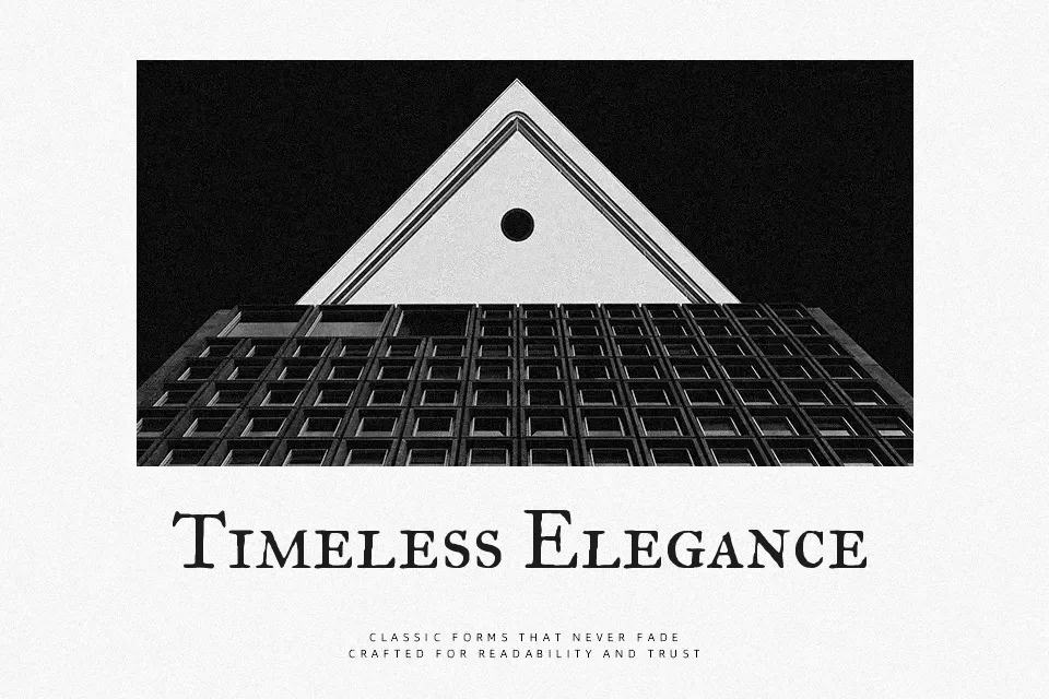
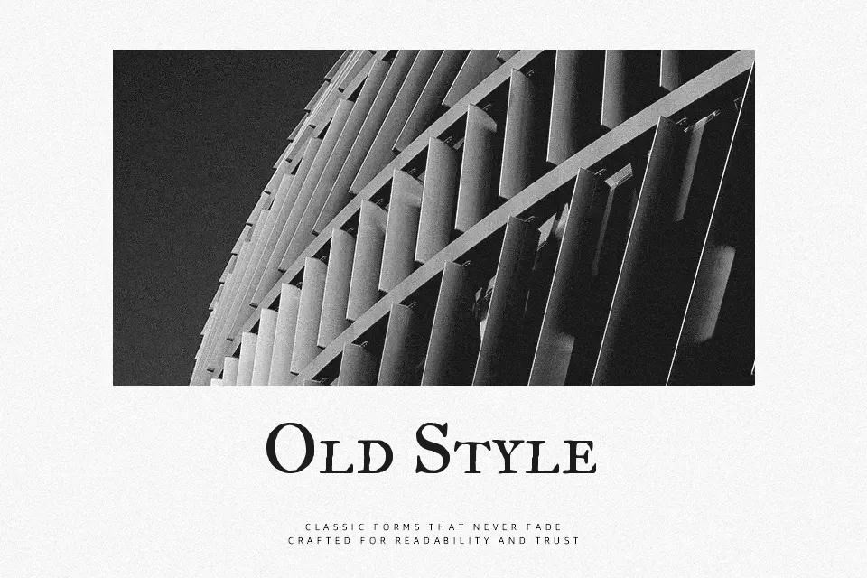
IM Fell Great Primer SC brings the rugged elegance of seventeenth-century typography into the digital era. Characterized by irregular contours, distinctive serifs, and an authentic letterpress texture, this small caps design features an uneven stroke weight that feels genuinely historical. The overall aesthetic balances formal academic rigor with antique craftsmanship. This typeface excels in period piece title sequences, boutique distillery packaging, and upscale historical book covers where a tangible, aged presence is necessary. However, the subtle ink-bleed edges and inherent roughness mean it struggles with on-screen legibility at small sizes. It is unsuitable for dense digital body copy or sleek app interfaces. Unlike highly polished modern serifs, it retains a warm, scholarly authenticity.
Best For:
Boutique distillery packaging
Period piece title sequences
Upscale historical book covers
Not Ideal For:
Dense digital body copy
Ultra-modern app interfaces
Small on-screen text
Perfect for branding, editorial, and film, with a ancient and display style.
License
Gallery