IM Fell English SC Font
Free for Commercial UseAbout
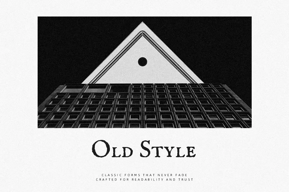
IM Fell English SC revives the classic 17th-century typefaces collected by John Fell, offering a distinctively historical appearance. This small caps serif stands out with its slightly uneven stroke weight, textured edges, and organic proportions that mimic early letterpress printing. It carries a deeply vintage, formal, and academic style.
The font shines when applied to antique product packaging, fantasy novel covers, or museum exhibition posters where an authentic period look is essential. Because of its irregular contours and all-caps structure, it struggles with readability in dense paragraphs or small digital interfaces. Compared to cleaner serifs like EB Garamond, IM Fell English SC sacrifices modern crispness in favor of undeniable rustic character.
Best For:
– Antique product packaging
– Historical book covers
– Museum exhibition typography
– Vintage editorial headlines
Not Ideal For:
– Dense body paragraphs
– Modern mobile interfaces
– Corporate financial reports
Perfect for editorial, film, and headline, with a ancient and display style.
License
Gallery