IM Fell DW Pica SC Font
Free for Commercial UseAbout
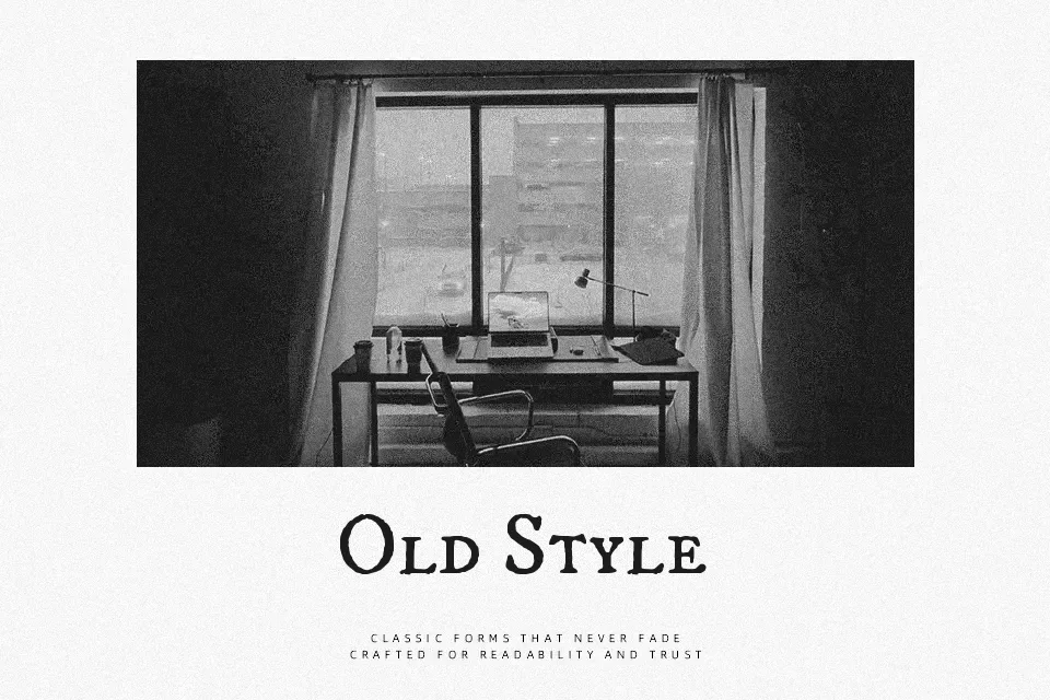
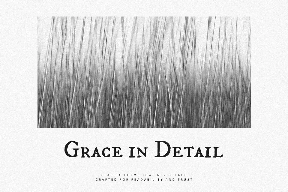
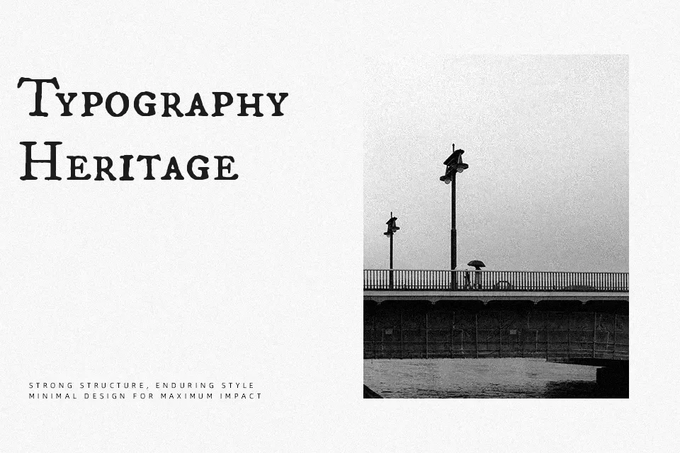
IM Fell DW Pica SC breathes life into the 17th-century types originally cut by Peter de Walpergen. This historical serif features a distinct small caps structure, authentic rough outlines, and an antique typographic rhythm. The irregular stroke weights and organic spacing impart a handcrafted, archaic feel that immediately establishes a sense of heritage.
The typeface shines when applied to vintage editorial design, luxury heritage branding, or dramatic film posters set in historical periods. However, its rough texture and archaic letterforms mean it struggles with modern digital UI design or lengthy corporate body text. Compared to highly polished modern serifs, IM Fell DW Pica SC offers a raw, untouched aesthetic that captures the genuine spirit of early printing presses.
Best For:
historical book covers
vintage branding materials
dramatic editorial headlines
heritage product packaging
Not Ideal For:
modern app interfaces
lengthy digital body text
corporate financial reports
Perfect for branding, editorial, and film, with a ancient and display style.
License
Gallery