IM Fell Double Pica SC Font
Free for Commercial UseAbout
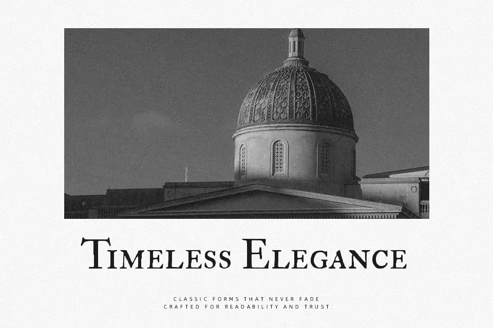
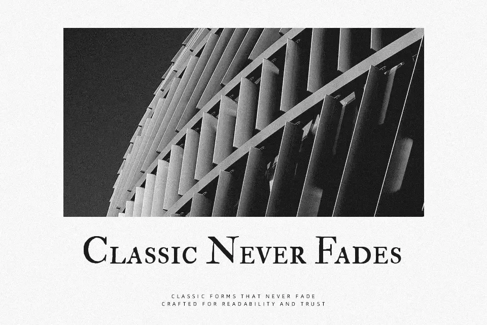
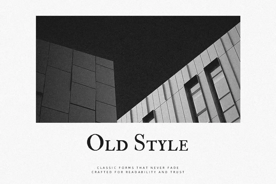
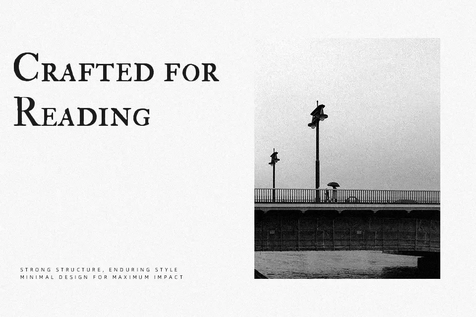
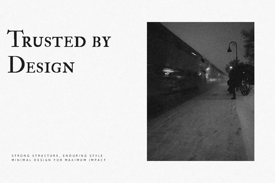
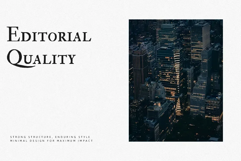
IM Fell Double Pica SC is a compact small caps serif with noticeable stroke contrast, slightly rough contours, and tight, traditional spacing that hints at hand‑set metal type. The letterforms feel formal yet a bit rugged, with sturdy verticals, sharp serifs, and a rhythm that looks more like an old printed page than a contemporary display face. It works especially well for literary book covers, historical fiction titles, heritage branding, and editorial headings where you want the typography to signal age and scholarship without looking overly decorative. On screens, the texture can feel busy at very small sizes, so I would avoid using it for long body text or dense UI copy where clarity matters more than mood. If you like classic Garamond-style serifs but want something with more patina and personality, this family sits nicely in that space.
Best For:
historical book covers
heritage or museum branding
editorial headings with vintage tone
literary quote graphics
Not Ideal For:
long paragraphs or body copy
minimalist corporate interfaces
tiny captions or UI labels
highly technical documents
Perfect for branding, editorial, and headline, with a artistic and display style.
License
Gallery