Gugi Font
Free for Commercial UseAbout
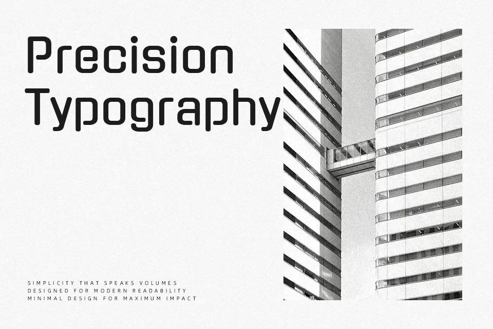
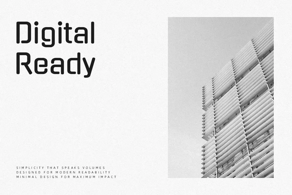
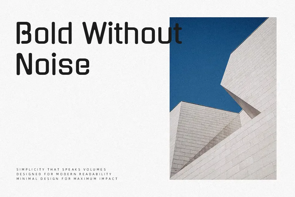
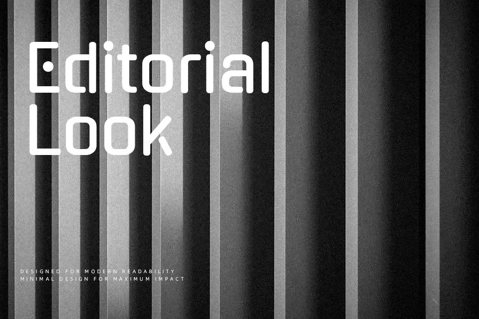
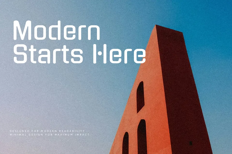
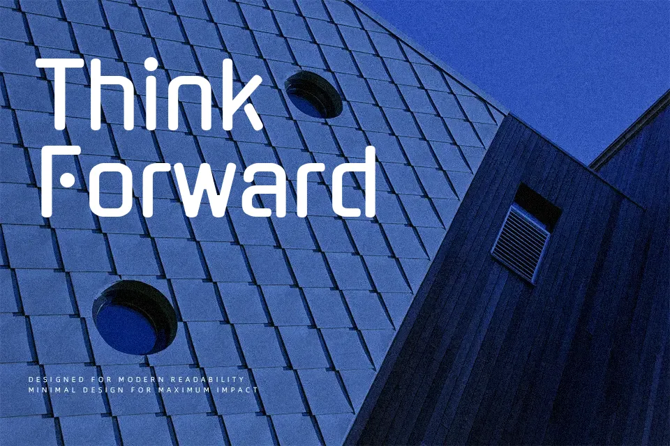
Gugi combines smooth, superellipse curves with consistent stroke thickness, giving letters a sturdy, monoline feel that still looks friendly on screen. The spacing is relatively open, so characters breathe well in short titles and UI labels, but can feel heavy and repetitive in dense paragraphs. Visually, it sits between rounded geometric sans and playful display fonts, with a subtle techno edge that hints at digital interfaces and sci‑fi aesthetics. I would reach for Gugi when I want Korean and Latin text to feel cohesive in a single headline, banner, or app splash screen, and avoid it for long editorial reading or highly formal, corporate documents where a more neutral sans serif is expected.
Best For:
gaming graphics
bold digital headlines
youth-oriented branding
Korean-Latin display text
Not Ideal For:
long paragraphs
formal documents
dense print layouts
Perfect for gaming, headline, and logo, with a creative and display style.
License
Gallery