Gudea Font
Free for Commercial UseAbout
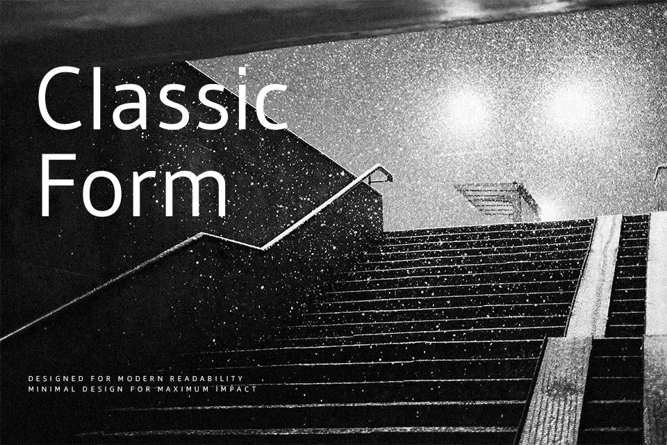
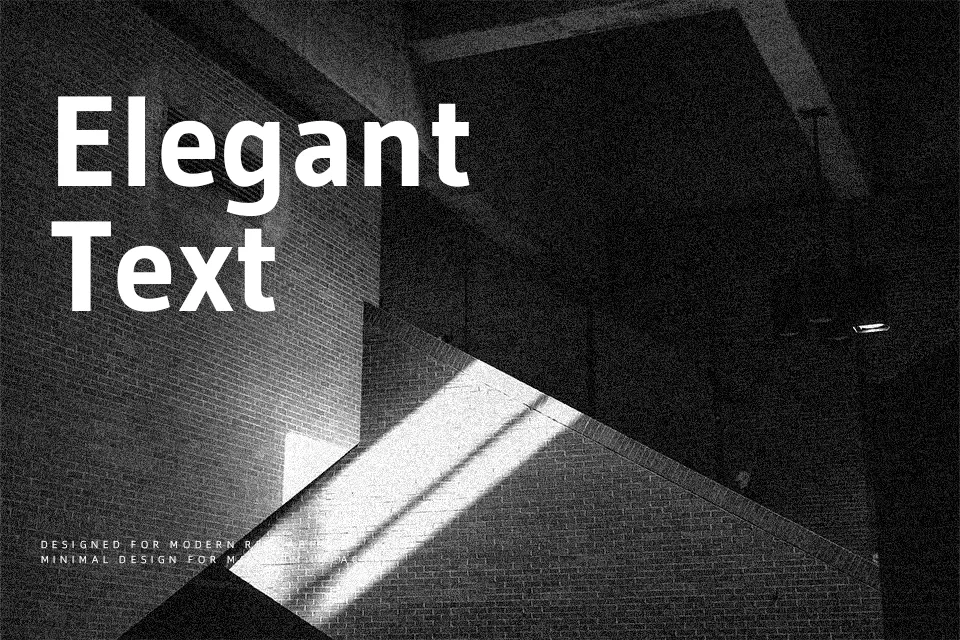
Gudea has a slim, upright build with a generous x‑height, open counters, and steady stroke contrast that help small text hold together on screen. The drawing leans humanist rather than purely geometric, so curves feel practical but not cold. Because it was originally conceived for labels and maps, spacing is economical yet controlled, which makes it handy when you need to fit dense information into narrow columns or sidebars. I like it for secondary UI text, captions, and utility pages where clarity matters more than personality, but I would think twice before using it as the primary brand typeface for a luxury or highly expressive identity.
Best For:
interface labels and menus
maps, diagrams, and captions
data-heavy dashboards and tools
sidebars and compact body text
Not Ideal For:
luxury or high-fashion branding
expressive display wordmarks
long-form print editorial
heavily decorative layouts
Perfect for body text, editorial, and headline, with a clean and condensed style.
License
Gallery