Grenze Font
Free for Commercial UseAbout
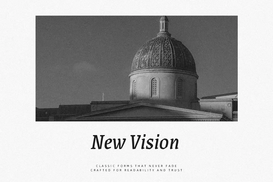
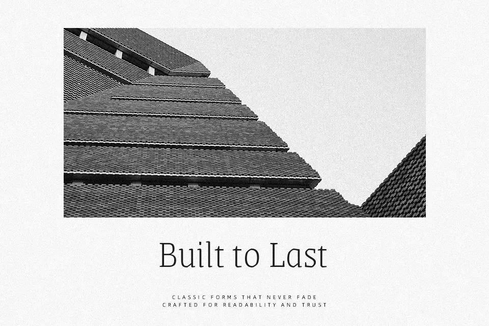
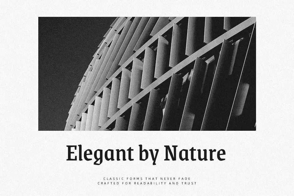
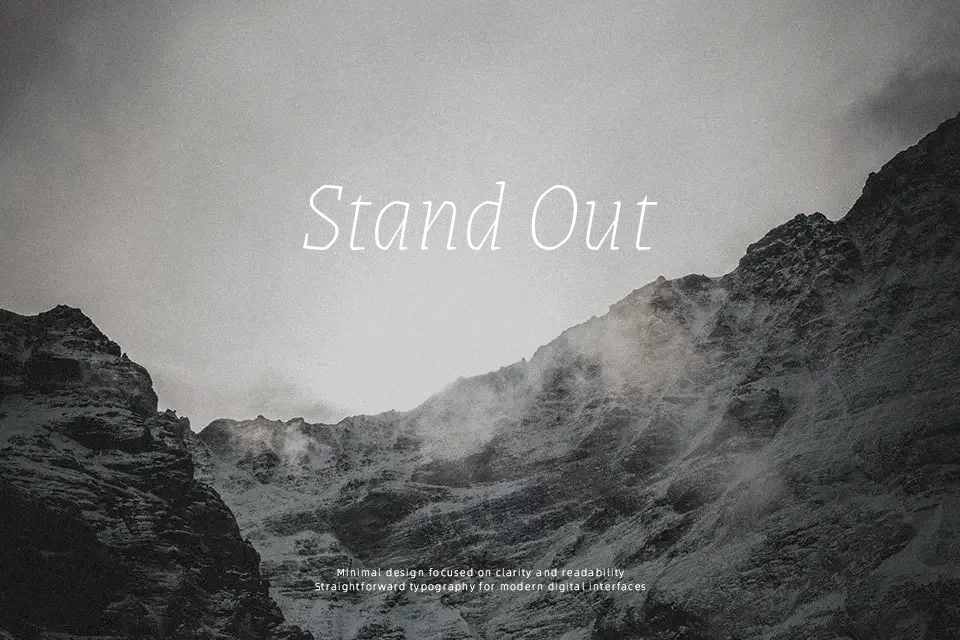
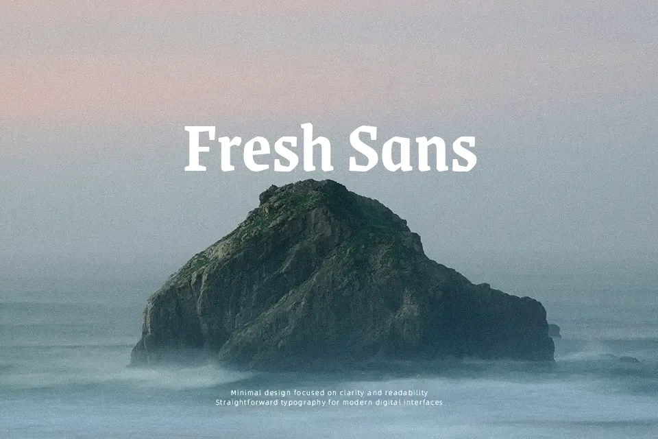
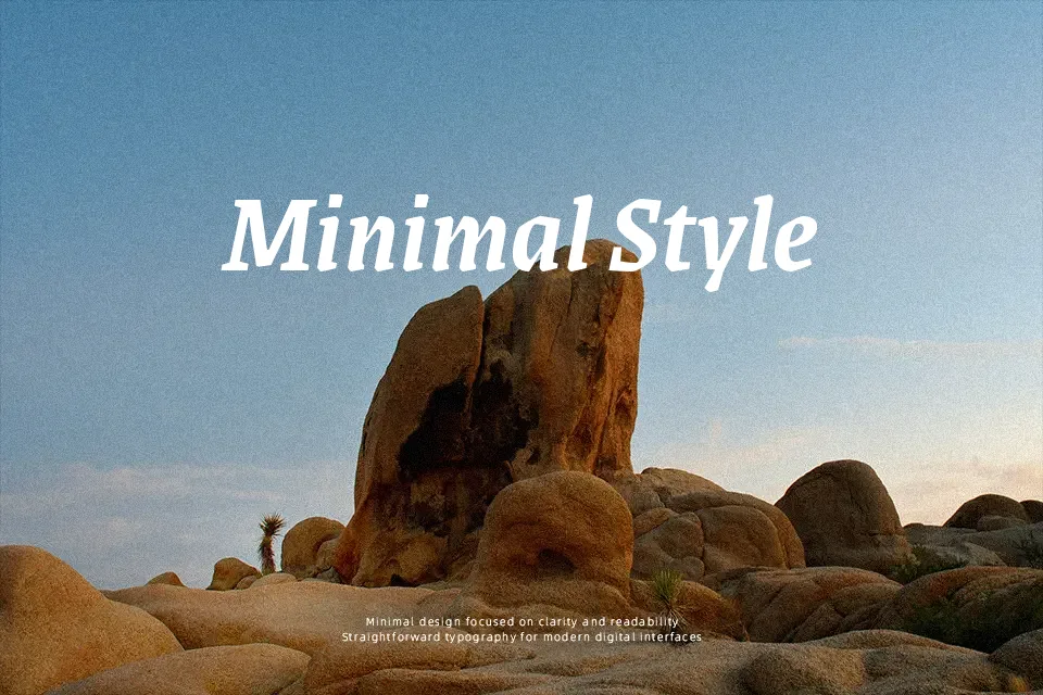
Grenze combines classical serif proportions with blackletter-inspired curves, so strokes feel dense and textured while counters stay open enough for comfortable reading. The family spans nine weights with matching italics, which makes it easy to dial in anything from subtle subheads to heavy, expressive titles in the same visual language. On the page, it carries a **dramatic** editorial tone—think cultural magazines, book covers, or feature stories that need some gothic flavor without going full blackletter. I would reach for it when a project needs personality and historical tension, but I’d avoid using it for dense, long-form body copy or minimalist UI where the textured forms can feel busy or distracting.
Best For:
editorial headlines,feature articles,mood-heavy posters,characterful branding
Not Ideal For:
long paragraphs,minimalist interfaces,formal corporate reports,small UI labels
Perfect for branding, editorial, and headline, with a artistic and display style.
License
Gallery