Aboreto Font
Free for Commercial UseAbout
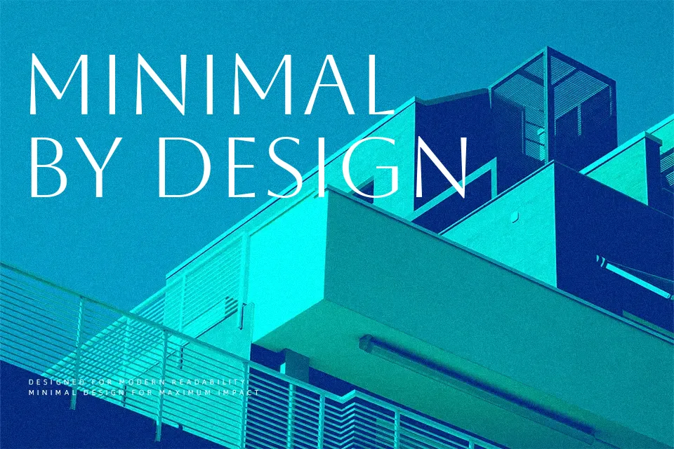
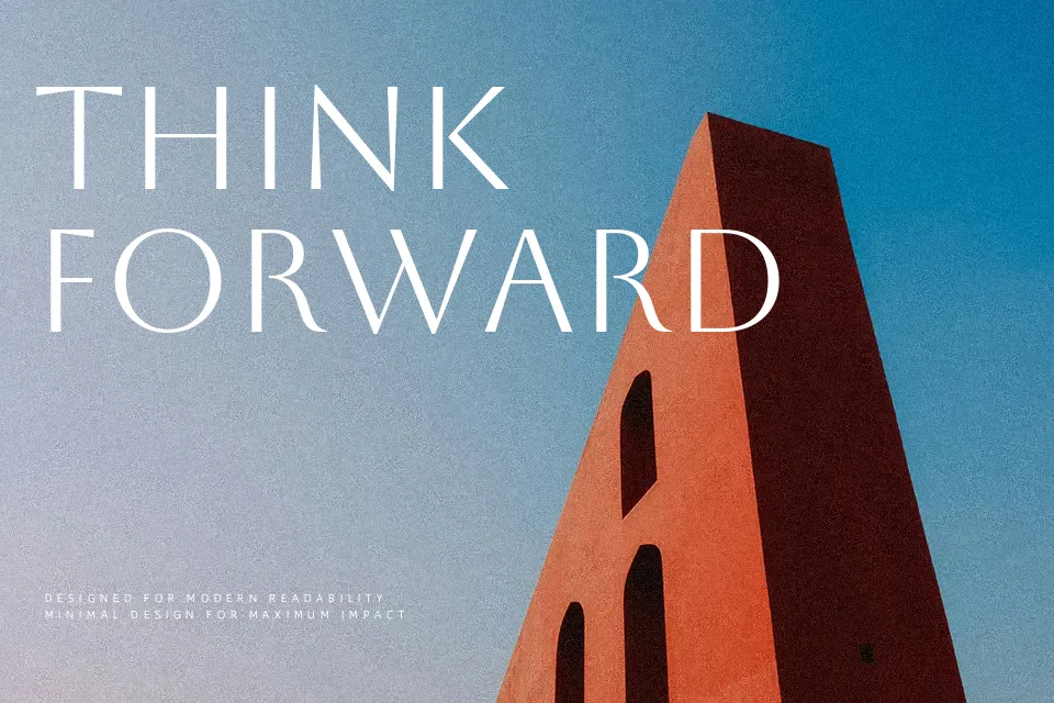
Drawn from the majuscule alphabet carved by Florentine sculptor Luca della Robbia, Aboreto isn’t a direct digitization — it’s a revival that adapts Renaissance letterforms to contemporary display needs. The construction sits in an unusual middle ground: essentially sans-serif, yet with stroke tapering and subtly thickened endings that hint at serifs without committing to them. Vertical stress runs through the uppercase forms, lending a structured, composed presence that feels deliberate rather than decorative.
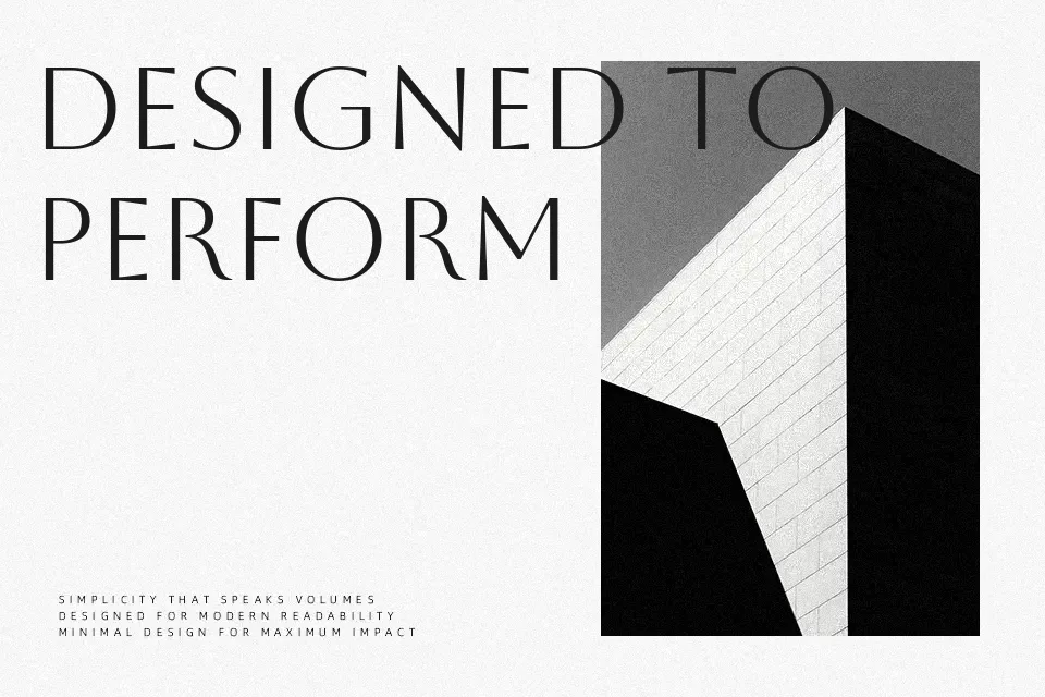
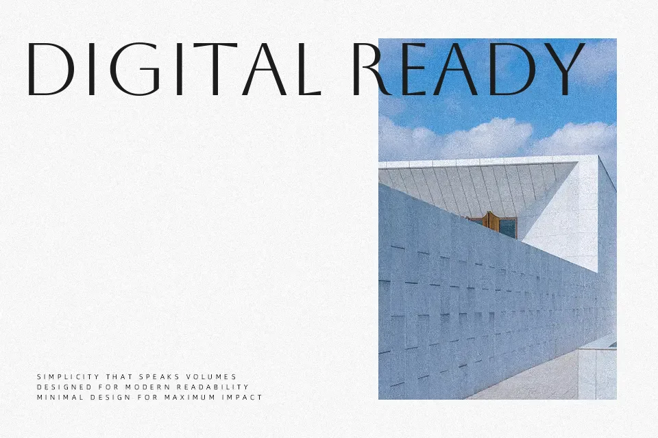
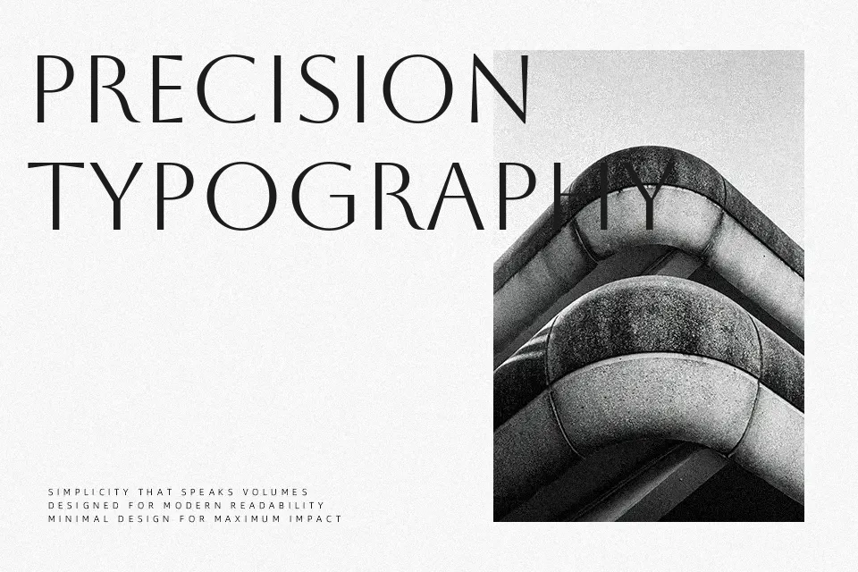
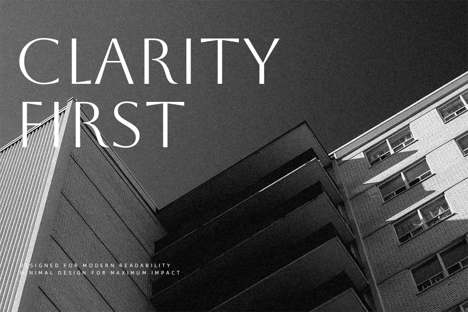
At large sizes — on a product label, a masthead, or a brand wordmark — Aboreto holds its own with quiet authority. The stroke contrast keeps things visually alive without tipping into excess. Where it struggles: mixed-case typesetting (the design is uppercase-focused), casual consumer branding, and anything that calls for a warm or approachable voice. Pair it with a neutral sans for supporting text rather than using it solo at small sizes.
Best For:
luxury brand wordmarks
editorial and magazine mastheads
heritage product packaging
large-scale display headlines
Not Ideal For:
body text or long reading passages
casual, playful, or youth-oriented branding
tech or startup brand identities
designs requiring a clear lowercase hierarchy
Perfect for branding, editorial, and headline, with a artistic and display style.
License
Gallery