Gasoek One Font
Free for Commercial UseAbout
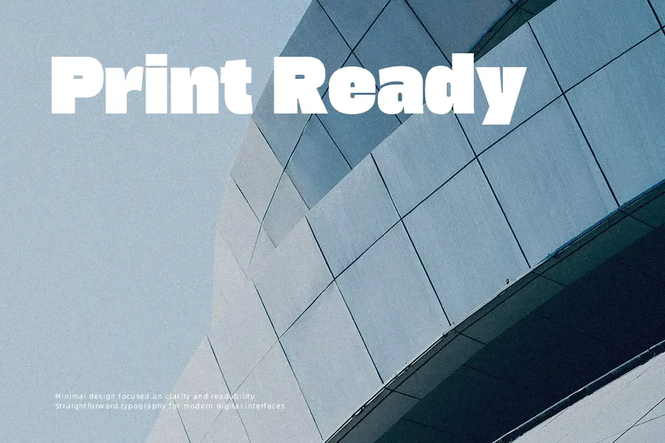
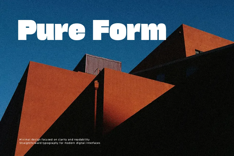
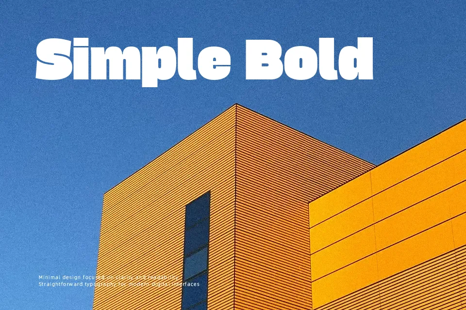
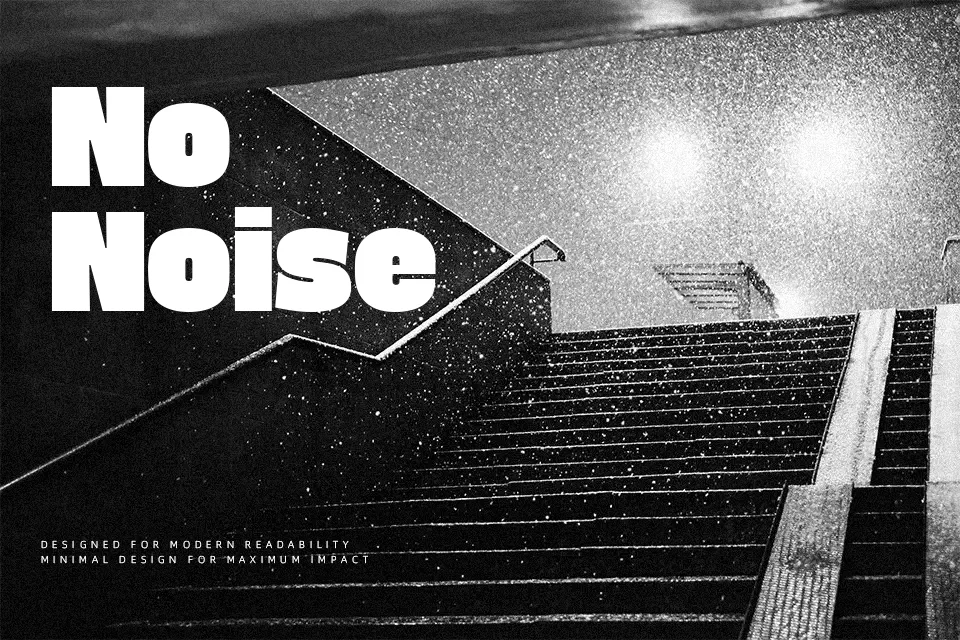
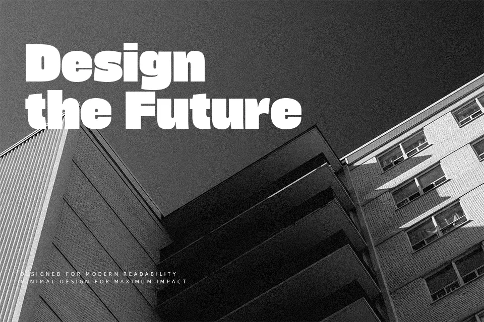
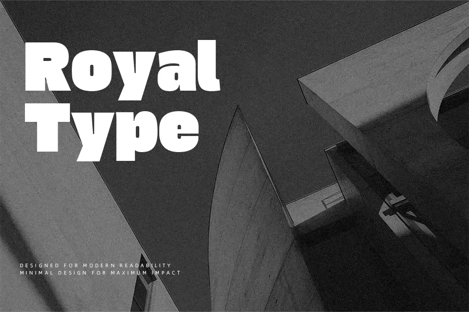
Gasoek One uses extremely thick strokes that pack tightly into a near-square frame, so letters feel blocky and weighty yet still readable. The stiff structure and angled stroke endings keep counters open, which helps the text stay clear even at smaller display sizes. Visually it leans toward a modern neo-grotesque sans serif, but the stone-inspired mass and Korean flavor give it a more characterful, poster-style voice than a neutral UI font. It works especially well for short Korean or Latin headlines, streetwear-inspired logos, streaming thumbnails, and bold event posters where you want type to feel almost like a graphic shape. For long paragraphs, minimalist branding, or formal editorial work, the heavy texture can quickly become tiring and overpower the rest of the layout.
Best For:
bold headlines
event posters and flyers
streetwear or K-culture branding
YouTube or streaming thumbnails
Not Ideal For:
long paragraphs
formal documents or reports
small UI labels
minimalist wordmarks
Perfect for branding, gaming, and headline, with a bold and display style.
License
Gallery