Gamja Flower Font
Free for Commercial UseAbout
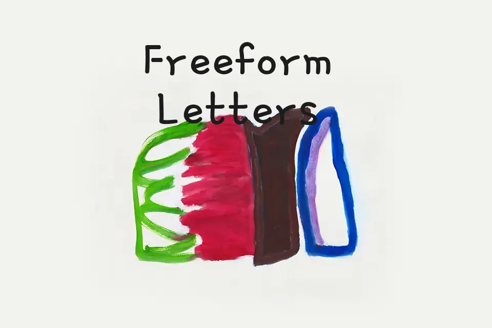
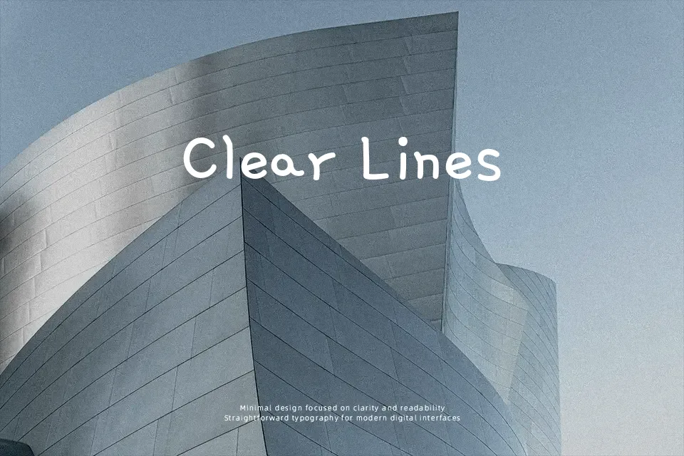
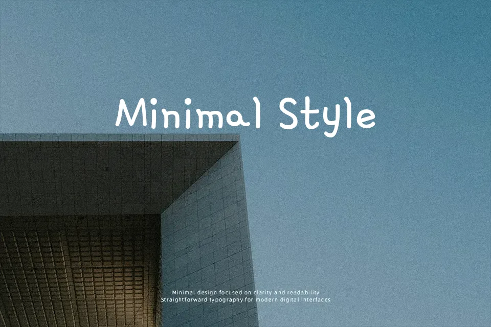
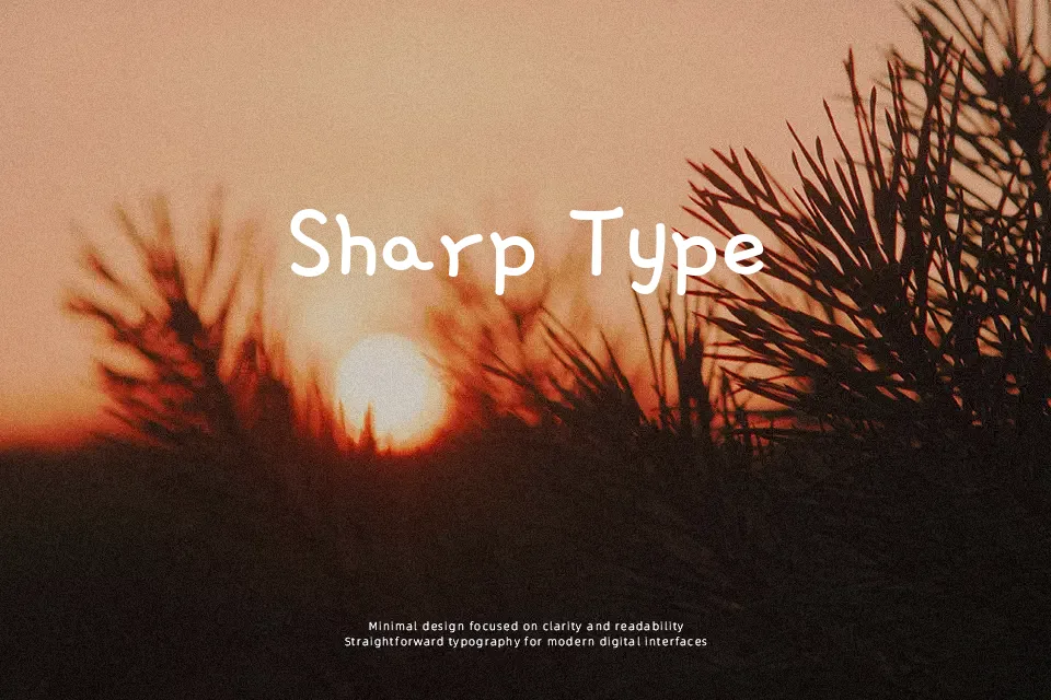
Gamja Flower uses thin, pen-like strokes, rounded terminals, and slightly uneven rhythm, which gives it the feel of tidy everyday handwriting rather than polished script. The spacing stays fairly open, so short lines and interface labels remain easy to read, especially when the design needs warmth without looking overly childish. I would use it for kids packaging, casual café posters, or friendly onboarding screens where a softer voice helps. I would avoid it in long editorial copy, dense dashboards, or formal brand systems, because the loose structure starts to feel less disciplined over extended reading.
Best For:
kids product packaging
friendly app labels
casual social graphics
short poster titles
Not Ideal For:
long paragraphs
formal documents
dense data interfaces
legal text
Perfect for headline, kids, and packaging, with a creative and display style.
License
Gallery