Francois One Font
Free for Commercial UseAbout
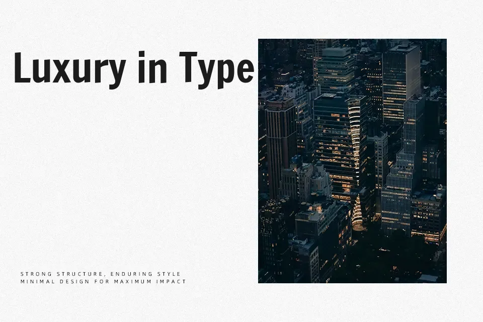
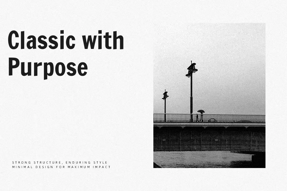
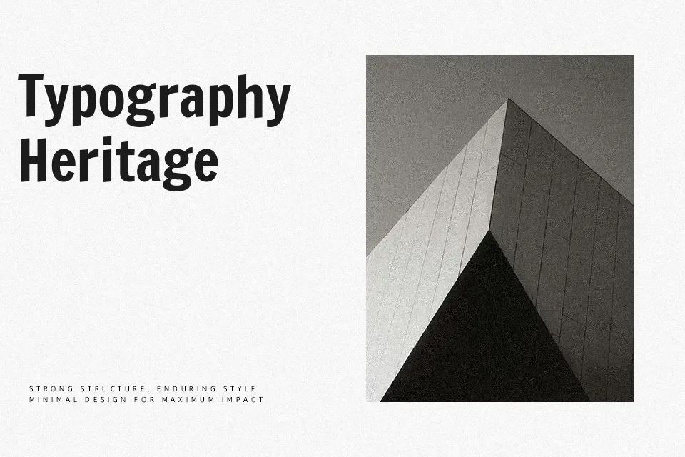
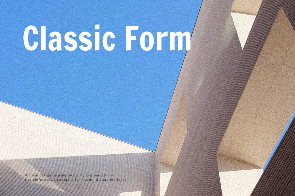
Francois One reworks traditional gothic sans serif forms into a sturdy, condensed shape with thick verticals, compact proportions, and slightly slanted terminals that add a bit of movement. Counters are opened just enough to stay readable at medium sizes, but the heavy weight and tight spacing make it noticeably assertive rather than neutral. It shines in bold headline roles on websites, editorial covers, and social graphics where you want a strong voice without drifting into novelty, and it pairs nicely with lighter grotesques or geometric sans for body text. Because there is only one style and no lighter companion, it tends to feel clumsy in dense paragraphs or systems that need a full typographic hierarchy.
Best For:
bold headlines
web banners and hero text
poster and flyer titles
short UI labels or badges
Not Ideal For:
long paragraphs
formal documents
interfaces needing multiple weights
small caption typography
Perfect for advertising, branding, and headline, with a bold and condensed style.
License
Gallery