Fira Sans Font
Free for Commercial UseAbout
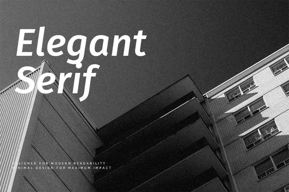
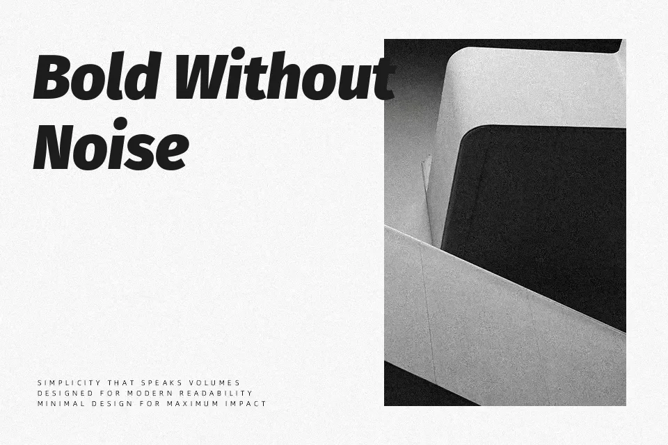
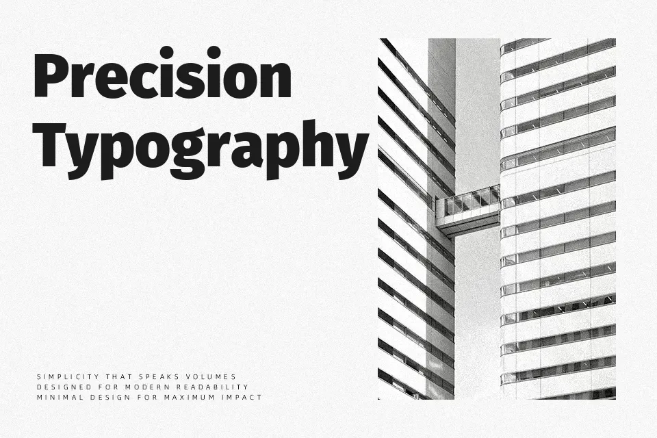
Fira Sans has open apertures, a tall x-height, and slightly tapered strokes that keep text readable even at small sizes. The overall impression is **modern** and humanist rather than mechanical, so it feels comfortable in product UIs, documentation, and editorial layouts rather than flashy logo wordmarks. With multiple weights and italics, it can handle hierarchy on web dashboards, app navigation, and technical reports without drawing too much attention to itself. If you need expressive branding or heavily stylized packaging, its restrained character can look a bit plain compared to more decorative sans serif families.
Best For:
UI Design navigation and labels
Website body copy and headings
Editorial-style articles and documentation
Product dashboards and data-heavy screens
Not Ideal For:
Expressive display logos
Highly decorative packaging
Playful kids branding
Very ornate event invitations
Perfect for body text, editorial, and headline, with a calm and geometric style.
License
Gallery