Federo Font
Free for Commercial UseAbout
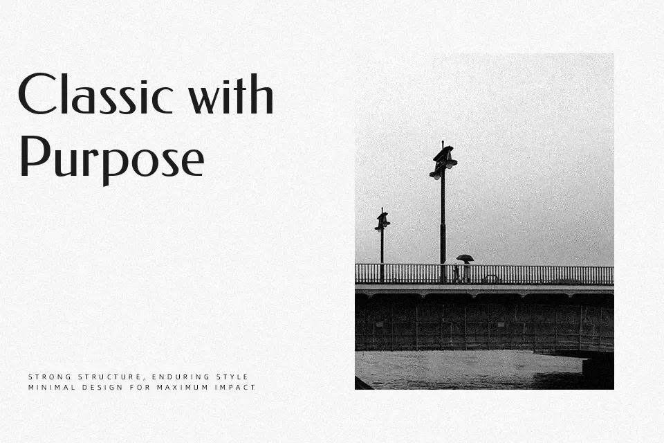
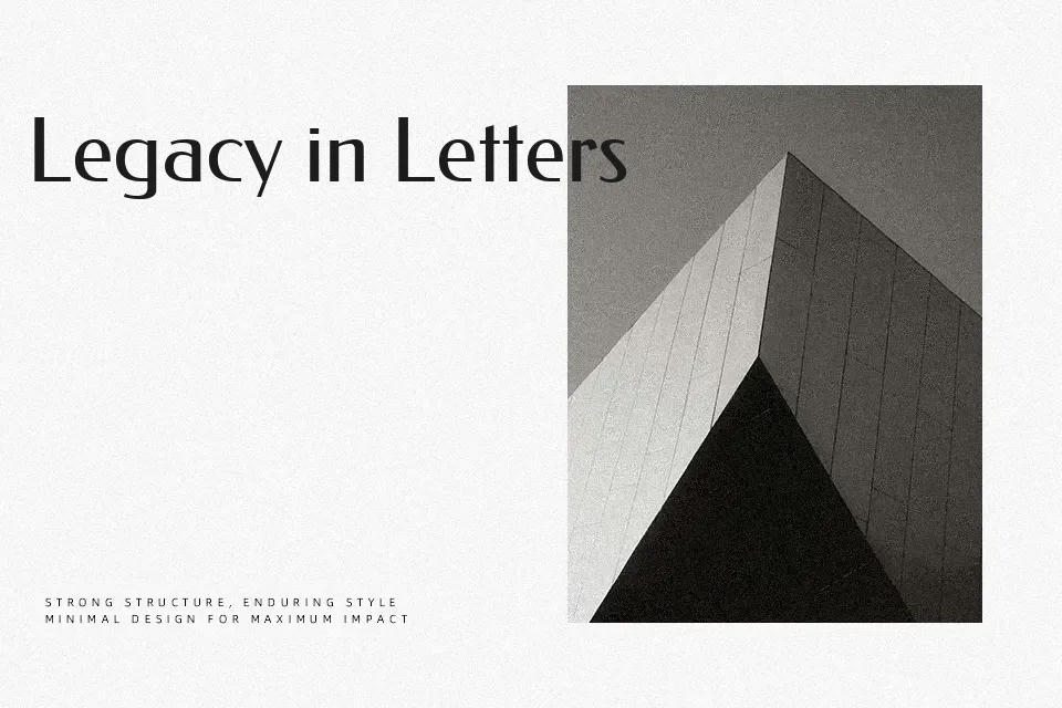
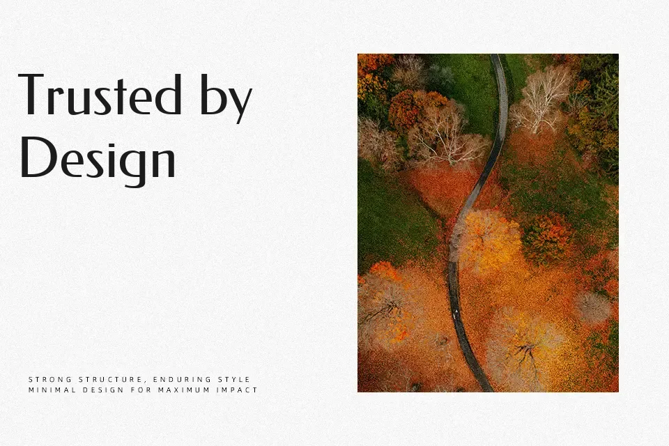
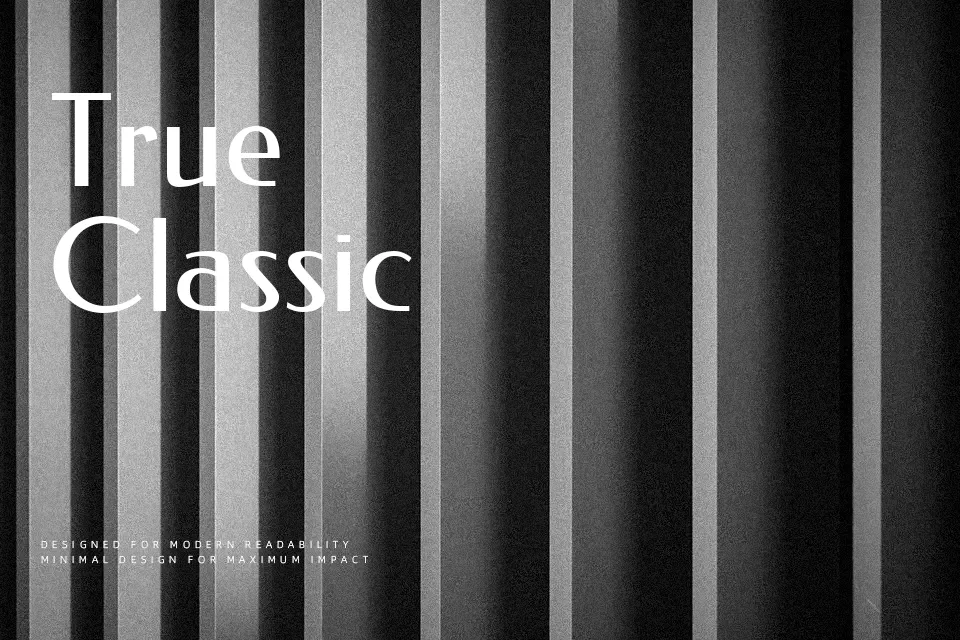
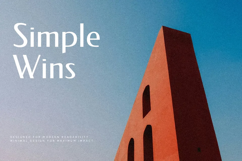
Federo is a lean, single-weight sans serif that references early 20th‑century grotesques, with straight strokes, low contrast, and generous counters that keep the letters open on light backgrounds. Its geometry feels restrained rather than flashy, so it reads as quietly confident rather than shouting for attention. I like using it for short headings, product labels, or navigation where you want a hint of Art Deco personality without sacrificing clarity. It can look a bit stiff and repetitive in long paragraphs, so I usually pair it with a warmer text face instead of relying on it for full articles or dense body copy.
Best For:
short web headlines
subtle Art Deco branding
navigation labels and UI text
product tags and small packaging text
Not Ideal For:
long editorial paragraphs
formal corporate documents
tiny caption text on print
highly expressive logotypes
Perfect for branding, headline, and logo, with a clean and display style.
License
Gallery